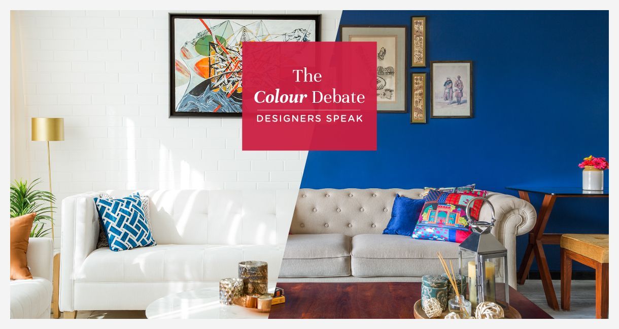
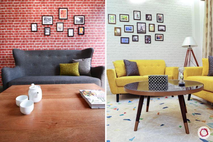
If you’re trying to decide on a colour palette for your home, this question has most certainly come up. Should you go for a single palette for the entire home or should each room have its unique colour? There are many factors that affect this decision. Thus, we asked our experts on what they would suggest for room colour combination. Here are their viewpoints:
Room Colour Combination Tip #1: Depends on Personality
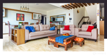
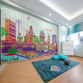
Colours speak volumes when it comes to defining the personality of an individual. Some prefer sober colours like neutrals and pastels while some go completely eclectic with vibrant shades. Thus, choosing a colour based on what your personality and your interests will help create many different zones.
“I prefer offering different colours for each room as every member of the family has a unique persona. It is essential that it gets reflected in their rooms as well.”
Vishaka D’souza, Design Partner, Livspace
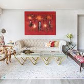
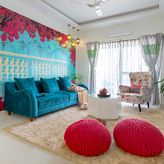
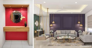
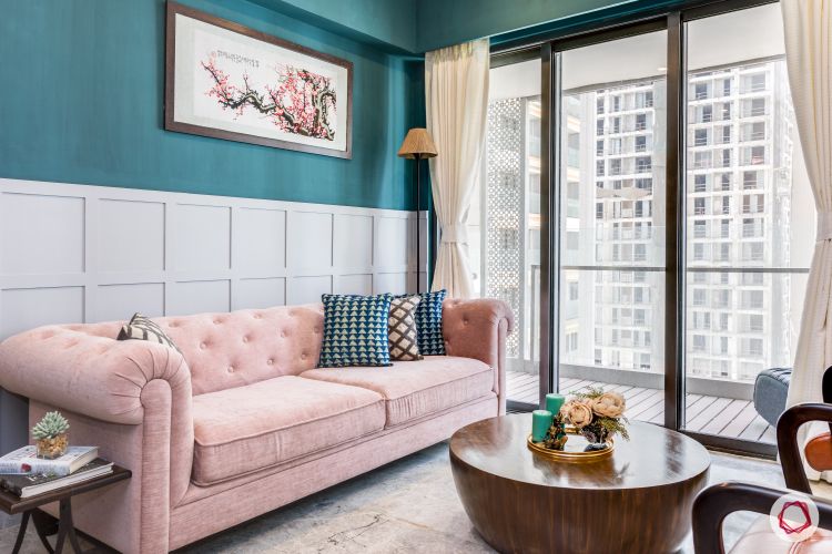
Room Colour Combination Tip #2: Make it Lively & Welcoming
Make sure the colours you choose, whether single or multiple, form a welcoming sight for your visitors and you. Therefore, choose shades that give it a homely feel. It also entirely depends on what your idea of lively and inviting is!
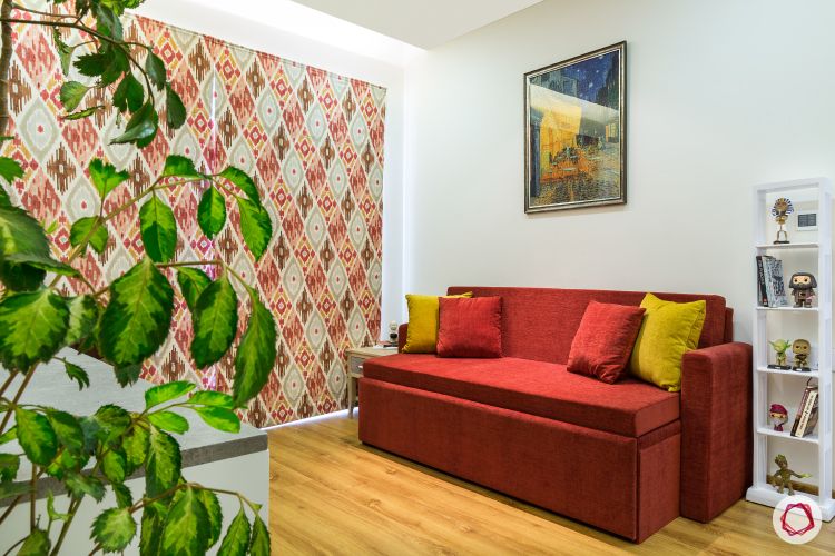
“Different colours in all rooms make the zone lively. However, if my clients insist on a single colour, I would add a canvas painting with a colourful mix or pops of colour in the soft furnishings. This way, you can save yourself from monotony!”
Megha Kedia, Interior Designer, Livspace
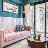
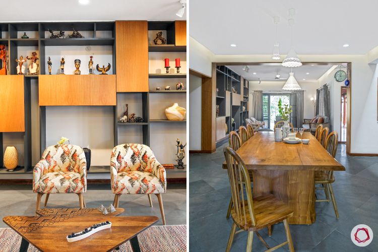
Room Colour Combination Tip #3: Subjective to Design Theme
While Scandinavian design uses a muted palette, Bohemian interiors come with vibrant colours. Thus, if you’re opting for a single theme to do up your home, you might as well stick to the colour palette to make the look work.
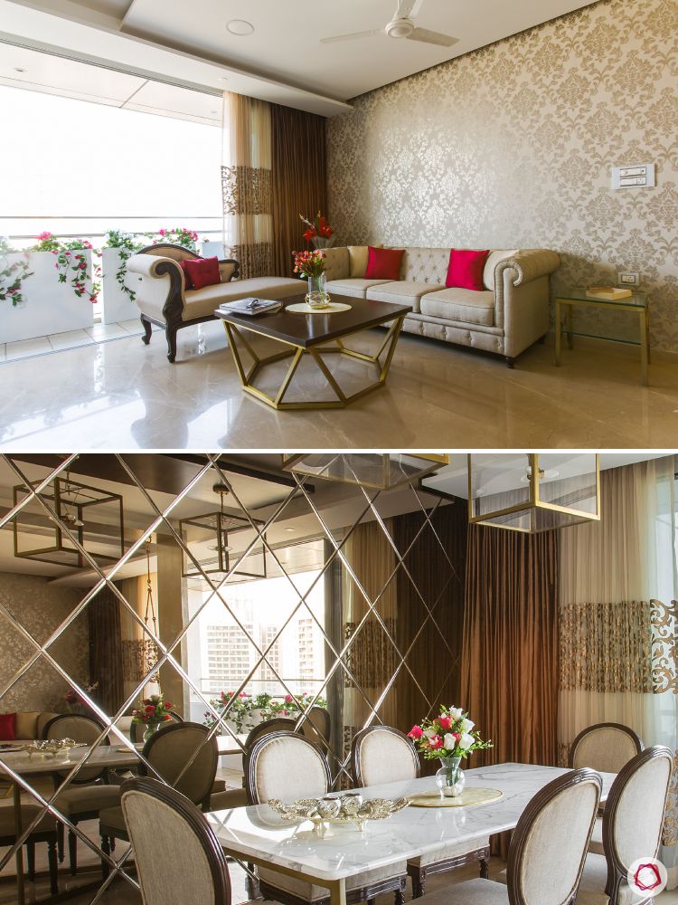
“Choosing colour combinations for the room varies based on the themes prevailing in the home. Thus a single palette can be sought. However, I like to bring in a contrast to highlight specific areas of the house.”
Kanwaldeep Kaur, Interior Designer, Livspace
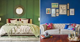
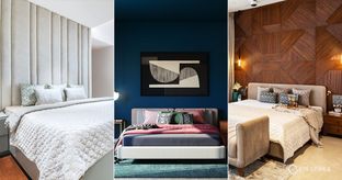
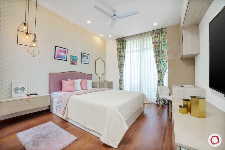
Room Colour Combination Tip #4: Decide on What Tone to Set
A classic example of how colours have a psychological effect on people is the use of warm shades like red, yellow, orange and brown in restaurants which are said to induce hunger. Similarly, cool hues like blue and grey can be soothing after a long day. Thus, it is essential to define what mood you want to set in a room when you pick colours. Check our mood boards based on colour.
“Having studied colour psychology in design, I like to use multiple colour palettes at a home based on the mood. This lets me play with different concepts and ideas for various spaces in the home.”
Hamsa Ganesan, Community Manager, Livspace
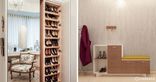
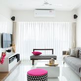
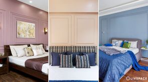
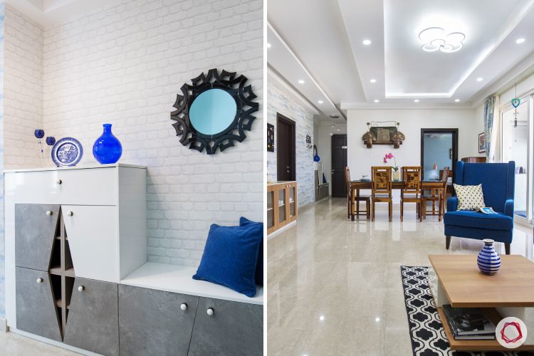
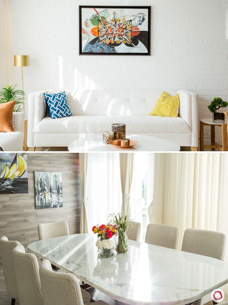
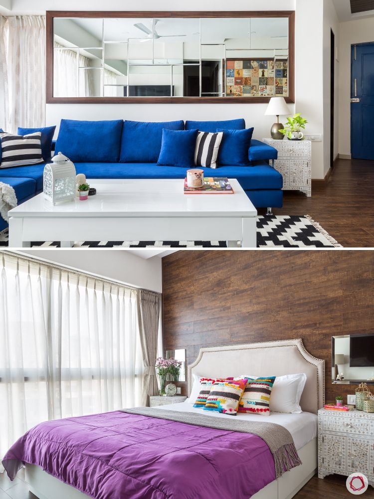
Room Colour Combination Tip #5: Create a Smooth Flow
Pick a common colour that can flow smoothly in every room. Whether neutrals, pastels or monochromatic colours with pops of other elements work well. This can be in the form of wall colour, flooring, or accessories. This makes sure a theme flows throughout the home. It also makes it easy when you need to pick design elements like furniture and decor without creating a patchy effect.
“I like to try a single palette and work with tone-on-tone technique for a home, with the kids room being the only exception. This will definitely help maintain a consistent theme, thereby helping homeowners pick decor and furniture to match the colour palette at home.”
Uma Kari, Community Manager, Livspace
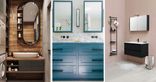
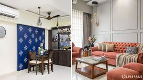
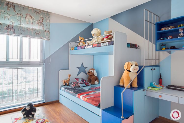
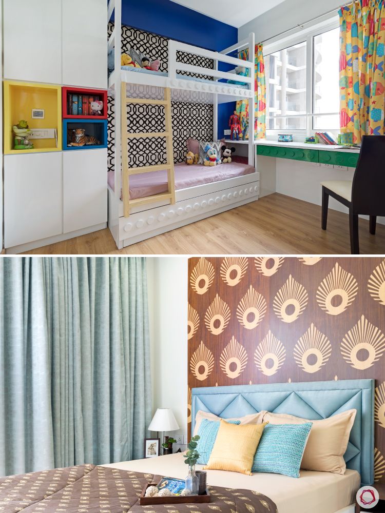
Room Colour Combination Tip #6: Depends on the Use
Colours have a powerful impact on the feeling of a room. Thus, you should carefully assess the characteristics of the user before you define a colour for the space. For example, using pastels for nurseries and parents’ room is valid as flashy colours might affect them adversely. For an entertainment room, using red, green and yellow might interfere with the movie experience as well.
“Working with different colours can help personalise the space for an individual as it can influence their mood. It is a must to induce positive vibes and energetic feel in the home with different variations.”
Megha Sobti, Senior Interior Designer, Livspace
Finally, all our designers agree that using a common palette with pops of colour makes the home unique and gives a seamless flow of design. However, it is essential to capture the personality and mood of the resident to make it a personal abode.