In This Article
- Anwesha B: Sakshi, homes in Mumbai have notoriously low ceilings, but the first thing we notice about this home is how tall it is! How did you manage to do that?
- AB: Are you saying you just have used just three colours in the entire home?
- AB: Are you serious? The living room can seat 18 people at once? How did you break up the seating arrangement because it sure doesn’t look monotonous?
- AB: This home is fairly contemporary in style. But something sets it apart from the crowd. I can’t put my finger on it, can you?
- AB: Another thing that struck me about this three BHK flat interior is that no matter which room you enter, it is evident that you are in the same home. How did you make this 3BHK look like a cohesive unit?
I distinctly remember feeling a sense of awe at how big Jyoti Punja’s Mumbai home looked as soon as I walked in! Don’t get me wrong; a three-bedroom flat in Mumbai spanning 2,000-odd sq ft is no mean feat. But space is not the same as size; space is a facet of perception and design rather than the actual dimensions of an apartment. With that thought in place, we got down to discussing this three BHK flat interior with its designer, Sakshi Shetty.
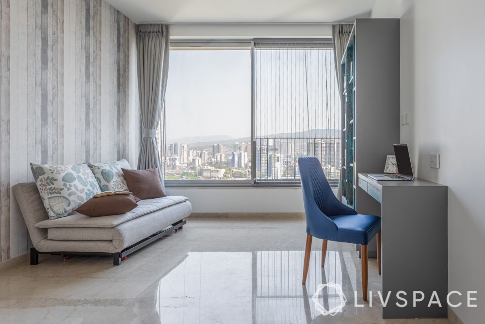
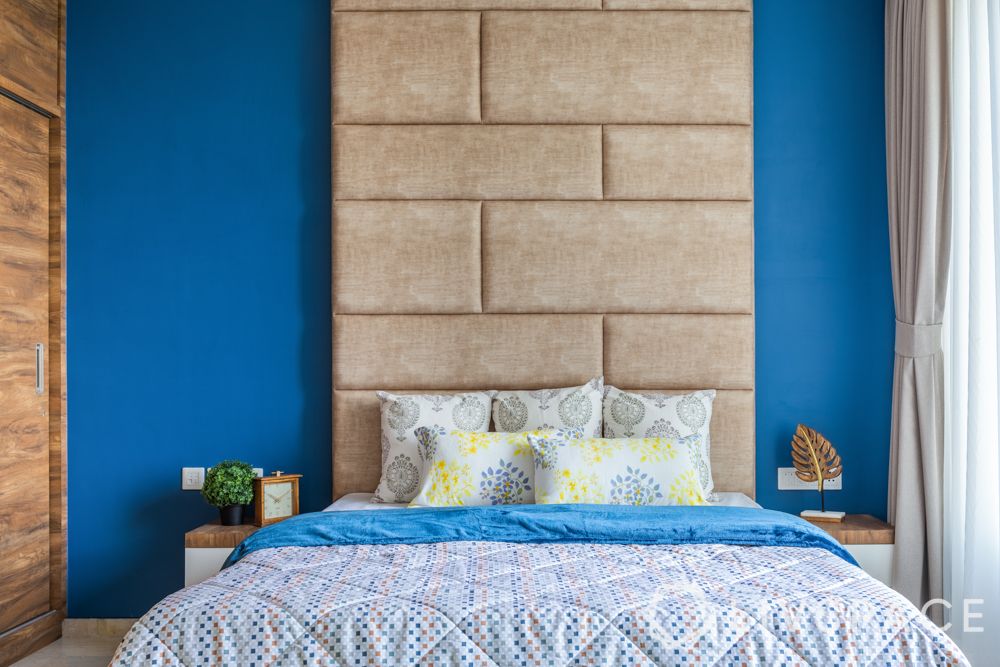
Anwesha B: Sakshi, homes in Mumbai have notoriously low ceilings, but the first thing we notice about this home is how tall it is! How did you manage to do that?
Sakshi S:
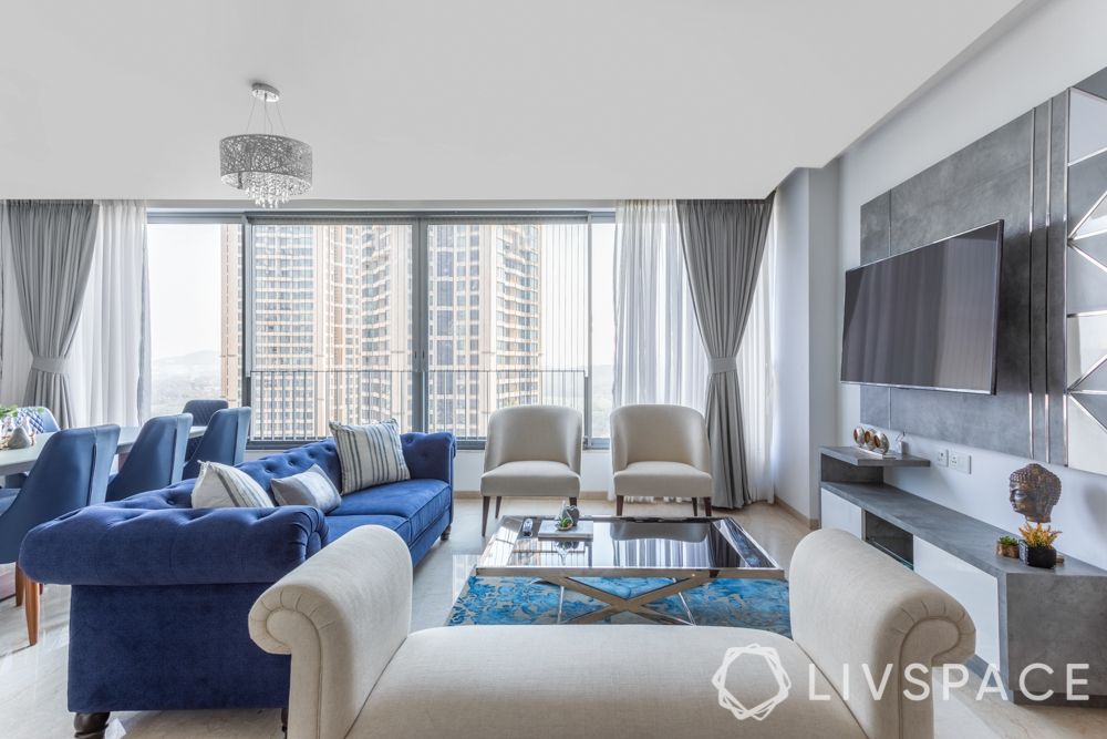
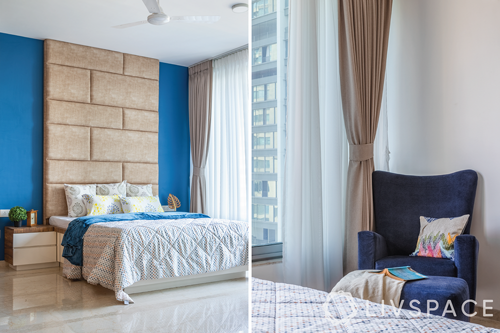
The height that you see here is an optical illusion. We have done wall treatments that accentuate the height of the rooms. For instance, the vertical lines on the wallpaper you see in the guest room/ study makes the ceiling look taller. You could also check out the master bedroom with its full-height headboard that gives the impression of a tall ceiling. The fact that we have floor-to-ceiling windows running across all rooms is an added bonus for this three BHK flat interior.
As we have used just white, grey and blue in this home, we used these very gradients to create a texture while we were building the vertical height.
AB: Are you saying you just have used just three colours in the entire home?
SS:
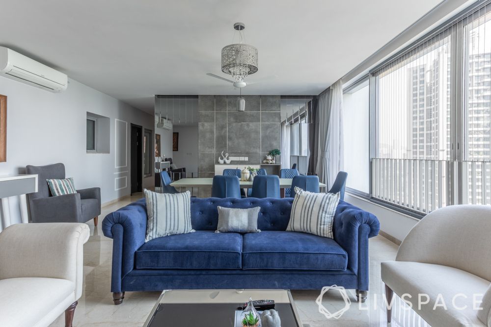
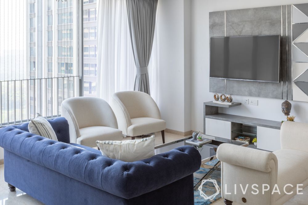
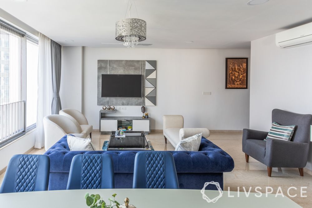
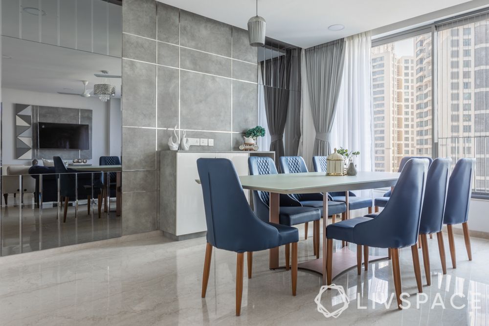
Actually, just two! Blue is a pop colour! To be honest, Jyoti did not want a melange of colours in her home; she wanted to have a colour scheme that is basic but profound. Besides, this home gets so much natural light! It’s a gift and we tried to make the most of it by using just greys and whites. The blues; we have used various shades of blues, which come forth as pop colours everywhere. The Chesterfield sofa and dining chairs, for instance, hold your attention. But the real job is being done by the whites and greys around them.
Monotones are excellent when you want to open up spaces. How else do you think we managed to provide seating for 18 people in the living room!

AB: Are you serious? The living room can seat 18 people at once? How did you break up the seating arrangement because it sure doesn’t look monotonous?
SS:
The most important consideration for designing a room is its layout and shape. If you notice, this living room is rectangular, so it’s elongated. Hence, I started by segregating it into the lounging area and the dining space. The Chesterfield sofa from our catalogue marks the end of the lounge area. We have added a variety of seating options even within that area; there’s a daybed, two eggshell chairs and a comfy area rug to hold it together.
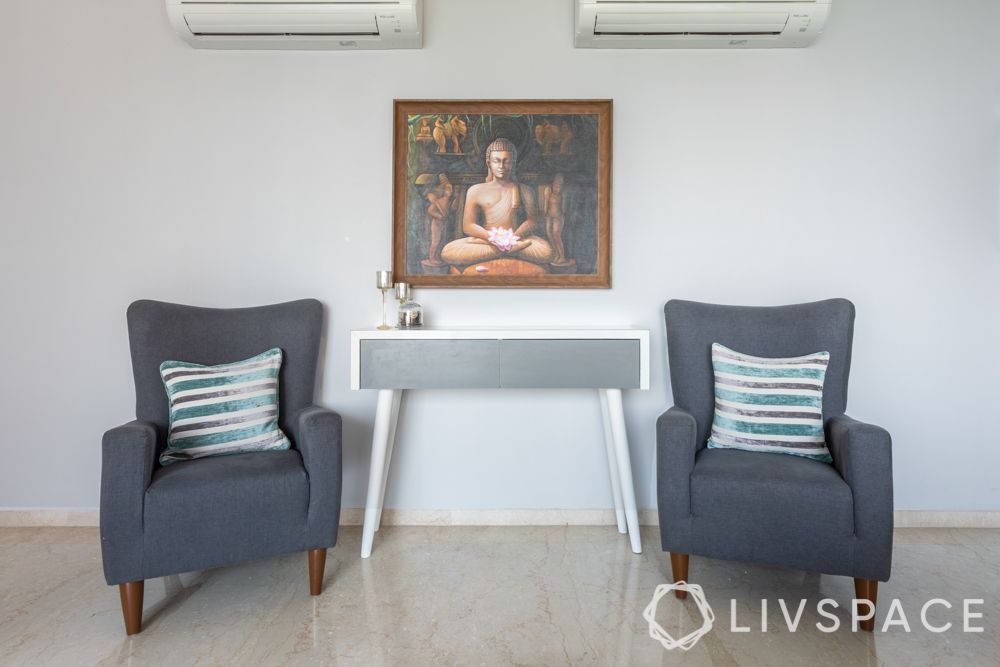
In the dining area, we have opted for homogeneity over variety. Naturally, all eight chairs are identical. And the mirror panel behind them helps make the space look roomy. But there was still some space remaining on the sides. So, we added corner seating with two armchairs and a console to go with it.
The seating doesn’t look monotonous because we have mixed chairs and couches belonging to different styles, time periods and pertaining to different functions.
AB: This home is fairly contemporary in style. But something sets it apart from the crowd. I can’t put my finger on it, can you?
SS:
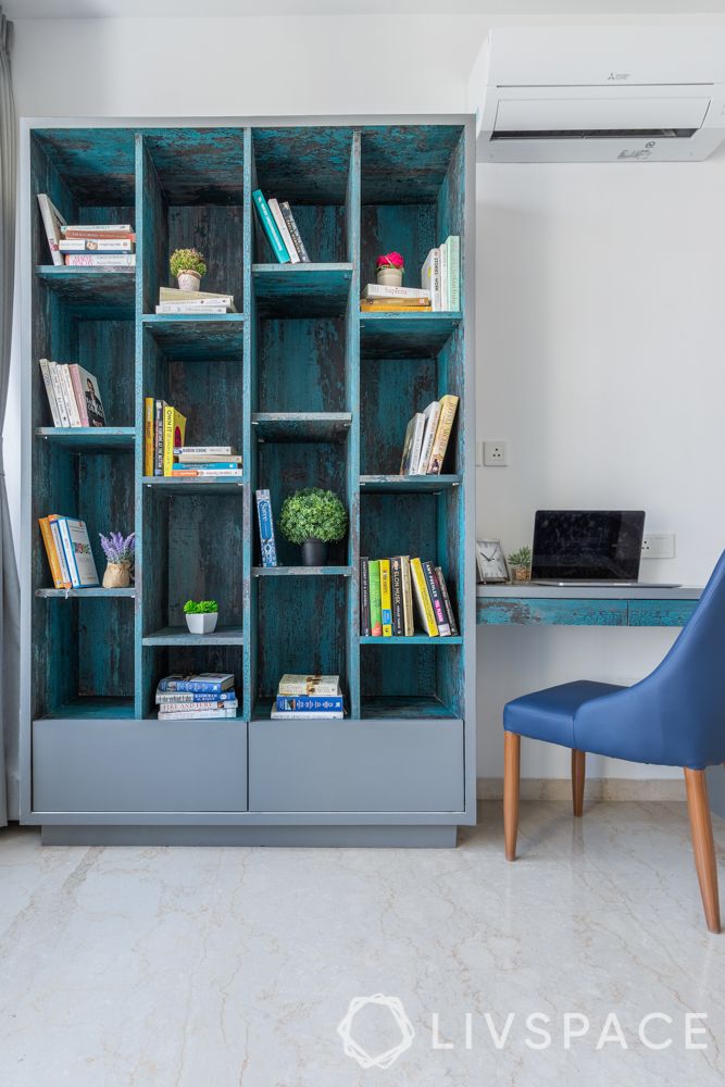
Yes, I can! But it could be subjective. From a design perspective, I feel we have used many novel materials for this apartment. My favourites are the steel beats integrated into the TV unit. It completely changes the look and feel of the lounge area. We have similar wall treatment in the dining space too. But here, the back-painted glass tabletop stands out. Also, if you see the dining chairs closely, they have a woven texture on them.
All of these come together to make this home stand out from the ‘me-toos’ we see around us.
AB: Another thing that struck me about this three BHK flat interior is that no matter which room you enter, it is evident that you are in the same home. How did you make this 3BHK look like a cohesive unit?
SS:
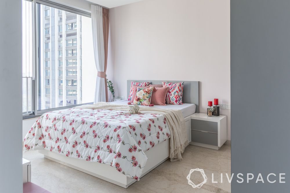
Well, it’s called design continuity. It is very important for any home. Many homeowners like each of their rooms to be unique because they belong to different members of the family and should be as per their individual taste. In the case of this three BHK flat interior, Jyoti wanted some common design threads. It’s mostly colour, and no matter which room you enter, you will see a bit of grey and blue. In the daughter’s bedroom, the grey is a lighter shade than the living area but you can form the connection in your head. In fact, even the pooja unit for this home is a lustrous silver grey!
If you enjoyed catching up with our designer to learn how she designed this three BHK flat interiors, also explore how we designed a cute and compact 2BHK under ₹10 lakhs!
Send in your comments and suggestions.