In This Article
- Anwesha B: How did you make the compact 2BHK look spacious?
- AB: How did you make the interiors child-friendly?
- AB: Their compact kitchen looks quite spacious too!
- AB: Tell us about the living room
- AB: Any reason why you’ve used these colours in the home?
- AB: Lastly, how did you manage to keep it all under ₹10 lakhs?
Homes are often made of dreams more than they are of bricks and mortar. And even more so if it’s your first home, like it was for Nikhil Kurothe and his wife. The young couple – owners of a 2BHK spanning 750 sq ft at Sara Metroville, Pune – came to Livspace with a tight budget and lots of ideas. Our designer Sravani Ayyagari took those ideas and converted them into a design that actually works for their Pune interiors. The clients too, gave Shravani a free hand to decide what colours and patterns to use, which left room for experimentation.
What we love about this home is the smart use of available space and how Sravani has picked colours. But how did it all come together without compromising on space or budget? This writer had a tête-à-tête with the designer to answer some burning questions!
Anwesha B: How did you make the compact 2BHK look spacious?
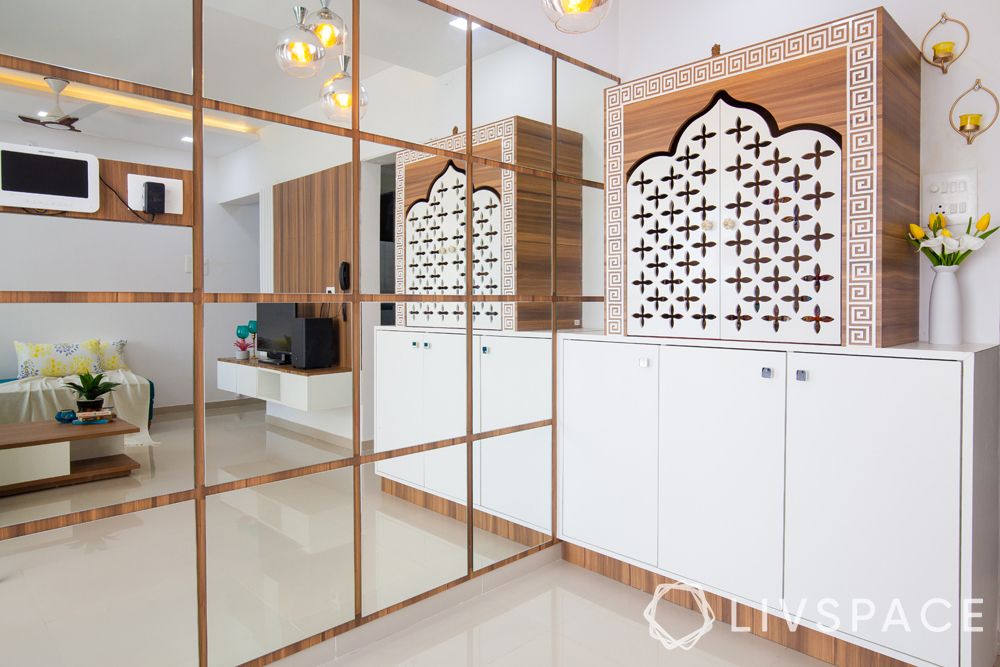
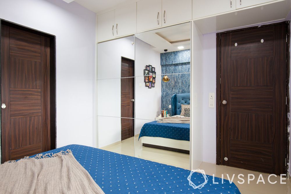
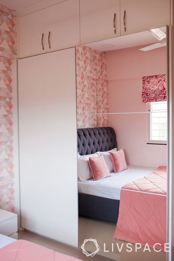
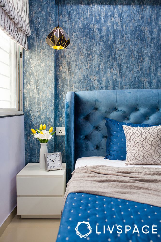
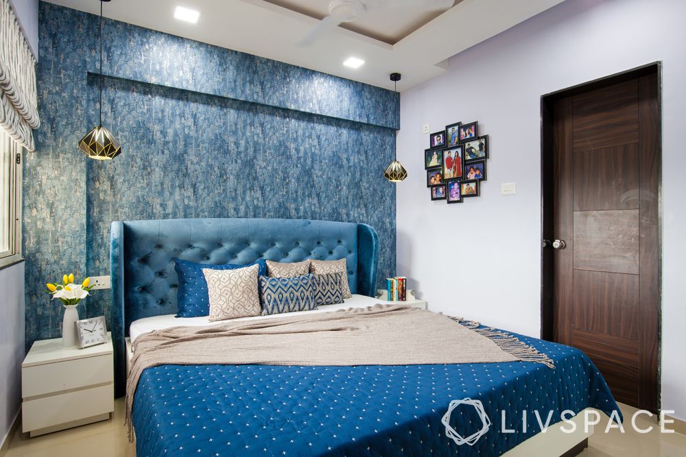
Sravani A: As the apartment was just about 750 sq ft, we had to design it with utmost care. Nikhil did not want the space to look cramped and we had to fit in the essentials. Mirror panels came to our rescue. My favourite is the one in the living room – its chequered pattern adds texture to the area and makes it look spacious. Additionally, one side of the wardrobe in the kid’s bedroom and the entire wardrobe in the master bedroom have mirror shutters. This adds to the illusion of space.
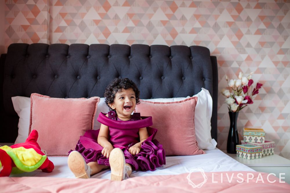
AB: How did you make the interiors child-friendly?
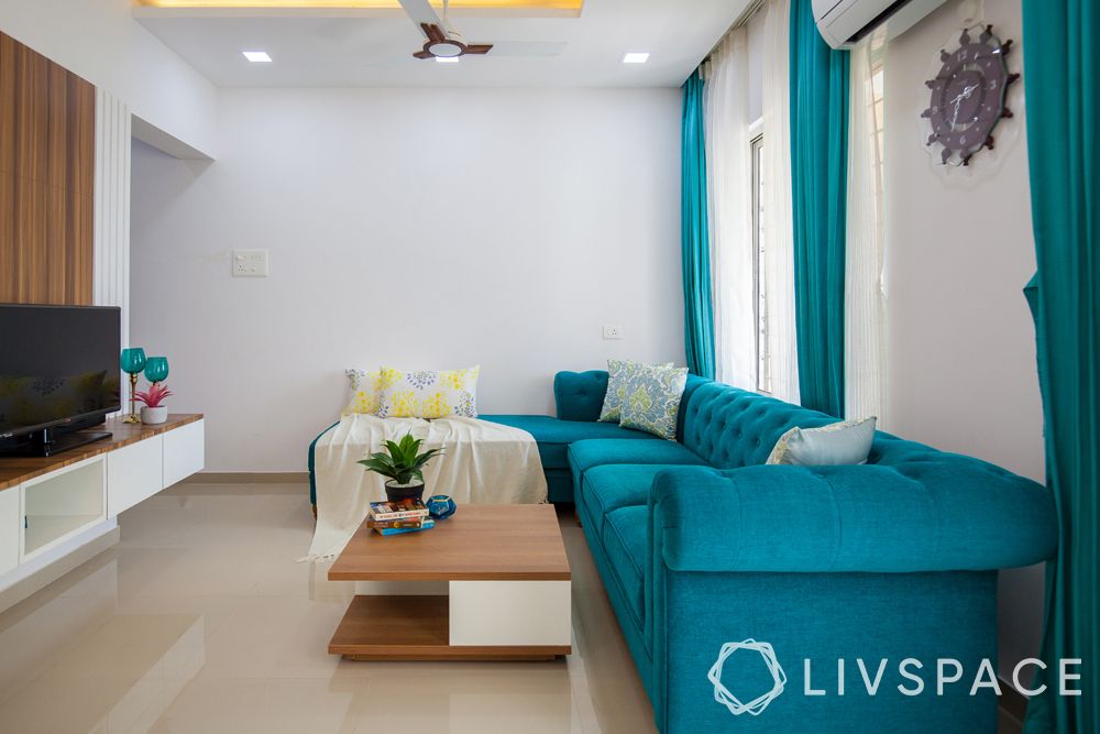
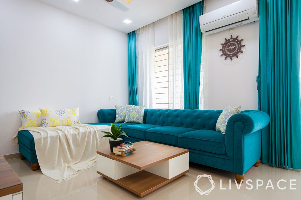
SA: If you look carefully, most of the bulky furniture in this house has rounded edges that make it child-proof. Straight edges tend to be a risky choice for homes with children. The L-shaped sofa from the Livspace catalogue is in the Chesterfield style, a popular choice. Also, both the beds have soft and curved cushioned headboards. The tufted design of the upholstery works like an element of design continuity in this house.
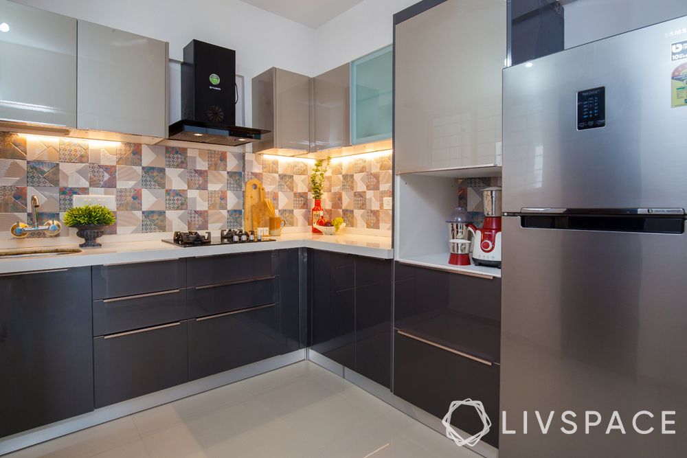
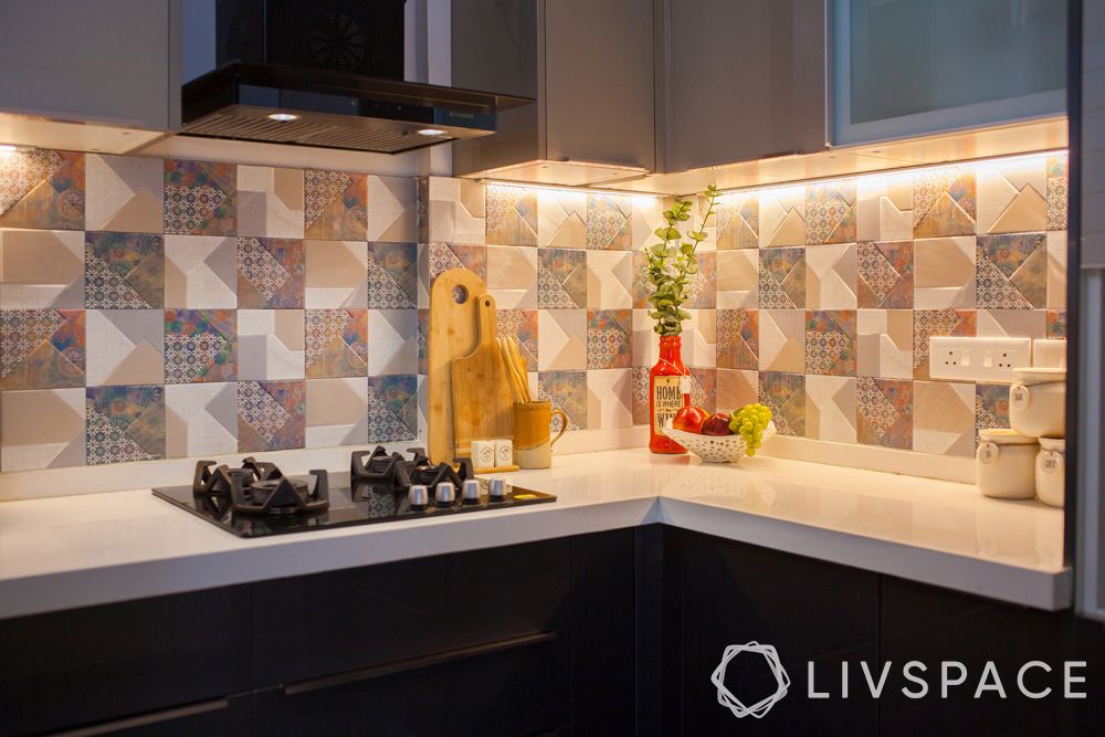
AB: Their compact kitchen looks quite spacious too!
SA: The space in the kitchen was quite limited and the couple wanted to remedy this. Typically, reflective finishes make a space look larger. So I suggested they opt for glossy acrylic finishes for the cabinets. In addition, the seamless white quartz countertop adds a plush vibe to the kitchen while opening up the space. Let’s not forget that this is also a very low maintenance kitchen as acrylic is easy to clean.

AB: Tell us about the living room
SA: The living room was too small to accommodate both an L-shaped sofa and a dining set up. While the mirror panelling does make the room look bigger, it doesn’t increase the space physically. Also, Nikhil was not too keen on a dedicated dining area. So we used the space for a large sofa and TV cabinet. And to take care of their dining needs, we chose a large centre table here that doubles up as a dining table.
AB: Any reason why you’ve used these colours in the home?
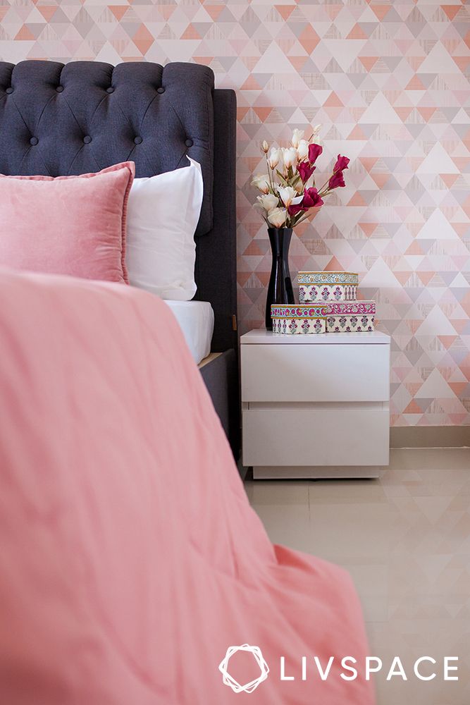
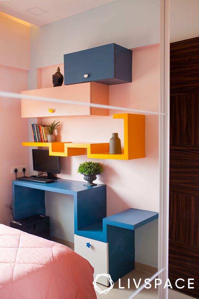
SA: As there was a child in the house, I saw it fit to add touches of playfulness and a dash of colour. The space was compact, so an overdose of colours or using too many dark shades is not recommended. So we’ve dressed the home in pleasing shades of blue and pink. I also added colours sparingly in the form of wallpapers in the both bedrooms. In the kid’s room, there is an extra dash of colour coming from the shelves and customised study unit.
AB: Lastly, how did you manage to keep it all under ₹10 lakhs?
SA: Having a tight budget doesn’t mean we should compromise on quality or aesthetics. So we opted for smart solutions by using the most affordable variety of laminate finishes and added mirror shutters wherever possible (which also helped our goal of adding the illusion of space!). Just using more cost-effective alternatives will help reduce the cost.
The kitchen wall units and tall unit are both made of MDF and only the base cabinets have been done up in plywood. We used Boiling Water Resistant ply for the sink unit only, so this has brought down the cost. The wardrobes are made of MDF instead of plywood. In the kid’s bedroom, the bed is also made of MDF which reduces its cost substantially. In the pooja unit, we have used acrylic jaali instead of a Duco painted one.
As we discussed before, there is no separate dining space, so the clients have saved the cost of dining furniture too. In both bedrooms, I used wallpapers instead of textured paint to create accent walls. Even for the mirror panel in the living room, we used an ensemble of small mirrors instead of a full-length mirror, which would have been more expensive.
If you enjoyed reading about this home in Pune interiors, also explore our first project in Pune which was classy on a budget!
Send in your comments and suggestions to editor@livspace.com