
In This Article
- How does it avoid looking like a seaside cliche?
- What makes Belli’s bedroom the perfect teen space?
- What do the brothers’ rooms reveal about character through design?
- What makes the living room work so well as a gathering space?
- How do you translate outdoor living to real life?
- Which colours capture the coastal feeling?
- What textures and materials matter?
- How do you make this work in your home?
- How can Livspace help you?
If you’ve watched The Summer I Turned Pretty (TSITP), you know the Fisher family’s beach house isn’t just a setting. It’s a character. It’s where first kisses happen, where hearts break over breakfast, where entire summers live in your memory long after the credits roll. And honestly? The coastal interior design deserves as much screen time as the love triangle.
This isn’t your typical coastal home. There are no “Live, Laugh, Love” signs or aggressive nautical stripes. Instead, it’s all weathered wood, soft linen, and the kind of lived-in comfort that makes you want to curl up with a book and never leave. The genius of the Cousins Beach house is that it looks effortless, but that effortlessness is actually incredibly intentional.
How does it avoid looking like a seaside cliche?
Here’s the thing about coastal interior design: it’s so easy to get wrong. One anchor too many and suddenly your home looks like a theme restaurant. But TSITP nails the brief by being coastal without being obvious about it.
There are no seashell borders. No rope-wrapped mirrors spelling out “BEACH” in driftwood letters. No oversized starfish clinging to walls. Instead, the nautical references are subtle and sophisticated. Rope appears as detailing on light fixtures. Driftwood inspires the finish on furniture. An occasional painting hints at ocean horizons without screaming about it.
The colour work is particularly clever. Instead of the predictable navy-and-white combo that dominated coastal homes in the 2010s, the house leans into softer, more complex tones. Powder blues that look like morning mist. Sea-glass greens that catch the light. Sun-bleached whites that feel organic rather than stark.
The result is a space that feels like it belongs by the sea without trying to convince you of it. It’s coastal living for grown-ups who want atmosphere, not Instagram moments.
Also Read: Hue Blunders: The Biggest Mistakes in Room Colour Combinations
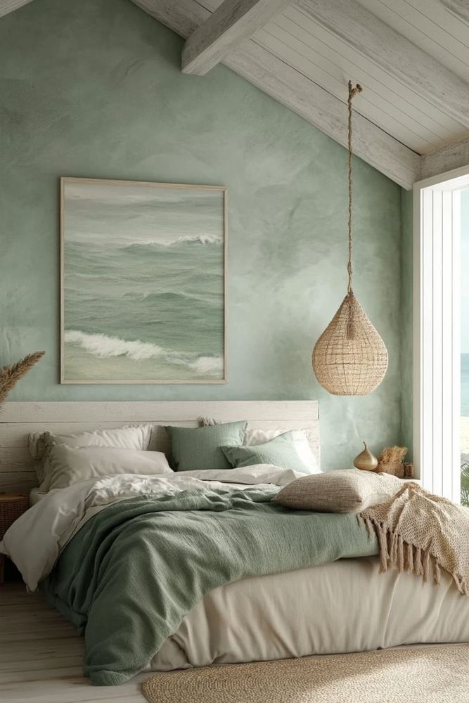
What makes Belli’s bedroom the perfect teen space?
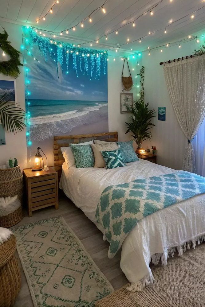
Belli’s room in TSITP is a masterclass in teenage design because it manages to be both dreamy and grounded. It’s not childish, but it’s not trying to be adult either. It exists in that perfect in-between space, much like Belli herself.
The foundation is genius
Neutral walls and simple furniture in white or light wood. This creates a blank canvas that can evolve as she does. You’re not locked into a theme. You’re not stuck with decisions made when she was twelve.
What brings the room to life are the layers of personality. Pastel wall accents in blush, lavender, and mint add warmth without overwhelming. Fairy lights create that nostalgic glow every teenager seems to crave. But it’s the personal touches that matter most. Stacks of well-loved books. Polaroids pinned haphazardly to walls. Seashells and souvenirs from summers past. These aren’t decorator-approved accessories. They’re memory markers.
The brilliance is in the flexibility. Strip away the personal items and you have a sophisticated guest room. Add them back and you have a space that feels like a diary written in decor. That’s the sweet spot for teenage design: rooms that can grow up alongside their inhabitants.
Also Read: 2025’s Hottest Paint Colour for Walls: 60+ Options for Stylish Indian Living
What do the brothers’ rooms reveal about character through design?
The show’s set designers understood something crucial: a person’s room tells you who they are before they open their mouth. Conrad and Jeremiah’s spaces in TSITP are studies in contrast, and they’re both absolutely correct for their characters.
Conrad’s room
Muted tones, darker wood, minimal decoration. It’s not about displaying things; it’s about having space to think. The aesthetic is almost monastic in its restraint. This is someone who needs quiet, who processes internally, who finds too much visual noise exhausting. The design creates a refuge, not a showpiece.
What makes Jeremiah’s room different?
Light floods in. Whites and soft blues dominate. There are playful patterns, open surfaces, an easiness that matches his personality. This is someone comfortable in their own skin, someone who doesn’t need their space to make a statement because they’re busy living in it.
The lesson here is profound: tone changes everything. The same square footage can feel like a cave or a cloud depending on your material choices. Darker woods and deeper colours create intimacy and introspection. Lighter tones and open arrangements invite connection and spontaneity. Neither is better.
They’re just different answers to the question: what do you need your space to do for you?
Also Read: 30+ Partition Design Ideas Between Indian Living and Dining Areas That are Trending in 2025
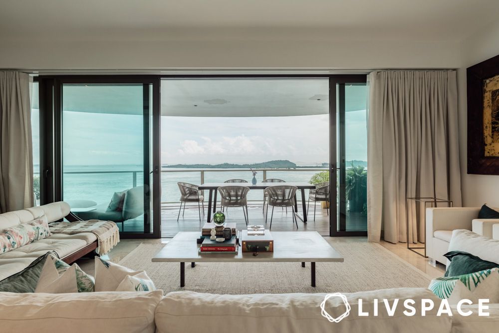
What makes the living room work so well as a gathering space?
The living room is where the magic happens in TSITP. Late-night conversations. Quiet mornings. Family dinners that stretch into evening. Moments of crisis and celebration. The coastal interior design supports all of it by prioritising comfort over formality.
Oversized sofa designs, usually dressed in linen slipcovers, anchor the room. These aren’t precious pieces you’re afraid to sit on. They’re made for sinking into, for conversations that last hours, for falling asleep during film nights. Layered cushions in neutrals and soft stripes add depth. Throws draped over arms invite you to stay a while.
The supporting cast matters too. Woven baskets hold blankets and books. Rustic coffee tables show their age proudly. These pieces have patina, history, character. Nothing looks fresh from the shop floor, and that’s the point.
Lighting design transforms the space from functional to magical. Instead of harsh overhead fixtures, lamps and sconces create pools of warm, golden light. It’s the kind of lighting that makes everyone look good, that softens edges, that turns ordinary evenings into memories.
This is a room designed for people, not photos. And perhaps that’s why it photographs so beautifully.
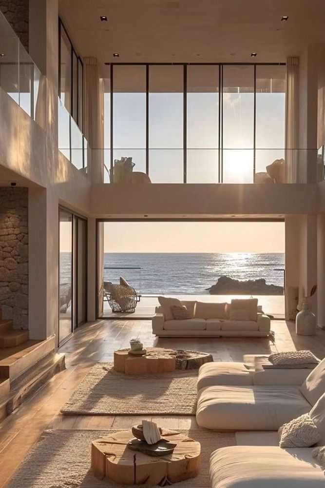
How do you translate outdoor living to real life?
The porch scenes in TSITP are where emotions run highest. First conversations. Last goodbyes. Moments of clarity as the sun sets over the water. The outdoor spaces aren’t afterthoughts; they’re integral to how the story unfolds.
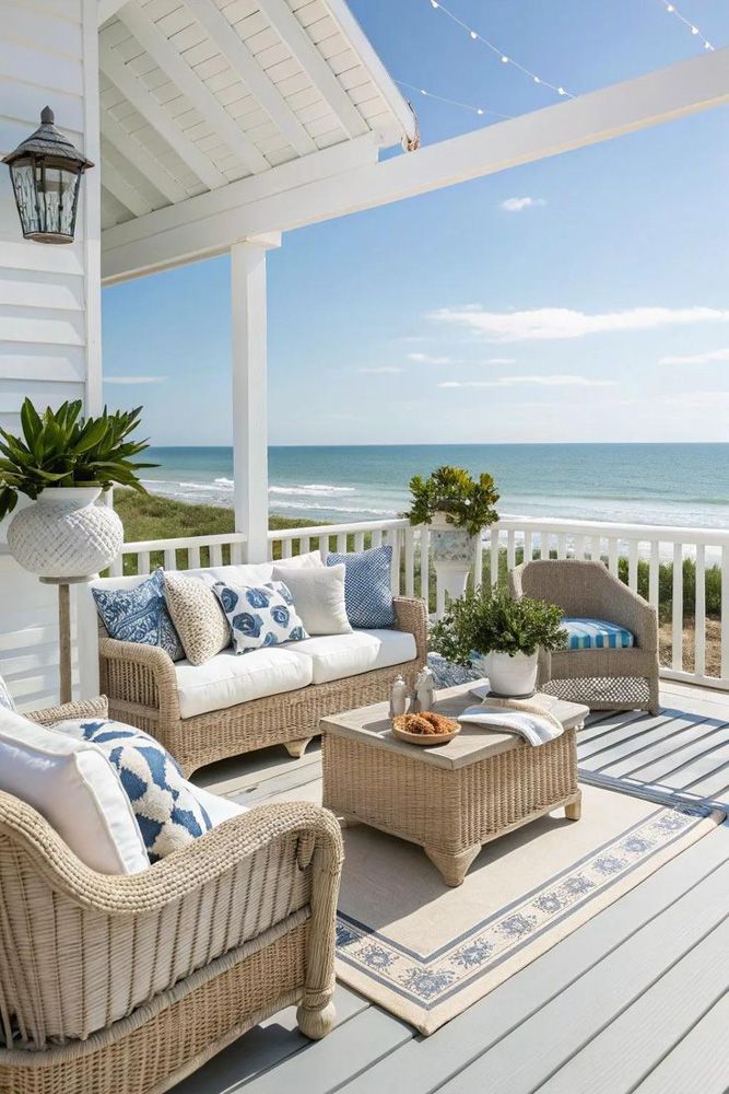
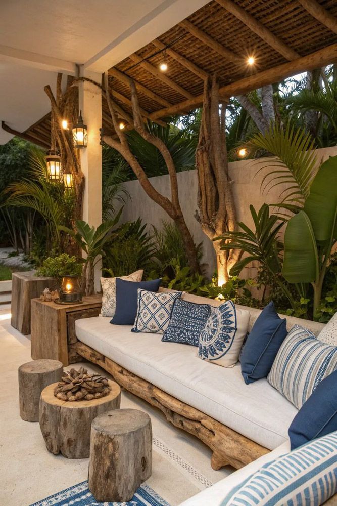
You can feel the sensory details even through the screen. The creak of a rocking chair. The glow of lanterns as dusk settles. The sound of waves providing a constant soundtrack. These spaces blur the line between inside and outside, extending the living area into nature.
The good news? You don’t need beachfront property to capture this feeling. A balcony can become a retreat with the right approach. Choose furniture in wicker or weather-resistant rattan. Add cushions in weathered fabrics. Bring in plants, lots of them. Hanging lanterns or string lights create that essential evening glow. Breezy curtains soften hard edges and add movement.
The key is treating outdoor space as an extension of your home, not an afterthought. It’s not where you store things you don’t know what to do with. It’s where you watch sunsets, have morning coffee, read on Sunday afternoons. Give it the same attention you’d give any room inside, and it becomes somewhere you actually want to be.
Also Read: Your Ultimate Guide to Stunning Decor Ideas for Your Small Balcony
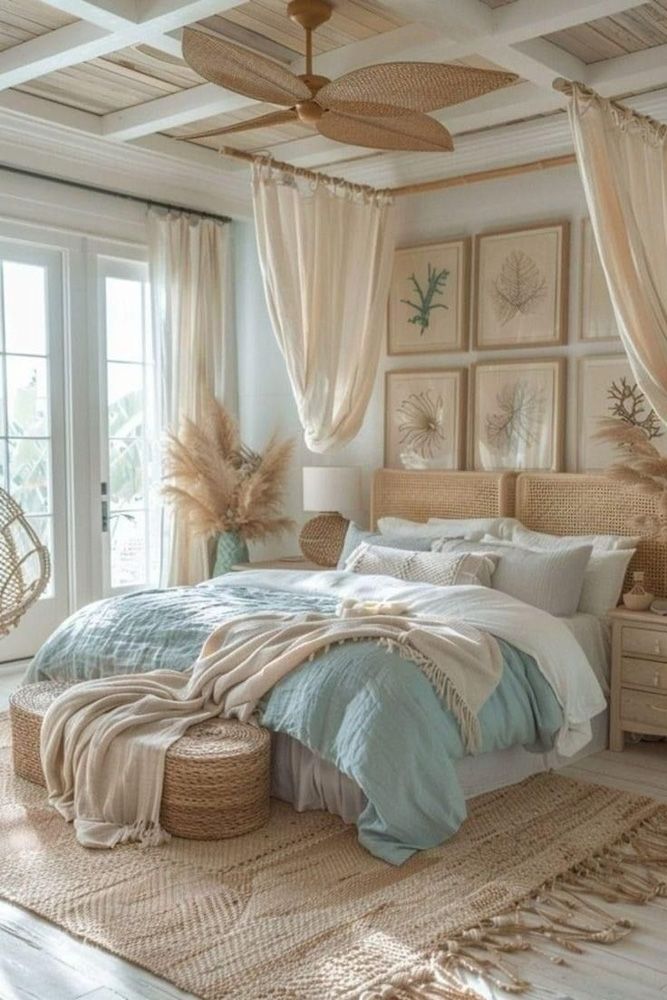
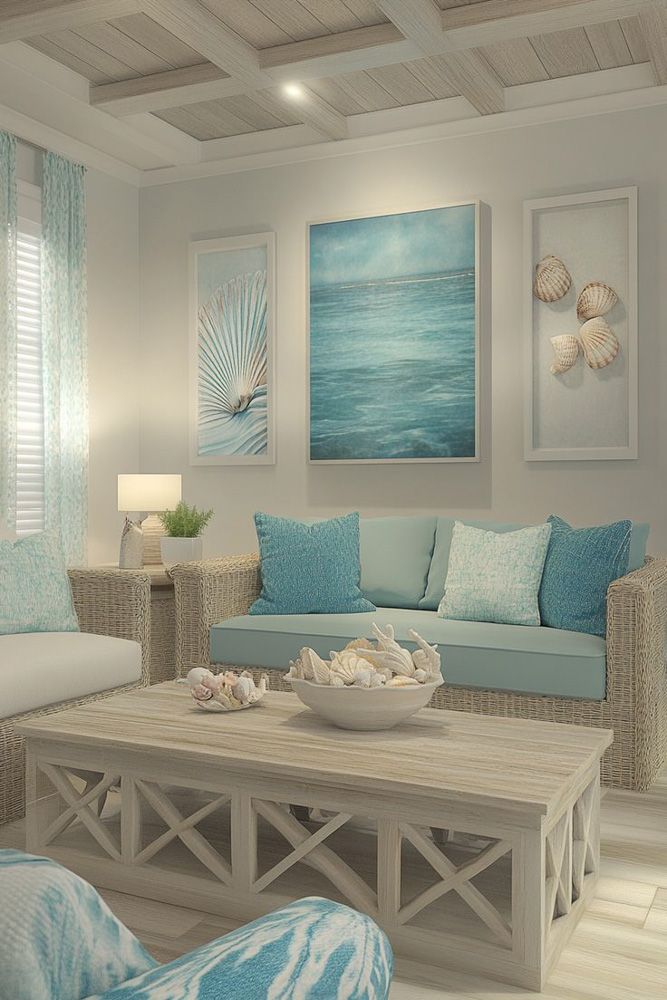
Which colours capture the coastal feeling?
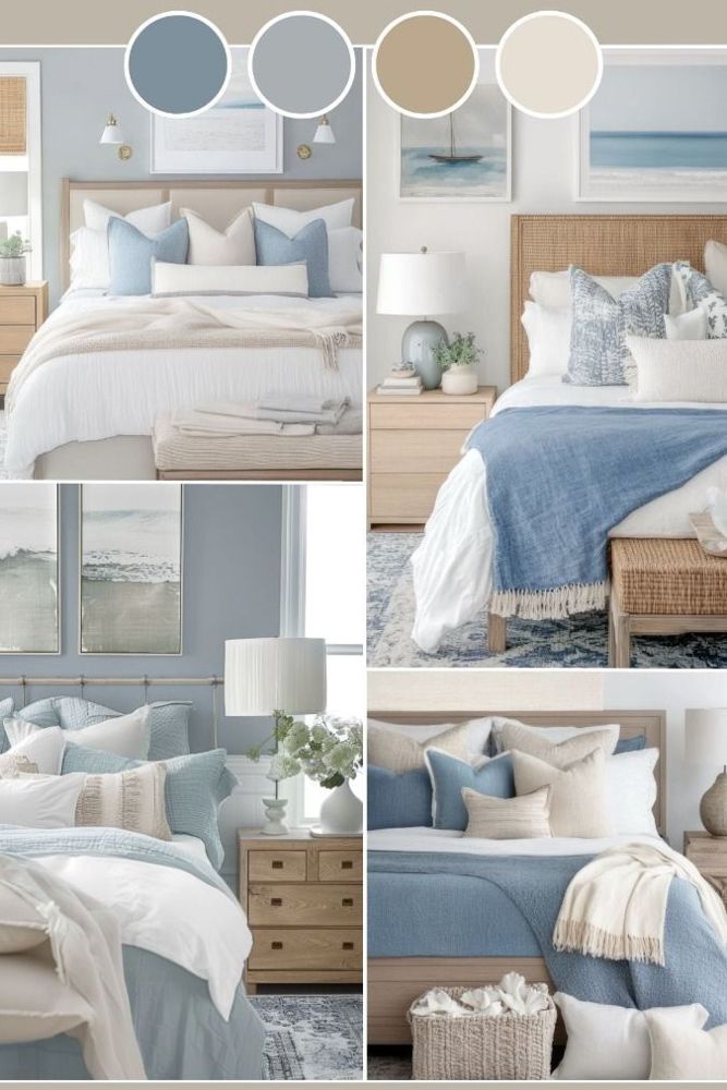
Forget what you think you know about coastal colours. This isn’t about navy stripes and bright white. The Cousins Beach palette in TSITP is far more nuanced, and that’s what makes it work.
Start with seafoam green, the colour of shallow water over sand. It’s calming without being boring, distinctive without demanding attention. Powder blue brings freshness, like early morning before the heat sets in. Sandy beige grounds everything, providing warmth and neutrality.
Driftwood grey is the unsung hero. It’s neither warm nor cool, which means it plays well with everything. Shell white brightens without the harshness of pure white. And here’s where it gets interesting: coral or blush accents. Just a whisper of warmth, like sunrise reflecting off water.
The magic is in the layering. Whitewashed walls provide the base. Seafoam cushions add colour. Driftwood furniture brings texture. Coral accessories provide punctuation. Nothing screams. Everything whispers. The overall effect is cohesive without being matchy, interesting without being busy.
This palette works because it mimics nature. These colours exist together at the beach, shifting with the light, changing through the day. Bringing them indoors creates that same sense of organic harmony.
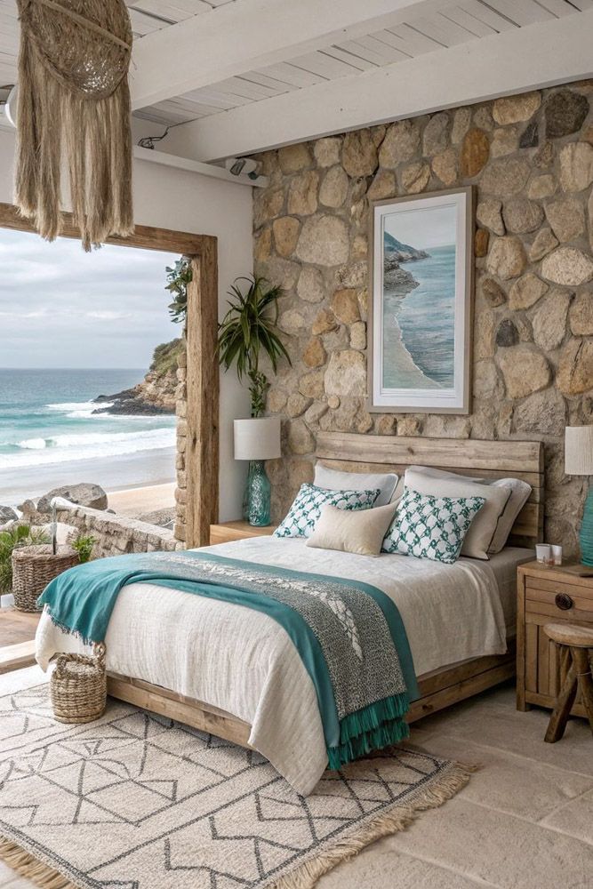
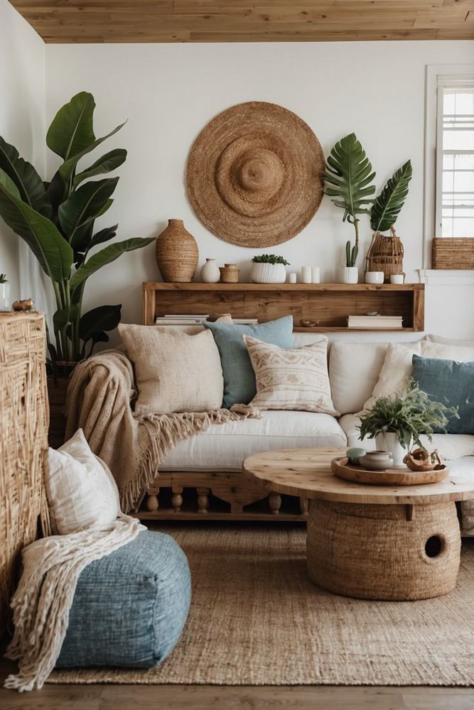
What textures and materials matter?
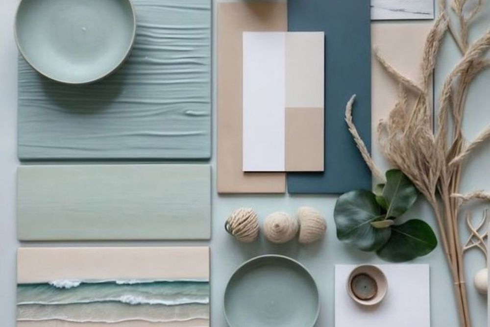
The Cousins Beach house in TSITP understands something fundamental: texture creates richness. You could paint an entire room one colour and it would still feel complex and layered if you varied the materials.
Linen and cotton are foundational. They’re soft, breathable, and they age beautifully. That slightly rumpled look isn’t a flaw; it’s character. Rattan and jute add warmth and visual interest. These materials have inherent texture, patterns woven into their structure.
Rope detailing provides subtle coastal reference without being obvious. Woven elements like baskets and macramé add dimension. Matte ceramics in soft whites or blues feel organic and handmade. Light oak or whitewashed wood brings the weathered, lived-in quality that makes spaces feel established rather than new.
The layering is crucial. A linen sofa against a jute rug. Ceramic vases on a wood table. Rattan lamps casting light through woven shades. Each material has its own texture, its own way of catching light, its own tactile quality. Together, they create depth and interest without requiring pattern or strong colour.
This is how you make minimalism feel warm. Strip away the decoration, but layer the materials, and you get spaces that feel rich and inviting rather than cold and sparse.
How do you make this work in your home?
The TSITP coastal interior design isn’t about location. It’s about capturing a feeling: ease, warmth, memory, comfort. You can achieve this coastal interior design in a flat in Mumbai as easily as in a beach house in Goa.
Start by editing. Coastal interior design works because it’s uncluttered. Clear surfaces. Open space. Room to breathe. Then introduce natural materials deliberately. Swap synthetic curtains for linen. Replace a modern coffee table with reclaimed wood. Add a jute rug.
Bring in the colour palette gradually. Cushions are an easy place to start. Throws in seafoam or powder blue. Eventually, consider repainting walls in shell white or sandy beige. The transformation doesn’t happen overnight, and it shouldn’t. The best spaces evolve.
Layer in personal touches. Family photos in simple frames. Vintage finds from markets. Handmade ceramics. Books you’ve actually read. These details are what make a house feel like home rather than a showroom.
Pay attention to lighting. Harsh overhead fixtures destroy the mood. Invest in lamps that create warm, localised pools of light. Consider dimmer switches. The right lighting transforms everything.
Most importantly, prioritise comfort over perfection. The Cousins Beach house works because it looks lived-in, loved, real. Cushions are squashed. Throws are rumpled. Books are stacked rather than lined up. This isn’t mess; it’s life. And life is what makes a house worth coming home to.
How can Livspace help you?
- 100,000+ happy homes designed with expertise and trust
- Operational in 100+ cities across India for seamless service
- 3,500+ designers and professionals bringing your dream home to life
- Designed to last, our products come with a lifetime warranty
At Livspace, we understand your home is a reflection of yourself. Our team of expert designers will draw up beautiful renders to help you visualise how your dream home will look.
Looking for tailor-made costs for your home? Hit our Cost Calculator to jump into your financial planning.
Need inspiration beyond your current Pinterest spiral? Check out Design Ideas for professionally curated looks that actually translate to Indian homes and lifestyles.
Want to see what real people think? We have designed over 75,000+ homes. Browse through Livspace reviews from customers and hear what they have to say about us.
Ready to take the next step? Find an interior designer near you, and let’s get started. Click here for directions.


