
In This Article
- Pastel colour wall paints for your living room
- Pastel colour wall paints for your bedroom
- Pastel colour wall paints for your kitchen
- Pastel colour wall paints for your bathroom
- Pastel colour wall paints for your home office
- Pastel colour wall paints for your dining room
- Pastel colour wall paints for your balcony
- Pastel colour wall paints for your kids’ room
- Pastel colour wall paints for your pooja room
- Pastel colour wall paints for your bar unit
- How can Livspace help you?
While pastel colour wall paints have been used sparingly in the yesteryears, they are currently having their moment. The marketing whizz at Barbie took it upon themselves to colour the world pink in 2023 and made us fall in love with all things pastel. The trend hasn’t stopped since and more people are embracing the funky infusion of pastel colours for home. Think dreamy cupcakes and sugary hues that make us ready to splash our walls with pastels and scale our aesthetics game to the next level.
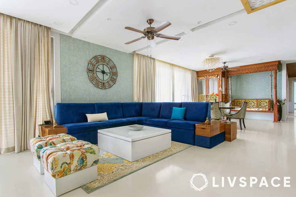
Pastel colour wall paints for your living room
Colour #1: Pastel blue with white
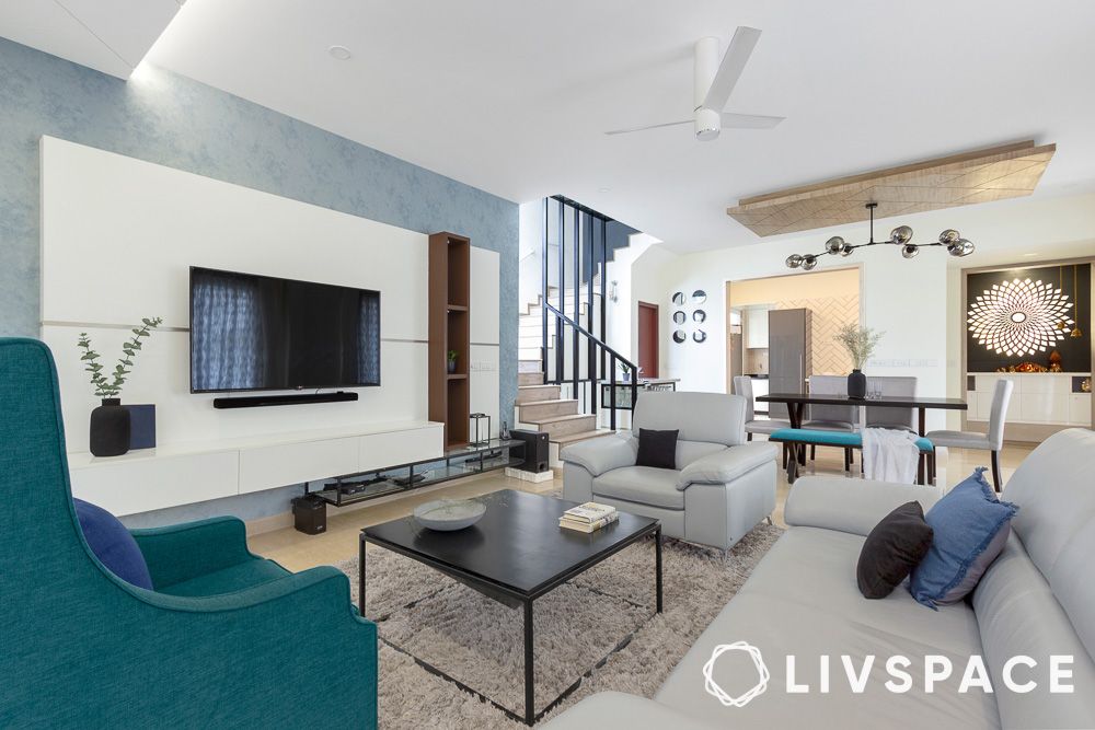
The light pastel blue alongside white brings an airy feeling into this living room, making it an inviting space for our guests. This pastel colour for the living room complements the contemporary style. Pastel blue introduces a calming atmosphere, while the crispness of white enhances the feeling of openness and purity.
Colour #2: Pastel sage green
The pastel sage green colour of the living room holds whispers of tranquillity, nature, freshness and harmony. Balancing it with white and throwing in wooden elements bring in a calming energy, making it an easy choice for wall colour. The pastel sage green effortlessly becomes the focal point, offering not just a canvas of pastel colour walls but an immersive experience.
Also Read: An Epitome of Muted Luxury: Unveiling The Subtle Beauty of This Elegant 4BHK In Gurgaon
Colour #3: Pastel pink
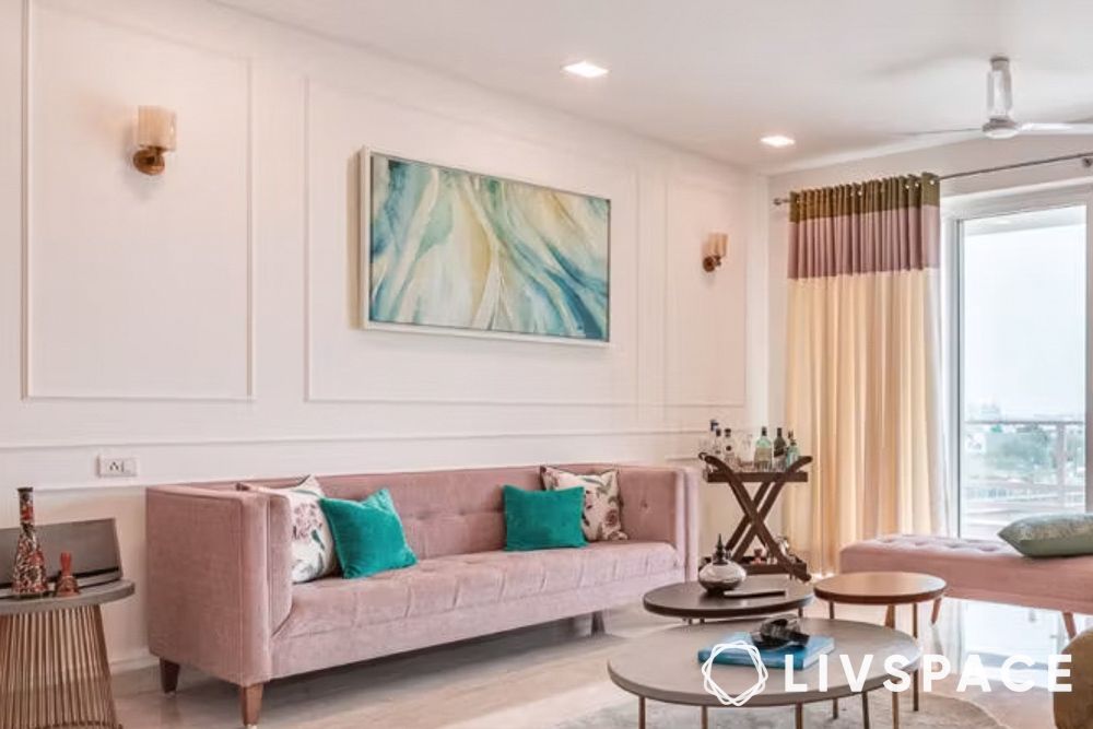
Walk into a world of sugary goodness and decadent cupcakes with pastel pink. This is a great choice of colour for the living room that screams bold and confident, while the muted tone brings in a balance of calm and serene. Throw in pops of green furnishings and you’ve got a winner. Bonus points for you if you love living in the world of Barbie!
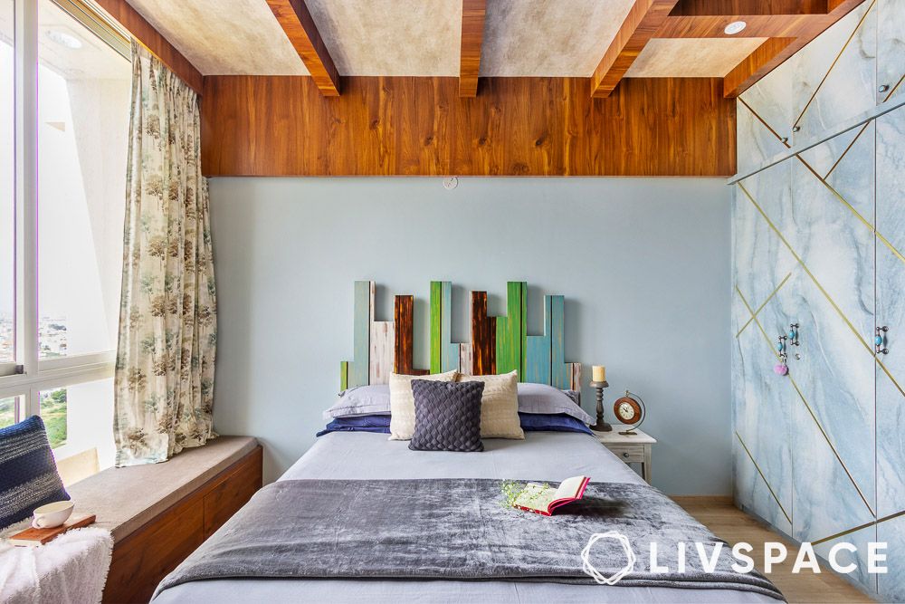
Pastel colour wall paints for your bedroom
Colour #1: Pastel mint green
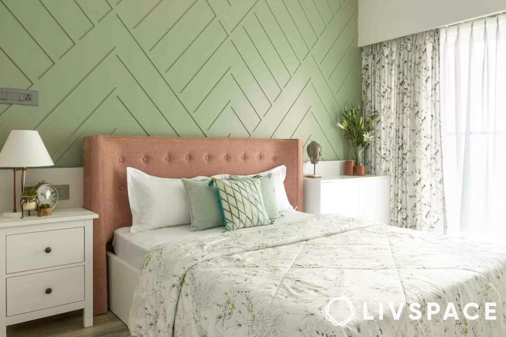
The mint green pastel wall colour paint reminds us of the invigorating quality of mint leaves. If you’re looking for decor and inspiration, why not pair the green with white or neutral tones? They can be the epitome of sophistication and elegance, turning your bedroom into a royal getaway. And our cosy bedroom should be nothing short of that, right?
Colour #2: Pastel blue
The pastel blue colour wall paint is renowned for its calming effect. It’s an ideal choice for bedrooms as this is our space to relax and unwind. It also visually expands a space, creating a sense of openness and spaciousness. What a world of difference pastel wall colours can make!
Colour #3: Pastel purple
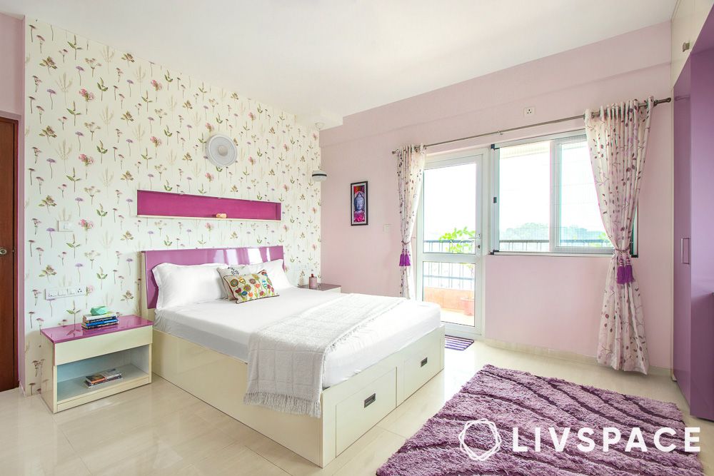
Pastel purple is a subtle and refined hue that creates an elegant ambience in the bedroom. Evoking a sense of romance and sweetness, pastel purple lends a dreamy quality to the bedroom, fostering an atmosphere of relaxation and healing. It also effortlessly blends modernity with a youthful playfulness, offering a chic and unique palette for a stylish bedroom sanctuary in the pages of home design.
Pastel colour wall paints for your kitchen
Colour #1: Pastel lilac
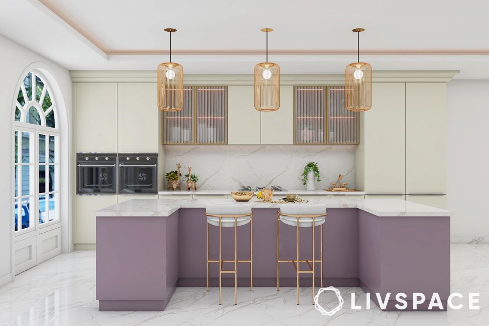
We love the pastel lilac wall colour paint for its touch of royal charm. When paired with off-white paint and sleek golden furnishings, we can’t help but be drawn to its charisma. Paint your kitchen lilac and whisk your guests away on a culinary journey. You can also liven up your kitchen cabinets with soft tones and let there never be a grey moment while cooking!
Colour #2: Pastel peach
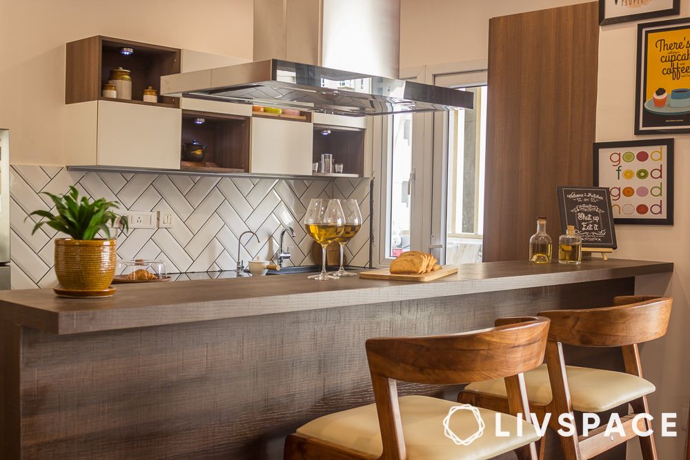
The peach pastel colour wall paint reminds us of a cosy kitchen tucked away in an oceanside villa in Spain. Get ready to entertain a crowd with pots of paella and glasses of riesling as staying away from this kitchen will be next to impossible. Who needs a flight ticket when you have pastel-coloured walls?
Also Read: 10 Newest Kitchen Design Trends to Look Out for in 2024
Pastel colour wall paints for your bathroom
Colour #1: Pastel peach
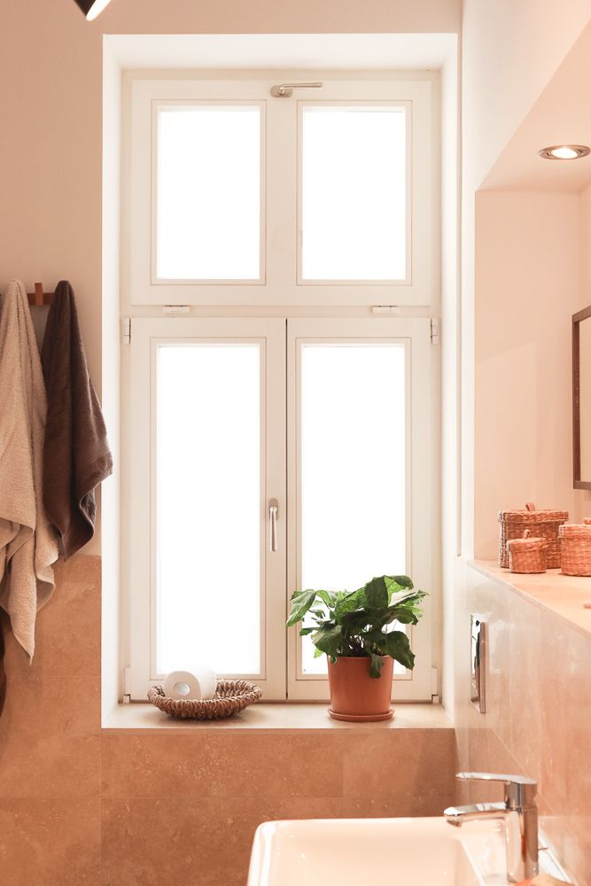
This one is for the books. Bathrooms and pastel peach colour wall paints are a match made in heaven. The simple touch of peach provides a spa-like ambience and invokes a sense of calm and rejuvenation. Add in wicker baskets and greenery and wash your worries away.
Colour #2: Pastel yellow
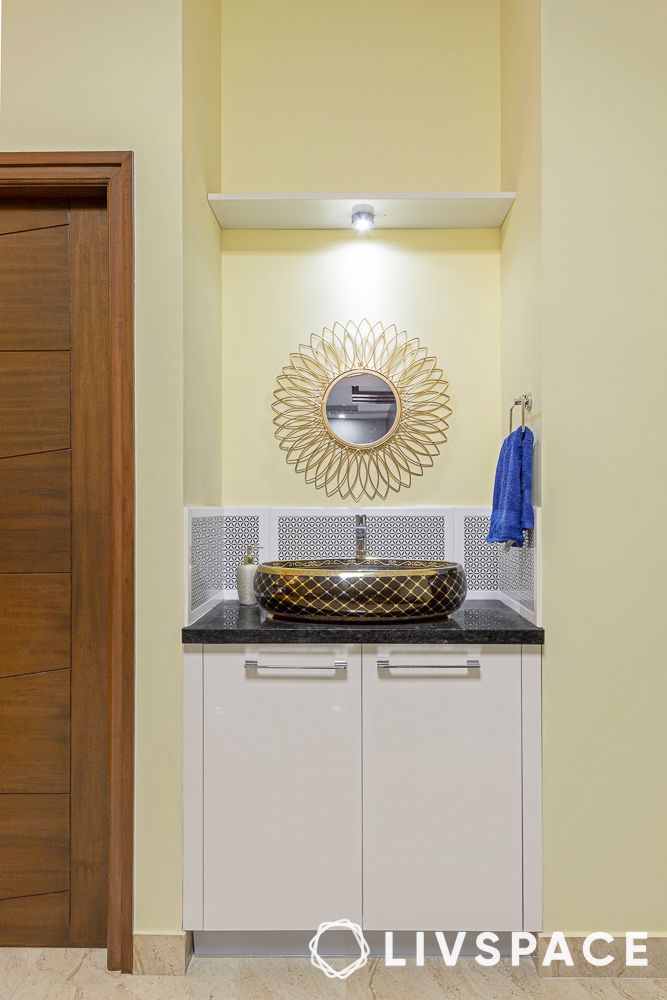
Pastel colours flow well outside the bathroom area into the sink space as well. This soft and sunny hue of pastel yellow brings a burst of positivity and energy to the space outside the bathroom, creating a cheerful ambience that transforms daily rituals into moments of joy. Elevating the sink aesthetic with a perfect balance of sophistication and vibrancy, pastel yellow wall colour paint proves to be a chic and timeless choice for a stylish haven.
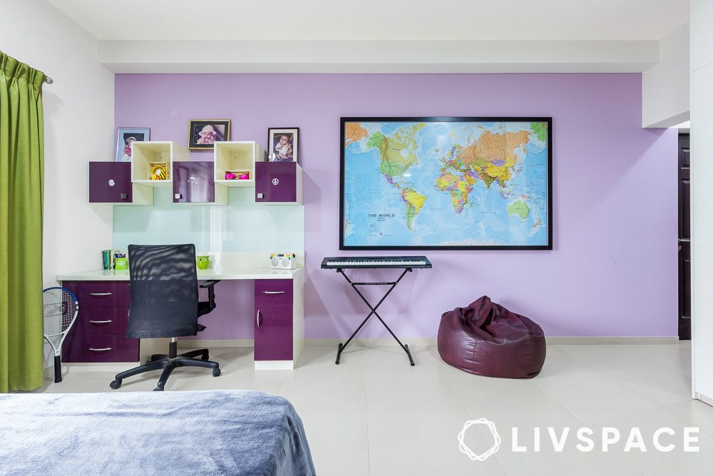
Pastel colour wall paints for your home office
Colour #1: Pastel beige pink
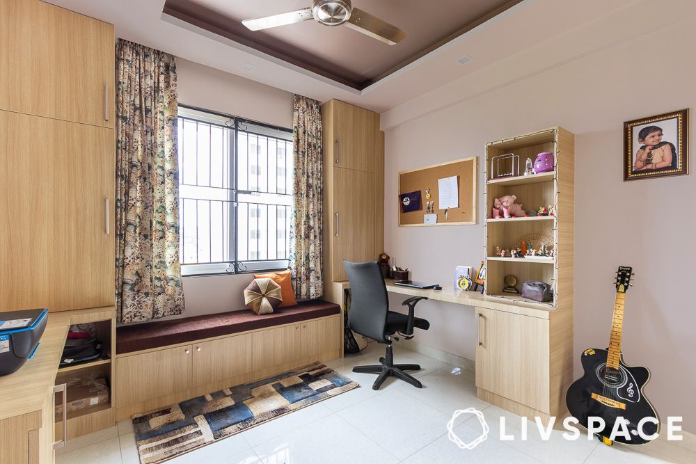
The pastel shade of beige pink is the perfect match for your workspace because of its calm and productive energy. This wall colour paint also infuses the home office with gentle and calming energy, making it an ideal choice for those seeking focus and tranquillity amidst the demands of the workday.
Colour #2: Pastel green
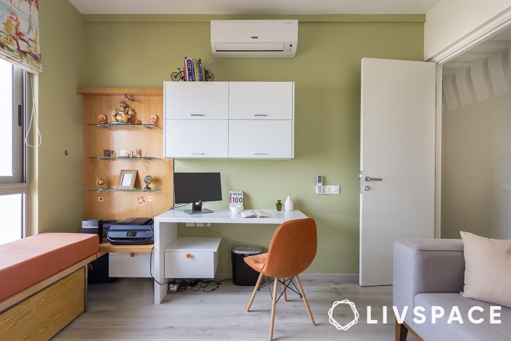
The gentle shade of pastel green not only adds a touch of modernity to your home office but also infuses the space with a sense of renewal and connection to the outdoors. With pastel green as your backdrop, your home office becomes a stylish sanctuary where creativity and efficiency thrive in perfect harmony.
Colour #3: Pastel purple
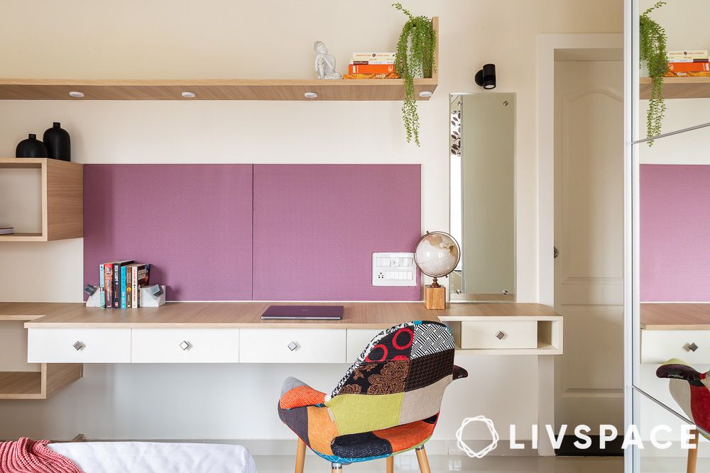
Pastel purple delicately balances a sense of calm with an undertone of creativity, making it an ideal choice for those seeking an elegant and productive atmosphere. This wall colour paint is a chic and timeless choice, turning your home office into a sophisticated place of work.
Pastel colour wall paints for your dining room
Colour #1: Pastel yellow with grey
The soft touch of pastel yellow and the neutrality of the grey speak of elegance and charm. We love how the lighting of the room provides a rustic look of a cosy restaurant. Whether you’re after a romantic dinner or an intimate get-together, this look is the perfect vibe for your dining room.
Colour #2: Pastel green
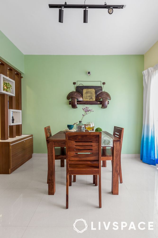
With pastel green wall colour paint as the backdrop for wooden furnishing, we can’t help but be drawn into this inviting space. The pictured dining room is a perfect example of chic meets traditional and we’re here for it!
Also Read: 30 Best Dining Room Decoration Ideas That Look Posh and Luxe
Pastel colour wall paints for your balcony
Colour #1: Pastel yellow
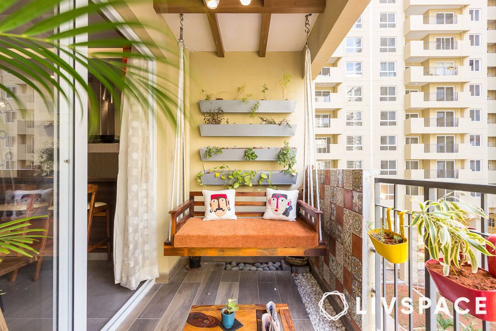
Ah, to stare into the blue skies from your cosy balcony for a moment of serenity, this is what a window of peace looks like. We love the muted pastel yellow wall colour paint as it serves as the perfect backdrop for the quirky decor and plants that fill our balconies.
Pastel colour wall paints for your kids’ room
Colour #1: Pastel blue
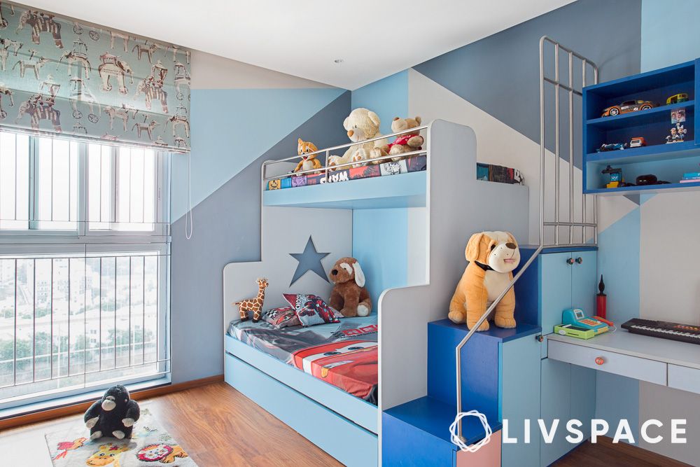
Transform your child’s room into a whimsical space that fuels imagination and creativity with blue pastel colour walls. Since children are high in energy, the pastel blue wall colour paint helps to channel that energy and provides wings to their imagination.
Colour #2: Pastel purple
Pastel purple is another colour that brings a combination of calm and whimsy into your child’s room. These pastel colour walls are a great choice for a neutral palette that doesn’t confine your child’s preferences and imagination.
Pastel colour wall paints for your pooja room
Colour #1: Pastel orange
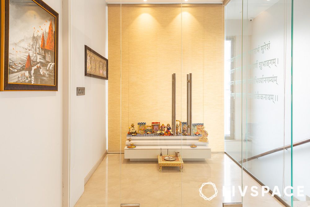
Elevate your pooja room with the vibrant and sacred energy of pastel orange. In this spiritual space, pastel orange exudes warmth and positivity, creating an ambience that accentuates devotion and serenity. With its soft and inviting tones, pastel orange becomes a symbolic and stylish choice, turning the pooja room into a sacred retreat where spirituality meets timeless aesthetics.
Pastel colour wall paints for your bar unit
Colour #1: Pastel brown
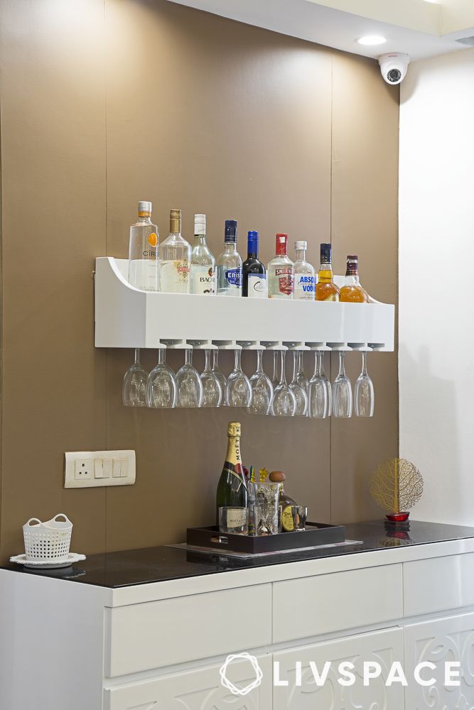
We love the pastel brown for the charming bar unit. This chic colour palette transforms your bar counter into a stylish unit where the calming pastel brown sets the stage for jovial gatherings and the adjacent white walls infuse an aura of luxury. The result is a timeless and sophisticated bar space that effortlessly blends contemporary design with a touch of lavish allure.
How can Livspace help you?
We hope you have been inspired by these beautiful pastel colours! Our team of seasoned and creative designers is ready to collaborate with you to bring your vision to life.
- Our expert team can custom design your dream home with curated render designs and expert advice
- We have delivered over 75,000+ happy homes
- We promise high-quality and durable materials
If you want beautiful interiors for your home, then look no further. Book an online consultation with Livspace today. To know how our customers feel about working with us, check out these Livspace reviews for more details!
Disclaimer: All contents of the story are specific to the time of publication. Mentions of costs, budget, materials, finishes, and products from the Livspace catalogue can vary with reference to current rates. Talk to our designer for more details on pricing and availability.


