
In This Article
- Colour forecast for 2026: Top 3 feature wall trends for Indian homes
- Some wall colour combinations for your living room from Nippon
- Some bonus wall colour combination ideas by Livspace
- Things to consider before choosing hall colour designs
- What are the different types of paints?
- What are the different types of finishes?
- How can Livspace help you?
Considering your living room is the first part of your house that guests will see, the wall colour combination for living room needs to be perfect to set the tone for the rest of your space. To help you along, we’re going to look at some amazing wall colour combination for halls ideas that will make visitors do a double-take!
We’ve also brought in the experts and consolidated Nippon Paint’s expert-recommended mood boards to help you pick among some of the ideal alternative wall colour combinations for your living room. Nippon Paint’s Colour Vision is based on human emotions and thought processes and hence ties in with the homeowner’s design preferences.
Curated by Nippon Paint India’s President, Mahesh S. Anand, and colour researcher, Dr Kaustav Sen Gupta, this list of 8 such palettes proves that a wall colour combination is all about life—and vice versa of course. Along with these, we’ve also recommended 25+ bonus wall colour combinations so you never run out of options!
Colour forecast for 2026: Top 3 feature wall trends for Indian homes
As we step into late 2025, Indian interior trends are embracing warmth, cultural depth, and serene escapes inspired by our rich heritage and global influences. For feature walls in living rooms, experts predict a shift toward earthy, immersive hues that blend tradition with contemporary vibes. Here are the top 3 colour trends to watch for 2025/2026:
- Deep emerald green: This lush, jewel-toned green draws from India’s verdant landscapes and symbolises growth and prosperity. Perfect for accent walls, it pairs beautifully with gold accents or neutral furniture for a luxurious, nature-inspired focal point in compact urban homes.
- Warm terracotta (Dusty sienna or brick red): Evoking Rajasthan’s sun-baked earth and festive motifs, terracotta brings cosy, grounded energy. Use it on a single wall to add rustic charm without overwhelming smaller spaces—ideal for Vastu-compliant designs that promote stability.
- Inky navy blue (or Midnight blue): A sophisticated nod to twilight skies over the Arabian Sea, this deep blue trend offers calming depth. Designers recommend it for media walls, layered with subtle metallics for a regal touch that enhances natural light in monsoon-prone Indian climates.
These forecasts highlight a move toward bold yet balanced palettes that foster well-being. Incorporate them into your living room for a space that’s both personal and on-trend.
Some wall colour combinations for your living room from Nippon
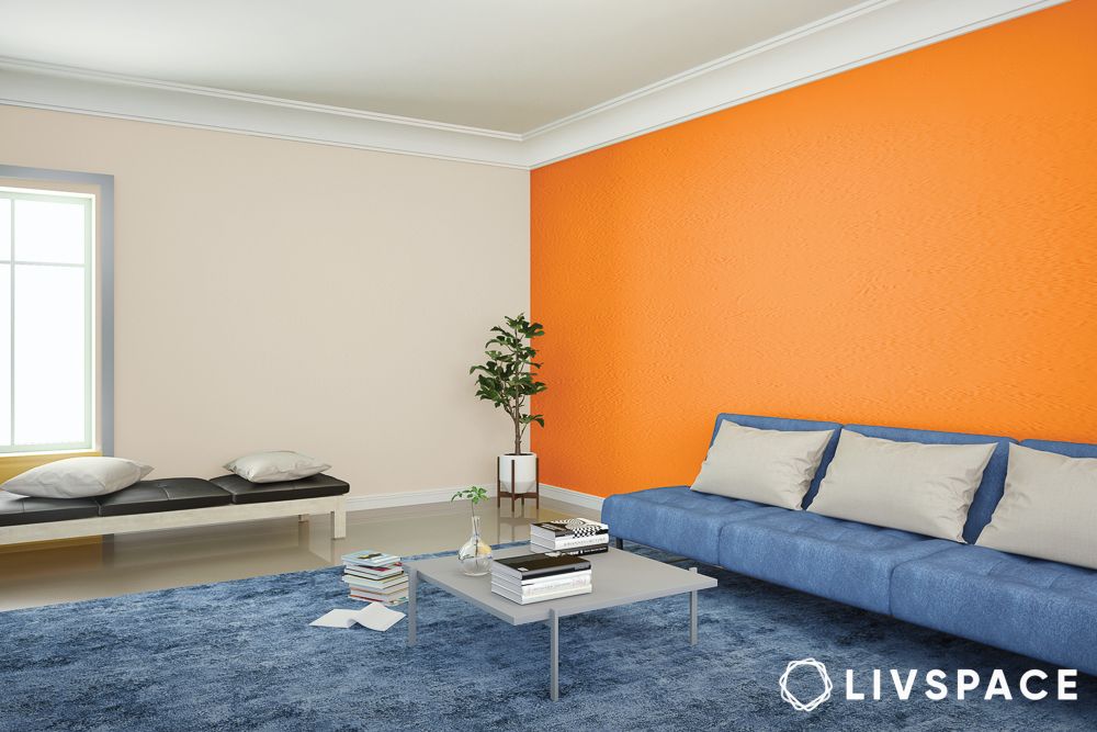
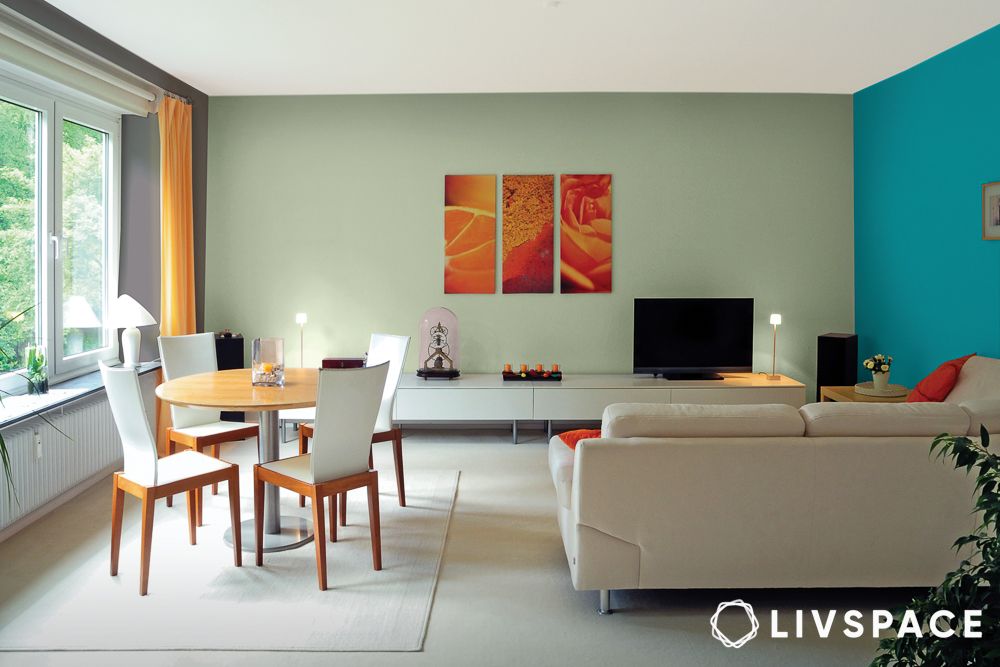
#1: How to create a vibrant feature wall with orange and blue?
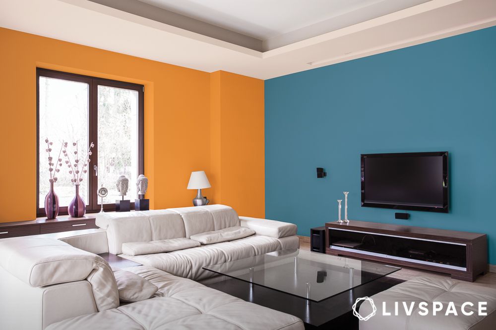
“Colours are omnipresent in our daily lives as a fundamental aspect of human perception. Individual human cognition, experience and behaviour as social swarm influence the colour tendency.”
– Dr Kaustav Sen Gupta, colour expert
Therefore, bright colour combinations for walls, like orange and blue, represent mental force. Thus, Qurious (a Nippon colour palette), as the name suggests, celebrates the freedom to ask questions, get surprised and learn more.
Since interior design is all about personalising your homes, the colour combination that you pick for walls will give character to your space. When you want to consider how an interior colour combination can be a suitable reflection of your personality, this guide on wall colour combinations will come in handy.
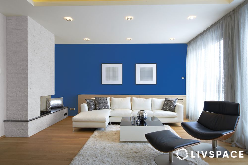
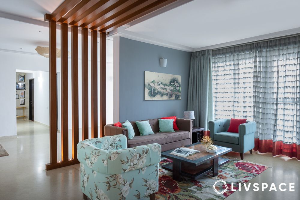
#2: What to do with deep blue and neutrals for a serene feature wall?
We’re here to celebrate the power of oneself with Flawsome, another Nippon colour palette. With shades ranging from deep purples and blues to pastel greens and yellows, this particular colour combination for walls encourages DIY experiments. Simultaneously, it also symbolises personal growth and helps in creating a calming aura in the room. So, if this wall colour combination resonates with you, be sure to get as creative as possible.
Apart from the living rooms, we recommend you play with this wall colour combination even in your bedrooms and home offices. The factors that make this wall paint colour combination suitable for living rooms also make it well-suited for other rooms.
#3: Is grey with deep blue a good two colour combination for living room walls?
The focus of these living room colour ideas is the celebration of all aspects of life, with heart-warming stories woven into each category. Purpassion (a Nippon colour palette) is ideal for those who like to end their day in a calm environment. A cool-toned colour combination for walls like this one creates the perfect atmosphere to relax in with a warm cup of tea. The gorgeous shades of blue and grey signify passion for purpose as well as peace.
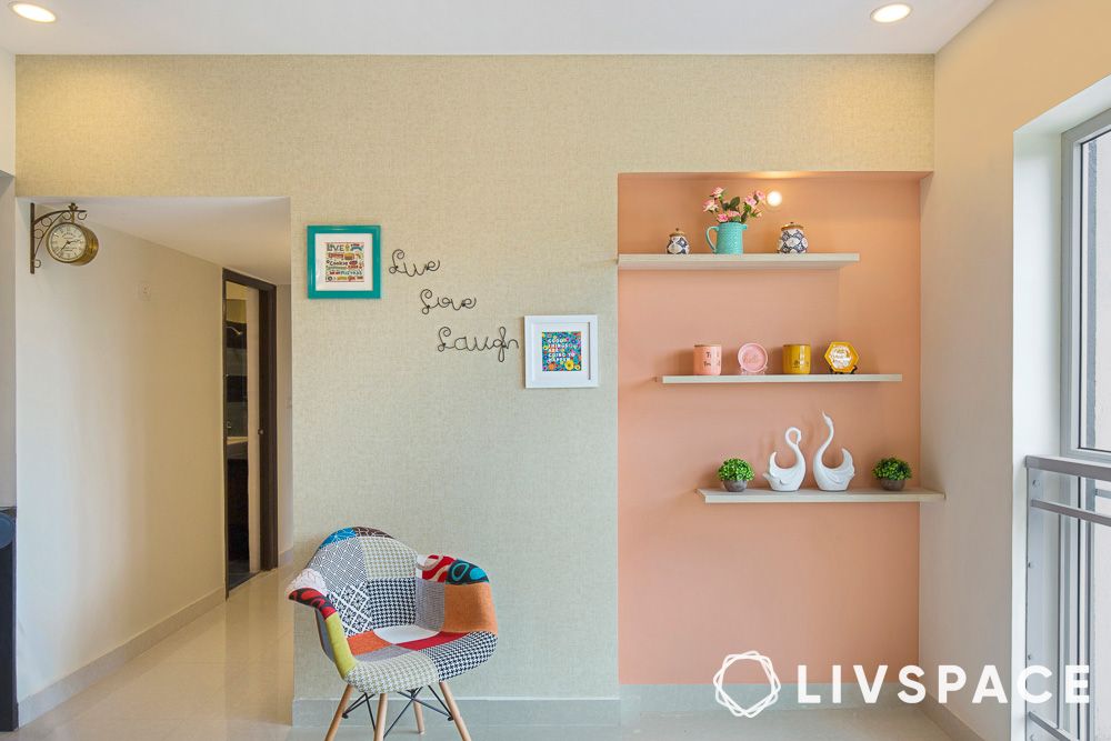
#4: Are trendy pastel shades for living room walls?
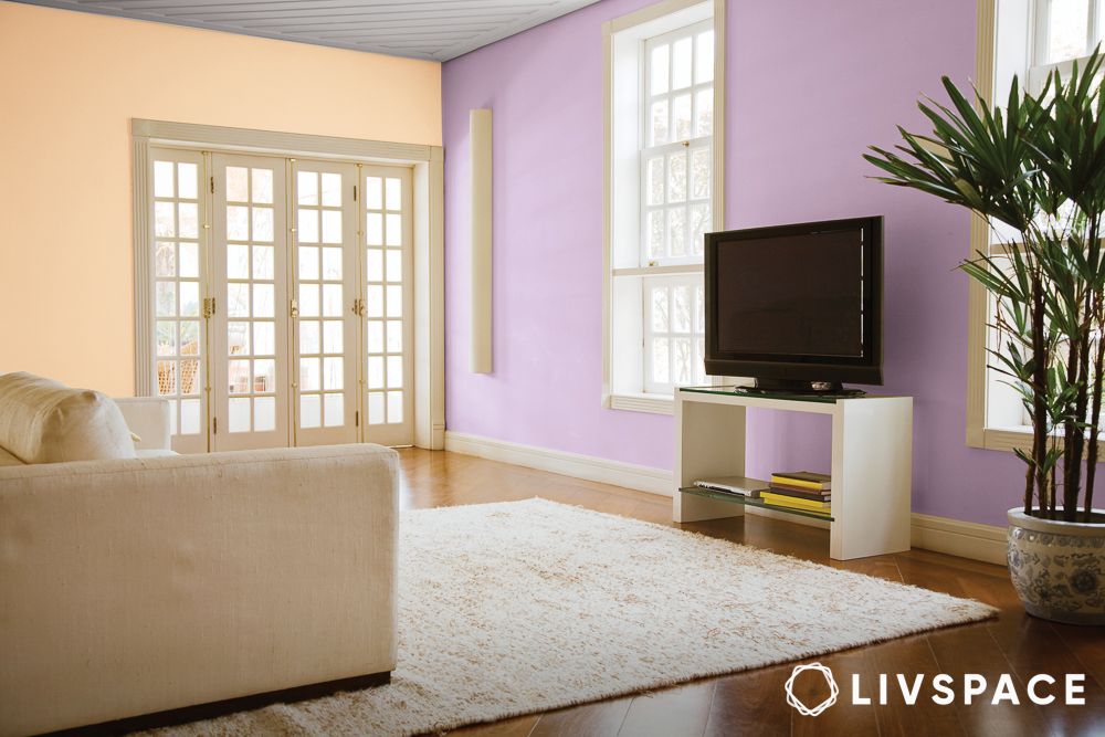
Inspired by creativity, this wall colour combination for the living room is for anyone who seeks inspiration from their surroundings. The pastel theme makes for an overall muted canvas while adding a bit of colour. In addition, there are many more arresting pastel shades in Nippon’s collection to choose from. As seen above, pastel purple and orange make for a bold yet calm wall colour combination.
“Color Vision is a well-researched and detailed indigenous colour forecast celebrating the zonal and youth colour tendencies of this nation. The Nippon Paint Color Vision forecast website is explorative and free to access. It is also well segmented so that the designers, architects, design students and design enthusiasts can refer to the stories for their colour inspirations and designing.”
-Mahesh S. Anand, President, Nippon Paint India
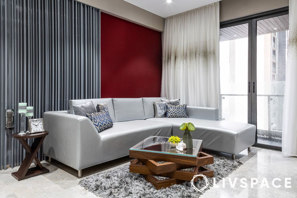
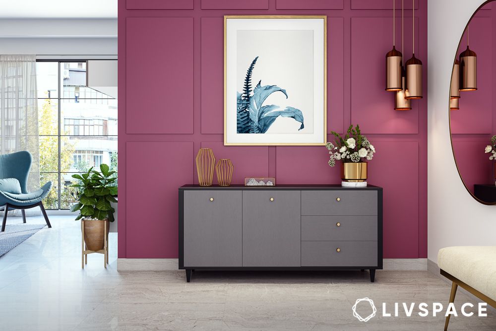
#5: Dark burgundy and white wall colour combination for hall: Is it a good idea?
When you want to keep your living room colour combination natural, keep it neutral. Neutrals from N.O.W. (a Nippon colour palette) are always a timeless way to express oneself. Moreover, a neutral wall colour combination always stands the test of time. Opt for white and beige tones for that good old classic white-on-white look.
Moreover, nowadays, a lot of people are choosing boho-Scandinavian interiors and this wall colour combination is perfect for that look. The latest trends can easily become a part of your existing walls if you choose such evergreen colour combinations for your hall or bedroom interiors.
Also Read: 5+ Colour Combinations for a Stunning Living Room
#6: How to pair classic blue and yellow for a feature wall?
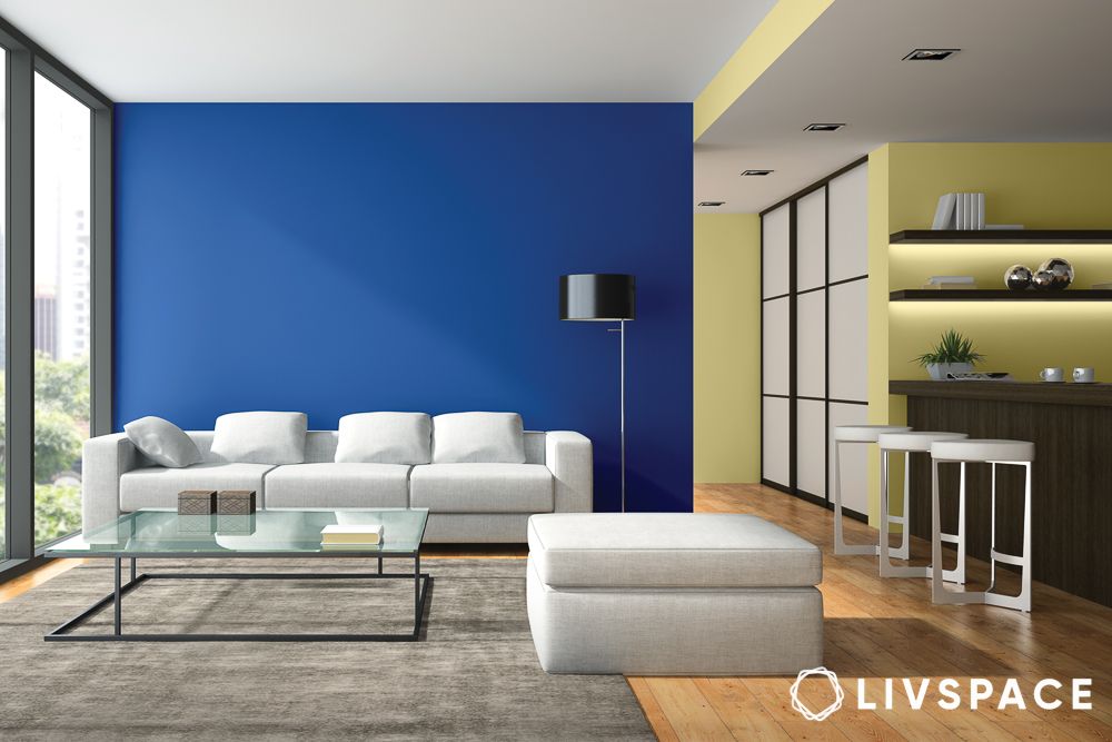
Celebrating love and positive interactions all around is LO+VE (a Nippon colour palette). It is a popularly chosen wall colour combination for halls by paint experts who say that the love of well-being will define homes. This wall colour combination of blue and yellow promotes health, comfort and positive vibes. The yellow brings out the pops of blue. Additionally, paired with a white sofa, this colour combination for walls looks just right in this setup.
#7: What to do with orange and neutrals for an energetic feature wall?
Inspired by Kolam, a south Indian tradition of drawing colourful designs with powder, this wall colour combination stays true to inspiration with rich reds and blazing oranges. Blendentity (a Nippon colour palette) is a theme conceived for those who respect individuality in a group and this colour combination for your walls is a good example.
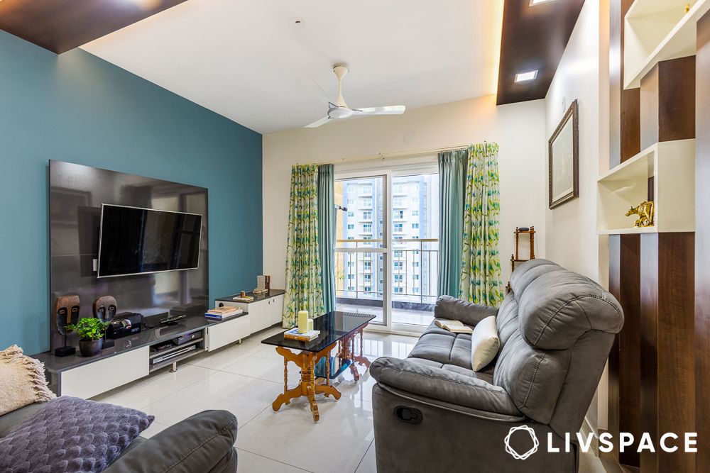
#8: Are shades of green and blue a good wall colour combination?
Soul Code (a Nippon colour palette) paints a picture of self-discovery. Comprising various shades of green, the hall wall colour combinations in this palette are endless. The vital question, “Who am I?”, serves as the first step to understanding one’s traditions. From turquoise to teal, colour combinations made up of shades of green can energise your room.
Nippon’s paint experts have captured everyday life in their suggested colour combinations for walls by conducting workshops and hosting discussion groups with people from various spheres, from musicians to entrepreneurs. If you are trying to stay on top of your wall colour combination game, while being true to you, this Nippon colour combination list will help you be a trendsetter in the design world.
“We sincerely hope that this open-to-access colour forecast will be widely used by architects, interior designers, product designers, visual artists and students for their inspiration and reference.”
– Dr Kaustav Sen Gupta, Colour Researcher, NIFT
Some bonus wall colour combination ideas by Livspace
#1: How to use purple and neutrals for a royal feature wall?
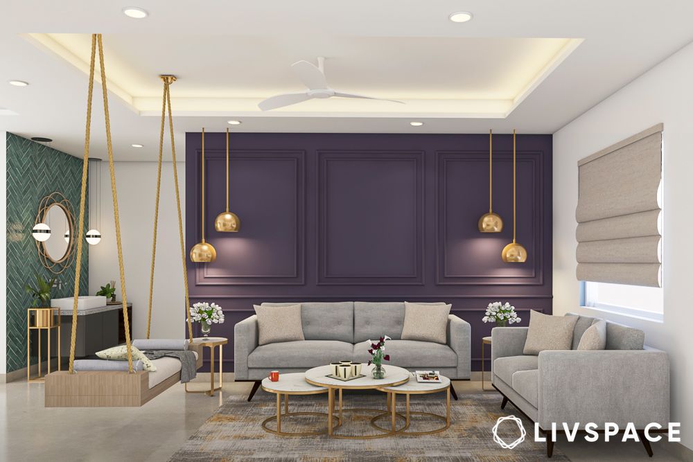
When we look back at our rich heritage, we realise that our history had much more complex beauty, unlike today’s simpler lifestyle. It is, however, never too difficult to fall back in love with these complex wall colours and reinvent them for our modern spaces.
The deep purple colour, for example, exudes a plush, royal vibe that you can pair with other light colours to maintain the brightness in your living room. Add some golden wall accents to this wall colour combination for the living room and complete the rich look.
Also Read: Colour Palette for Home: Single or Multiple Shades?
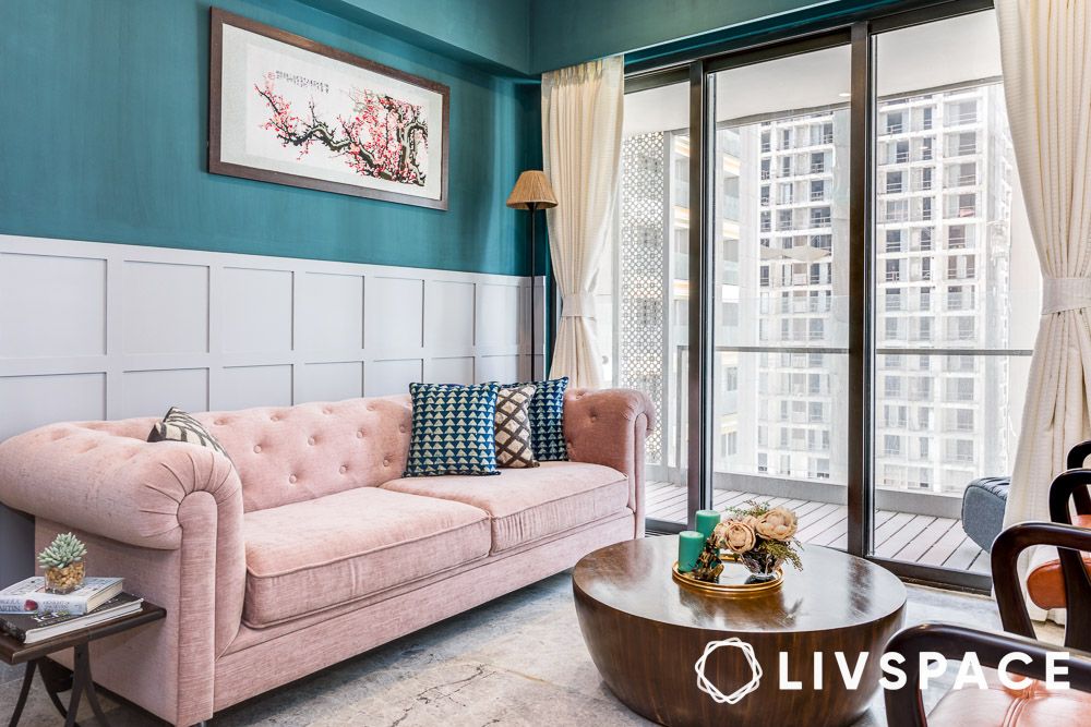
#2: What to do with green and cream for a welcoming feature wall?
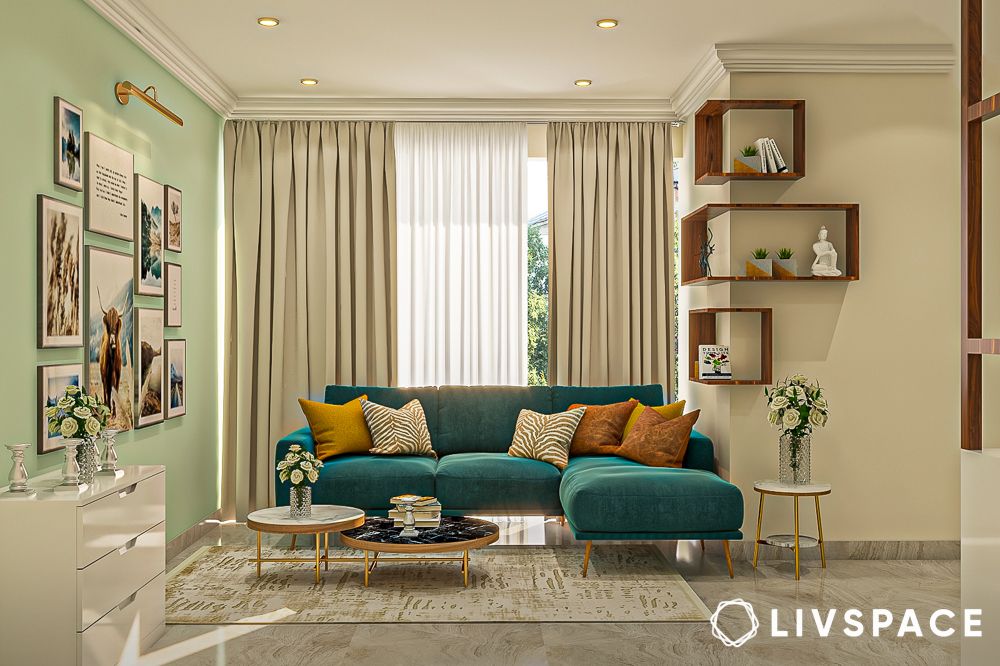
We don’t need a forecast to tell us that most people want their houses to feel more like home. Warm and soft wall colour combinations help in achieving this. This is the reason why most homeowners have been keen on using warm wall colour combinations for their living rooms.
#3: Are aqua and white a good two colour combination for living room walls?
Light green pastel has a deep psychological impact—it can instantly make you feel relaxed and also induce a sense of positivity. But that is not all there is to this colour. Its versatility lets you pair it with light as well as dark colours. Moreover, you can also use it in a warm wall colour combination for your living room, and it will not look odd.
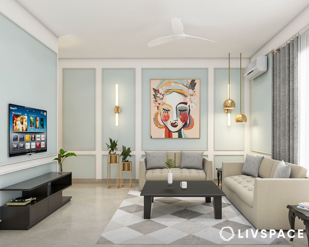
#4: How to achieve a sophisticated look with shades of grey?
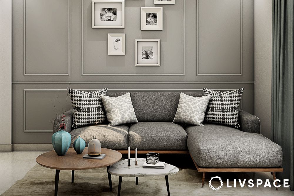
When it comes to interior colour combination ideas, a lot of people prefer grey due to its versatility. It also represents a balance that people prefer to experience in their homes. In addition, this balanced wall colour combination for the living room is an evergreen choice.
#5: Can we use navy blue with light colours for wall colour combination for hall?
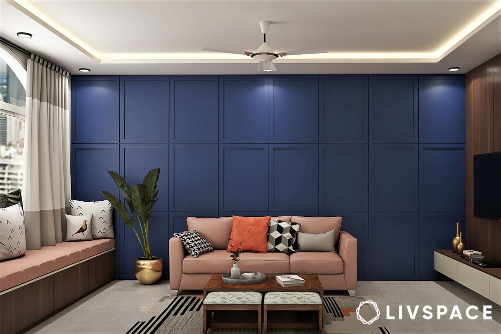
Among the various colours that you could select for your wall paint, blue can be the trickiest to work with as you need to choose additional colours that complement it well. However, the timeless navy blue is a good choice as your wall colour combination. It pairs well with lighter shades for a royal look.
#6: How can brick red and muted colours create a rustic feature wall?
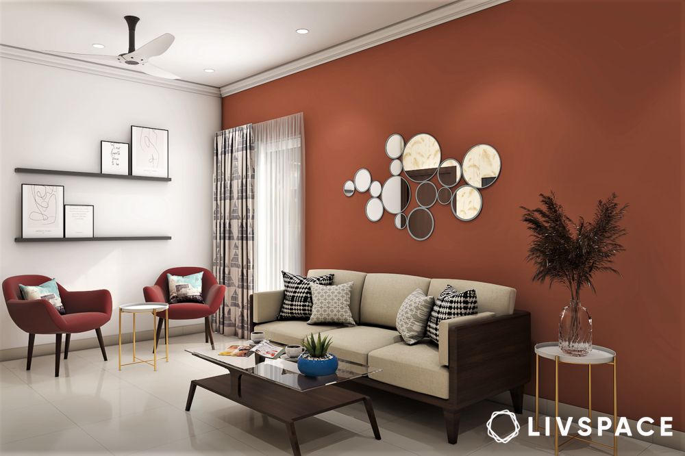
Red is considered a lucky colour in Feng Shui and Vastu Shastra. However, most homeowners find the common red quite tacky to use in their living rooms. Brick red, on the other hand, is a muted shade that gels with other warm colours beautifully. Brick red and white as a wall colour combination for the hall is known to create an energetic vibe. This is also why it is best for young homeowners.
#7: Are turquoise and grey a good match for two colour combination for walls?
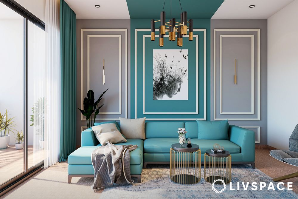
Homeowners today are willing to be bold and hence are open to unique wall colour combinations for their halls. You will see turquoise paired with white often, but the trend of using more than two colours has allowed us to experiment with more combinations. As such, you’ll see that grey is often used as a third colour in many wall colour combinations, and this is one of them.
#8: How to mix white, blue, and brick orange for a striking feature wall?
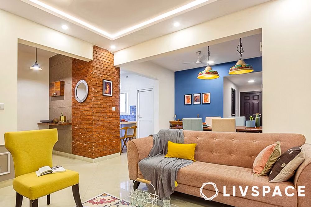
Like we said, three is so much better than two! If you are looking for unique hall painting colour combinations, go for blue and white and mix it up with something offbeat like a burnt, brick-like orange. We love how the brick-patterned pillar in this hall acts as a striking feature.
#9: What makes vivid purple, cream, and white ideal for a desi feature wall?
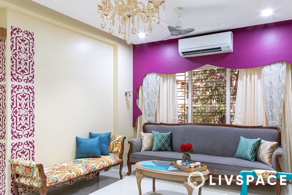
While there are many unique colour combinations for halls to choose from, this one stands out. The desi living room features a purple and cream colour combination with furniture in brown and turquoise blue. In addition, paint has been used to create an arch on one wall and ethnic motifs on another.
#10: How can sea green and white refresh your living room wall?
Go for a sea green and white combo for your living room walls—it’s like a breath of fresh air, perfect for cosy spaces. Use white to open up the room, and if you’re adding pops of sea green, balance it out with other lively but neutral colours, like white.
#11: What to do with grey and white for a cool neutral wall?
When it comes to wall colour combinations for a living room, grey and white are both neutrals. But, when you combine these, you’ll get a colour palette that is cool and not-so-basic. Whether you opt for a warm greige or a cool grey, this is a colour combination that can work in all kinds of rooms.
#12: Do yellow and white work well for a wall colour combination for hall?
Yellow and white make a cool and stylish duo for your living room walls. The blend of these colours brings a refreshing and lively feel without being dull or bland.
#13: What makes light slate grey and white a dreamy feature wall choice?
Try blending a soft grey with a clean white to create a fresh and open living room vibe. Remember, stick with cool greys and mix in “chill” colours like blue, cool white, and light greens for a harmonious look.
#14: How can saturated blue and white cool down your living room wall?
Pairing blue and white for your living room walls can bring a cool atmosphere. To warm it up, throw in some pops of yellow or red, or mix in warm wooden elements for a stylish touch!
#15: What to do with stripes of Crayola blue bell and cream shades?
Consider pairing cream with bright or light blues for a tropical feel, like a day by the ocean. Throw in a bit of tan, and voila! You’ve got the ideal seaside colour scheme for your living room.
#16: Are pastel pink and cream a good wall colour combination?
Whether you’re into light or bold pinks, they team well with creamy tones. To keep things harmonious, let pink shine as an accent—blend it with cream in furniture, textiles, and decor for a stylish touch without overwhelming the space.
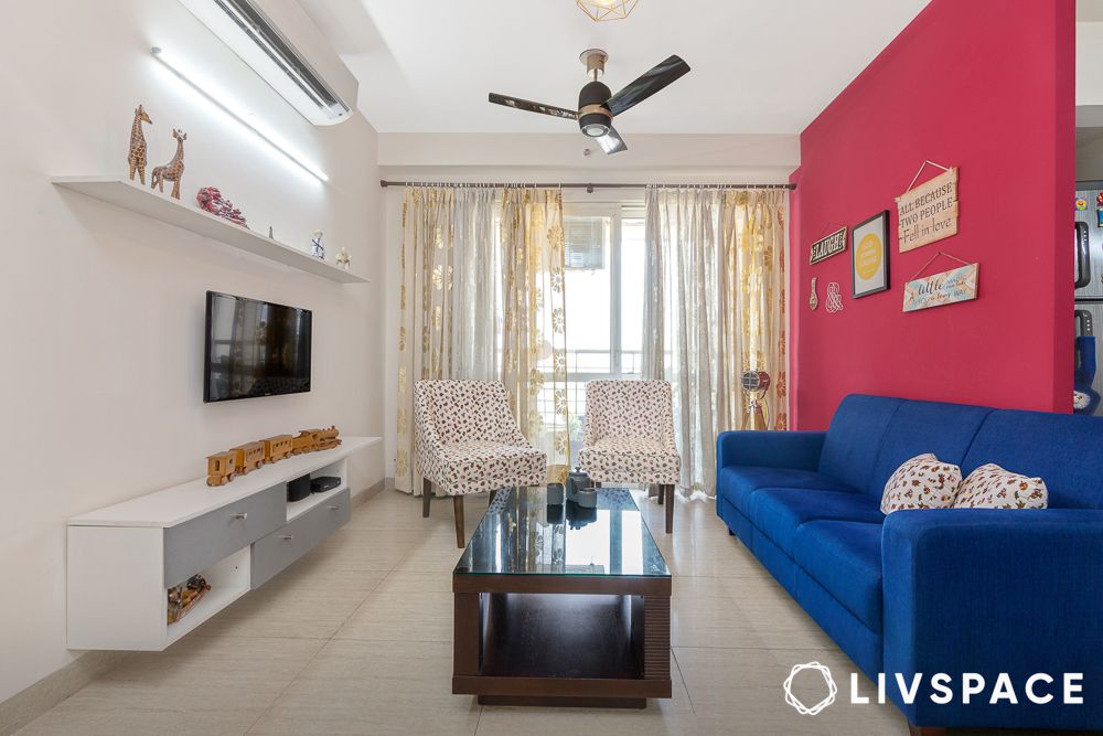
#17: What makes magenta and white an energetic feature wall option?
If you’re looking for a royal colour that exudes energy, excitement, and confidence, then look no further than magenta. It’s a bold choice that adds energy without making the room feel too busy. Try it on the wall behind your sofa, TV, or fireplace for a stylish focal point.
#18: Is pink and white a good idea for living room walls?
Bold, cheerful pink walls are offset by crisp white woodwork or ceilings. It’s an easy combination that works every time. Whether you prefer bold fuchsia or soft baby pink, any shade of pink pops beautifully against a bright white backdrop.
#19: How does light cerulean and off-white work for a home paint colour combination?
Go for a cerulean blue and white wall colour combination in your living room by painting all the walls a light cerulean colour—it’ll open up the space and welcome you in. If that’s too much, pick just one wall, maybe the sofa backdrop, to splash with that soothing cerulean shade. Keep things cosy by adding warm touches, like wooden furniture or cream-coloured fabrics, to balance out the coolness.
#20: How to incorporate tuft bush and cream in the living room walls?
In for more pastels? Tuft bush and cream is a unique combination to try. You can mix in neutrals like grey or beige for a subtle look. Alternatively, splash in some green or blue for a bold combo.
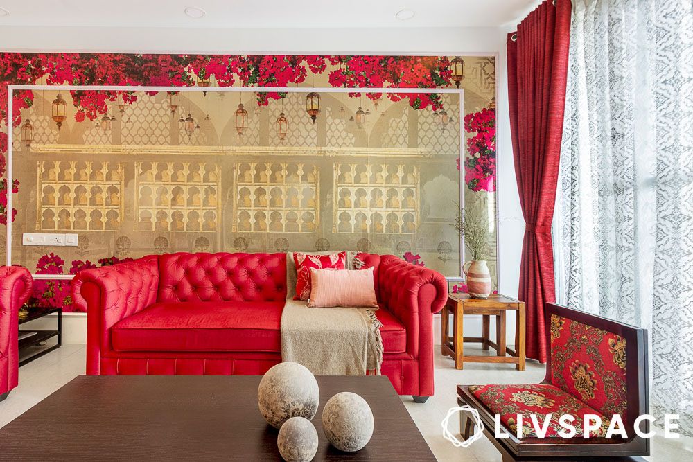
#21: Is a red and white wall colour combination trendy?
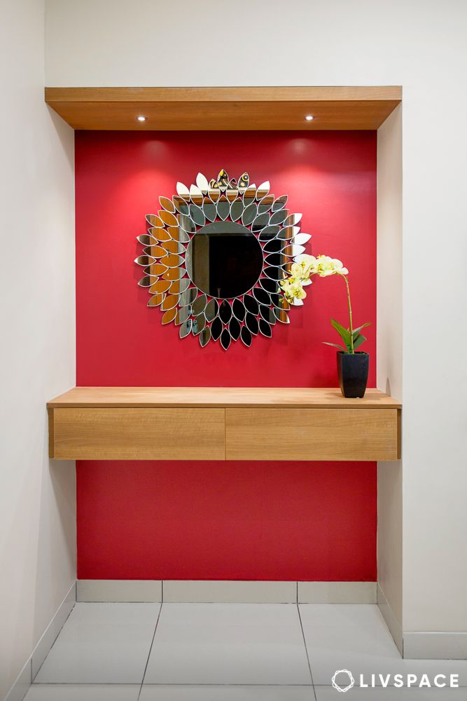
White pairs amazingly with anything, and red is no different. Use red as a lively accent wall in your living room for a bold and vibrant look. This classic combo is a surefire way to make your space look fantastic.
#22: Can we use dusty pink and off-white for the living room walls?
Create a calming and inviting atmosphere in your living room with the gentle pairing of dusty pink and off-white. Dusty pink, a muted rose tone, adds a touch of warmth and femininity without overpowering the space. Off-white, a versatile neutral, provides a clean backdrop and keeps the overall feel light and airy. This combination is perfect for creating a serene atmosphere that’s still stylish.
#23: How to use orange and red with a touch of gold?
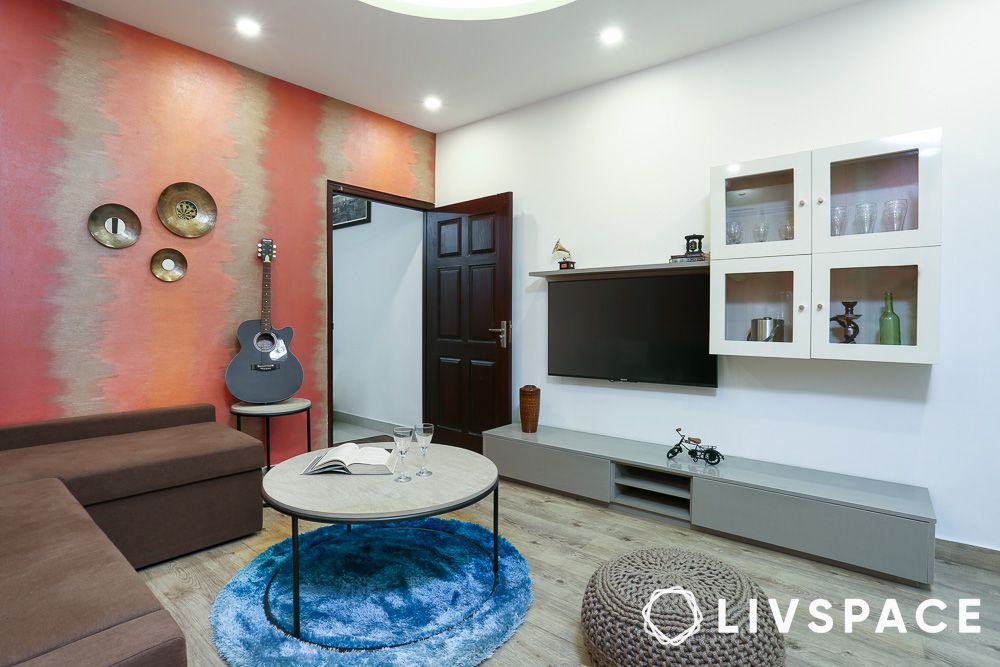
Inject a burst of energy and warmth into your living room with a bold combination of orange, red, and a touch of gold. Orange, a stimulating colour, adds a vibrant pop of energy and encourages conversation. Red, its fiery cousin, brings a touch of drama and passion, perfect for creating a cosy atmosphere. The key to balancing these bold hues is the gold accent.
#24: Is gold and white a good wall colour combination?
Channel timeless elegance and effortless luxury with a gold and white colour combination in your living room. White, a symbol of purity and spaciousness, creates a clean canvas for the golden accents to shine. Imagine crisp white walls reflecting ample natural light, making the room feel bright and airy. The magic unfolds with the introduction of gold.
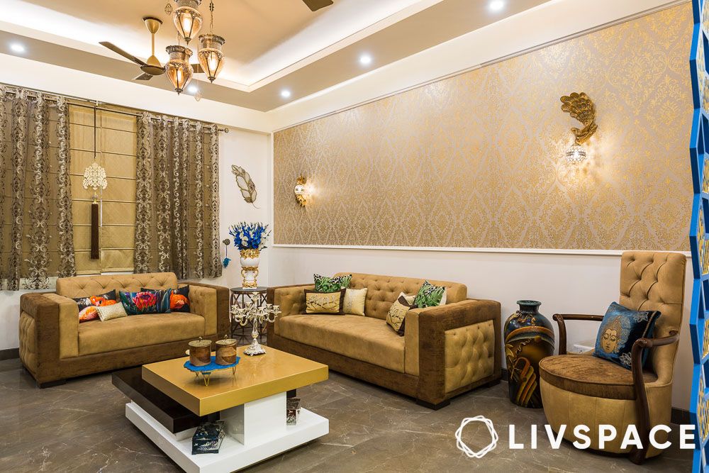
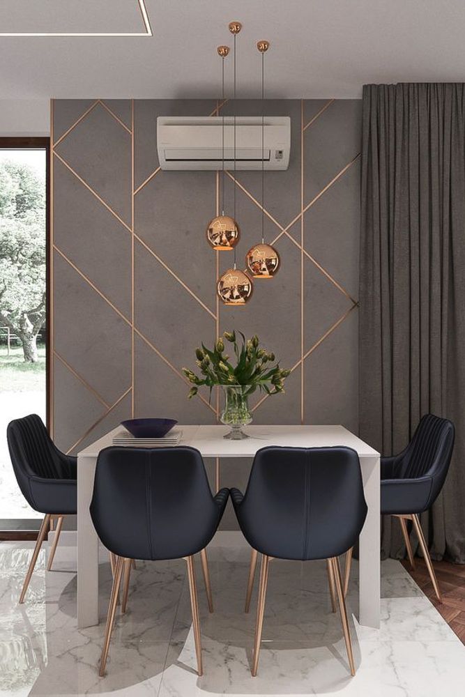
#25: How to use dark blue and gold wall colour combination for halls?
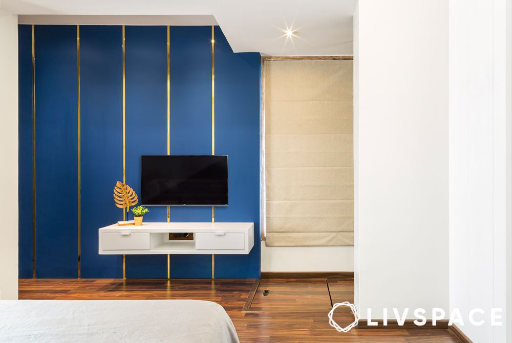
Breathe new life into your living room with a bold and sophisticated combination: dark blue walls and golden stripes. The deep, luxurious hue of dark blue creates a dramatic backdrop, instantly adding a sense of intimacy and fostering conversation.
This rich colour creates a cosy atmosphere, perfect for unwinding after a long day. To balance the intensity and add a touch of glamour, introduce golden stripes. These can be thin and metallic, adding a touch of elegance, or even thicker and more playful, depending on your desired aesthetic.
#26: Is the peacock green and orange two colour combination for living room walls a good idea?
Daring yet delightful, the peacock green and orange wall colour combination brings unexpected harmony to any home. This striking pairing balances the rich, jewel-toned depth of peacock green with the sunny warmth of orange to create spaces that feel both sophisticated and cheerful.
Perfect for an accent wall in your living room or a bold wall colour combination, these complementary colours create visual interest that instantly elevates your decor.
#27: Can a combo of green and green work?
A two-tone green wall colour combination offers the perfect balance of nature-inspired calm and design-forward style. Pairing sage with emerald or mint with forest green creates depth and interest while maintaining a harmonious feel throughout your space.
#28: What about gold with grey two colour combination for walls?
Gold and grey create a match made in interior design heaven! This sophisticated pairing brings together the understated elegance of grey with the glamorous warmth of gold for spaces that feel both cosy and luxurious.
Grey provides the perfect neutral backdrop for your living spaces, while gold accents add that touch of opulence we all secretly crave. As a wall colour for living rooms, try a soft dove grey on three walls with a stunning metallic gold feature wall behind your sofa. The result? Instant designer style without overwhelming the space.
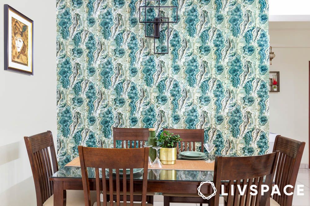
#29: Do teal and cream colour combinations work in living rooms?
As a wall colour for living rooms, teal creates a gorgeous focal point when used on a feature wall, whilst cream keeps the overall feel airy and bright. This clever wall colour combination works brilliantly in both north and south-facing rooms, adapting beautifully to changing light throughout the day.
#30: Can we use red with wood?
A red and wood wall colour combination delivers warmth and drama in equal measure! This striking pairing brings together the passionate energy of red with the natural charm of wood tones for rooms that feel both cosy and confident.
As a wall colour for living rooms, red creates an instant focal point that draws people together. Try a rich cranberry or terracotta on a single wall, allowing the warm wood elements to balance the boldness. This clever wall colour combination works brilliantly in rooms that feel a bit chilly or lack natural light.
Things to consider before choosing hall colour designs
Before you choose your wall colour combination, here is everything that you should consider:
- The size of the room
- The type of mood and aesthetic that you want to create
- And finally, the paint finish
What are the different types of paints?
Once you decide on the wall colour combination for your living room, you must determine the paint type.
| Paint | Feature |
| Water-Based | Uses water as a liquifying agent and thus emits fewer VOCs and has less odour |
| Oil-Based | Contains natural oils and are extremely durable |
| Synthetic Rubber | Made from polyvinyl materials and is non-toxic |
| Emulsion | Long-lasting and available in a variety of finishes |
| Enamel | Solvent-based paint that is good for spaces where there is a rough usage |
What are the different types of finishes?
Once you have finalised the type of paint, let’s look at some finishes.
| Finish | Features |
| Matte | Hides imperfections and provides good coverage |
| Eggshell | Has a soft and the subtle sheen and is easy to clean |
| Satin | Has an elegant sheen and is very durable |
| Glossy | Highest sheen and durability and easy to clean |
How can Livspace help you?
- 100,000+ happy homes designed with expertise and trust
- Operational in 100+ cities across India for seamless service
- 3,500+ designers and professionals bringing your dream home to life
Finding the right designs for your dream home is not an easy feat. The good news? You don’t have to figure it out alone, and you definitely don’t need to make expensive mistakes that’ll haunt you every time you walk into your home. Visit our interior designers near you, to start your journey.
Looking for tailor-made costs for your home? Hit our Cost Calculator to jump into your financial planning.
Need inspiration beyond your current Pinterest spiral? Check out Design Ideas for professionally curated looks that actually translate to Indian homes and lifestyles.
Want to see what real people think? We have designed over 75,000+ homes. Browse through Livspace reviews from customers and hear what they have to say about us.
Ready to take the next step? Find an interior designer near you and let’s get started.
Disclaimer: All contents of the story are specific to the time of publication. Mentions of costs, budget, materials, finishes, and products from the Livspace catalogue can vary with reference to current rates. Talk to our designer for more details on pricing and availability.


