In This Article
- The family…
- And their designer!
- Anwesha Barari: When we initially covered this home, we called it ‘perfect 2BHK for a family of three’. Do you concur?
- AB: And what is the most stunning feature of this home according to you?
- AB: Speaking of storage, how difficult is it to accommodate storage in an apartment below 1,000 sq ft while maintaining the semblance of spaciousness?
- AB: And what role do the colours play in making this home exemplary?
- AB: We see such an amazing variety of wall treatments in this home. How could you incorporate all this given the limited space?
Space is a vital consideration before planning the interiors of house. But so is storage. If we go by sheer common sense, the more storage you add, the less free space you have in a home. Thus, storage is inversely proportional to spaciousness.
But there is a corollary to this theorem and it’s called smart design! And our Mumbai designers are pros at exploring smart design. After all, Mumbai is infamous for its space crunch and necessity is the mother of all invention!
The family…
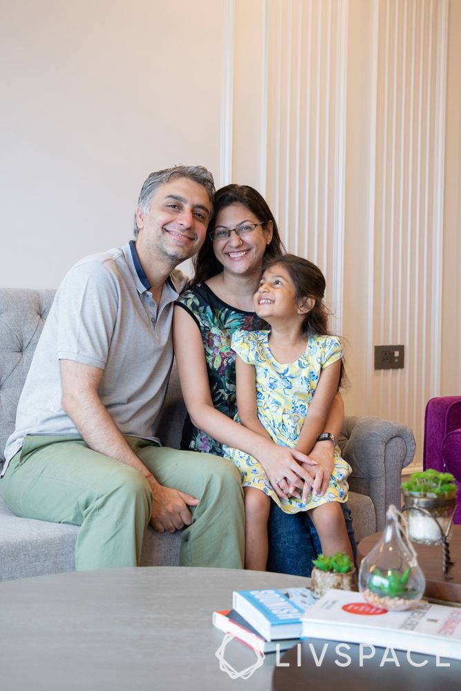
So, what do we have here? Ekta and Kunal Khanna with their daughter Myeisha had an apartment in Rustomjee Paramount in Khar, Mumbai. They wanted their 900 sq ft 2BHK to look spacious but also have enough storage, which is what most Indian families aspire to have.
And their designer!
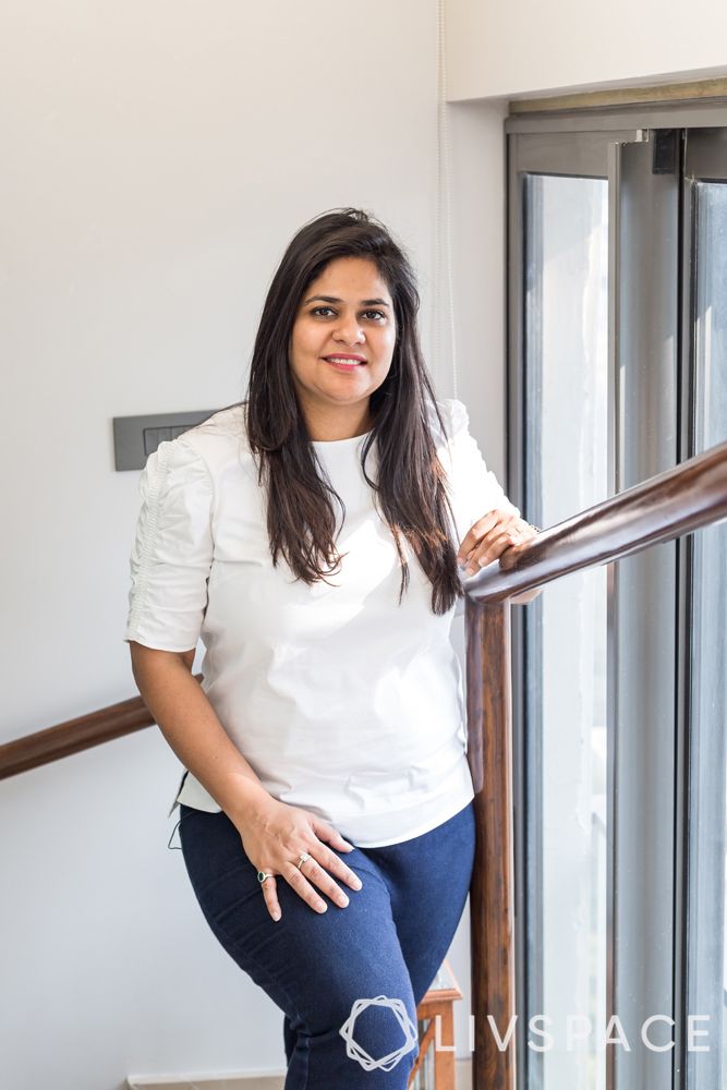
Then they met their match in Livspace designer Pallavi Goel (who is also our Studio Head for Mumbai). We caught up with her to know how she designed the interiors for house in this project and here’s what she had to say.
Anwesha Barari: When we initially covered this home, we called it ‘perfect 2BHK for a family of three’. Do you concur?
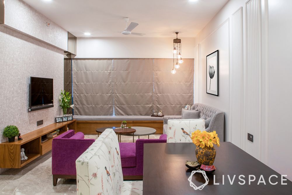
Pallavi Goel: Absolutely! We have accommodated everything that a small family of three could want in a home here. There is a living room that has enough seating to host guests. The kitchen has enough room for one person to cook and there are sufficient cabinets for a small family. The kids room and the master bedroom are personalised as per the needs of the family. It’s a complete interiors for house package.
AB: And what is the most stunning feature of this home according to you?
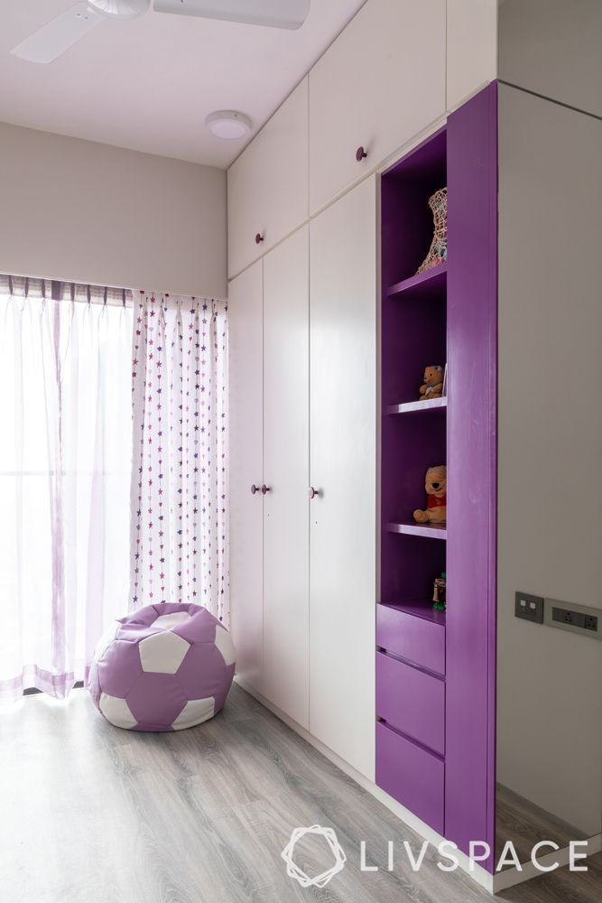
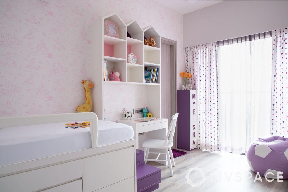
PG: The amount of storage we have tried to incorporate in this 2BHK is quite a lot and made considering its size. So basically, every area in the house is multifunctional, be it the living room, kids room or the master bedroom. To give you an example, a portion of the wardrobe in the kids room is used by Ekta as a dresser because there was no space for it in her bedroom.

AB: Speaking of storage, how difficult is it to accommodate storage in an apartment below 1,000 sq ft while maintaining the semblance of spaciousness?
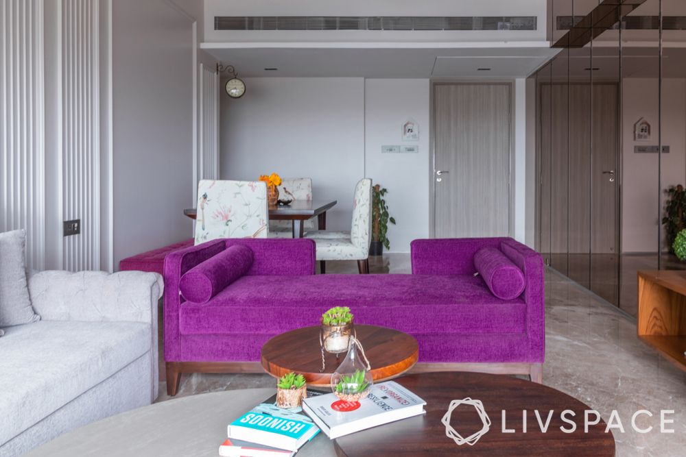
PG: It’s actually not as difficult as people think it is. Keeping the aesthetics in mind, storage can always be catered to. This house is one of the best examples to illustrate this. In the living room, the sofa is actually a sofa-cum-bed, and it has storage inside it for all the bedding and cushions. The bay window seating also has storage underneath. In this way, there are different parts in the whole house where there is a lot of hidden storage like the kids’ loft bed. So, there is no compromise on the aesthetics. Storage doesn’t have to be about adding bulky lofts everywhere.
AB: And what role do the colours play in making this home exemplary?
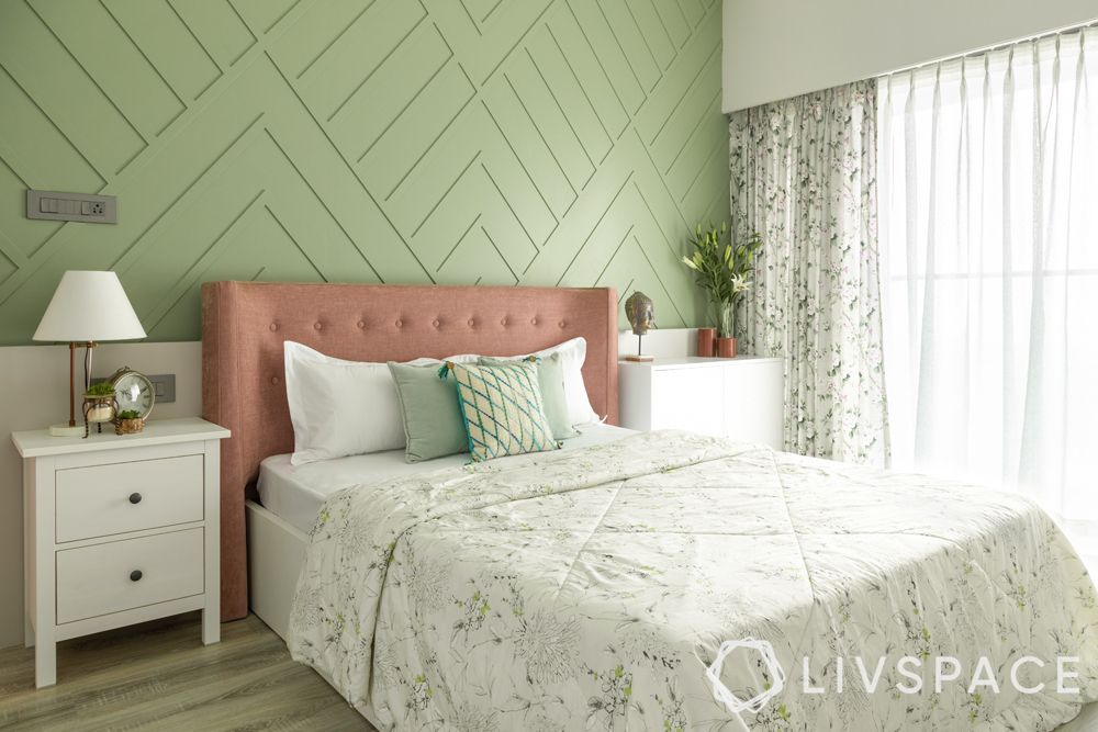
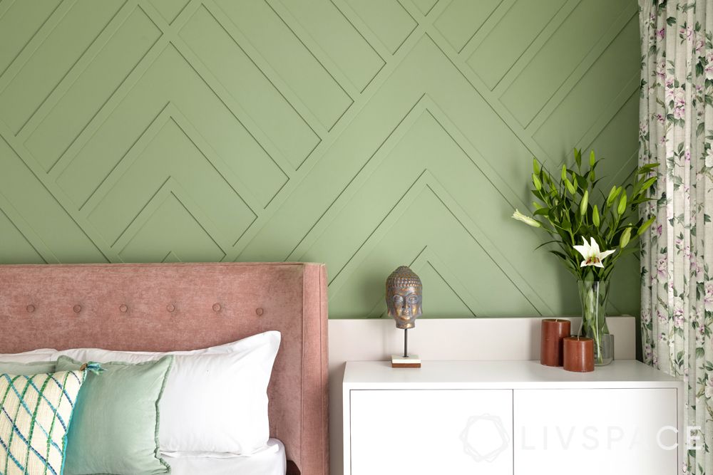
PG: Firstly, it’s a playful colour palette but we haven’t used too many colours. It goes very well with Ekta’s personal taste and will not bore her. Secondly, every area is muted but it has one pop of color with the rest working along well. For instance, if you see the accent wall in the master bedroom, it’s a very soothing shade of pastel green. The headboard, also a muted dusty pink, pops against the green just because of the contrast. The point being, you don’t have to use dark or bright colours to make something pop.
AB: We see such an amazing variety of wall treatments in this home. How could you incorporate all this given the limited space?
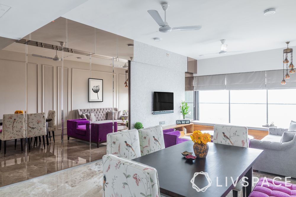
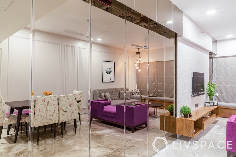
PG: With the area being a bit tight, we had to make it look elegant in every possible way and add the illusion of space. So, we used the wall treatments as a tool to do this. For instance, the tinted mirror in the living room makes the space look so much larger and accentuates the moulding on the opposite walls.
If you enjoyed reading our gupshup with Pallavi, also read our interview with designer Dalina Singh who extolled the virtues of effective space optimisation.
Send in your comments and suggestions.