
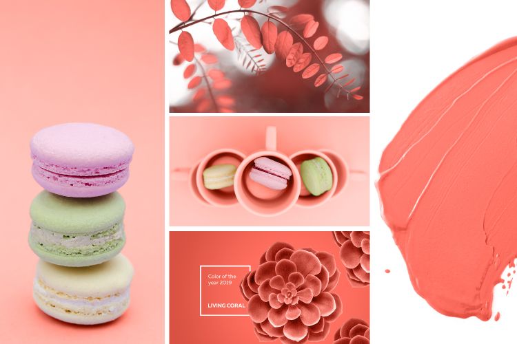
Pantone just announced its Colour of the Year 2019 and this delightful shade is called Living Coral! At first glance, this hue evokes images of the Great Barrier Reef that once provided shelter to a kaleidoscope of colours. But Pantone affirms that this saturated orange base with a golden undertone is not only warm and welcoming, but versatile and life-affirming.
We are so thrilled with this peachy orange shade being the “it” colour for the season ahead. Although it may seem more pink in nature, Pantone describes Living Coral as “an animated, life-affirming shade of orange, with golden undertones.” A refreshing break from Ultra Violet, Pantone Colour of the Year 2018, this shade is all things pretty and we are all set to infuse our homes with it. Take a look at some of the ways in which you can easily incorporate this colour in your homes!
Interior Inspiration from Pantone 2019: Create Magic with Upholstery
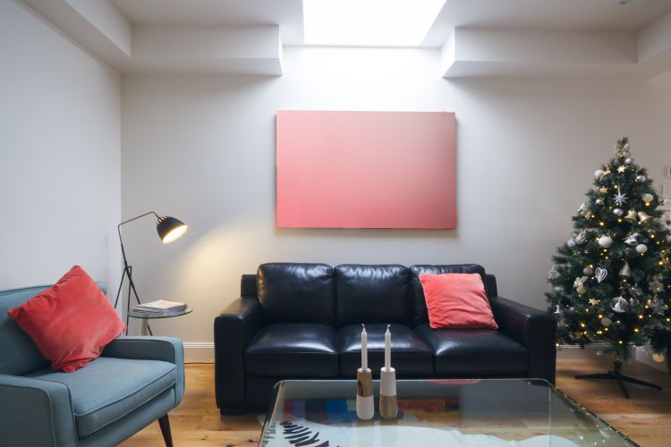
There’s something about this colour that feels so magical and welcoming, optimistic and vibrant. Most of us would see this colour being used more like an accent in the home space. But even though Living Coral is bold, you are likely to spot some beautiful couches, chairs and headboards in this lively colour in the coming months. Upholstery is the way to brighten up your interiors with this rather refreshing colour.
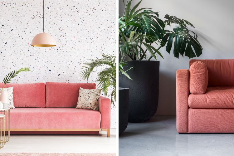
What better way to flaunt this colour than in your living room. This welcoming peachy orange shade can be used to upholster your sofa or couch for creating the right ambience at home. Choose from velvet to chenille or any fabric that you like and let your couches do the talking.
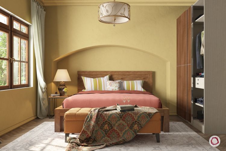
Don’t we all want to wake up to a bright and happy feeling in our room everyday? Living Coral is just the right amount of colour that can make this dream come true. Upholster your headboard in this pretty shade and see how it uplifts your mood instantly.
Interior Inspiration from Pantone 2019: Wonder in the Kitchen
We are loving the warmth and vivacity of Living Coral that’s been chosen by colour experts and trend forecasters at Pantone. While it might seem tricky to crack, but this shade can adorn the walls and cabinets of your kitchen beautifully. Being bright and loud-ish, you can tone it down by pairing it with pretty neutrals on your floor, backsplash and walls.
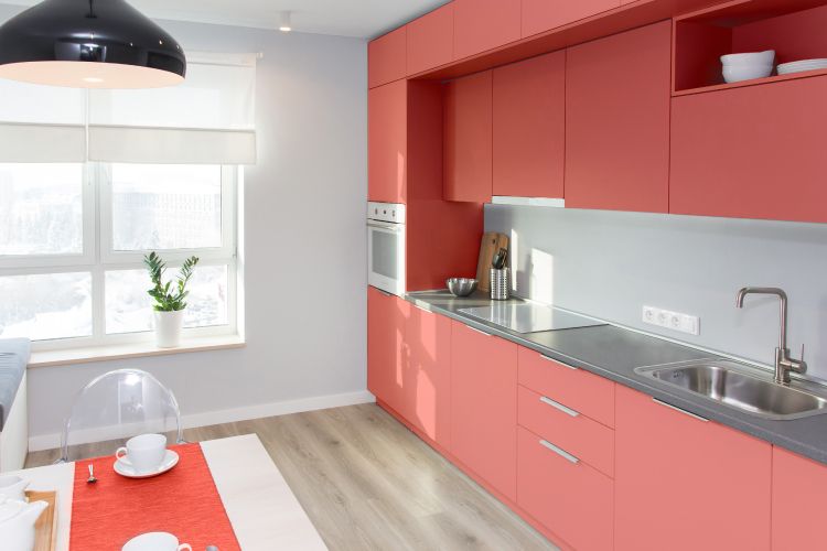
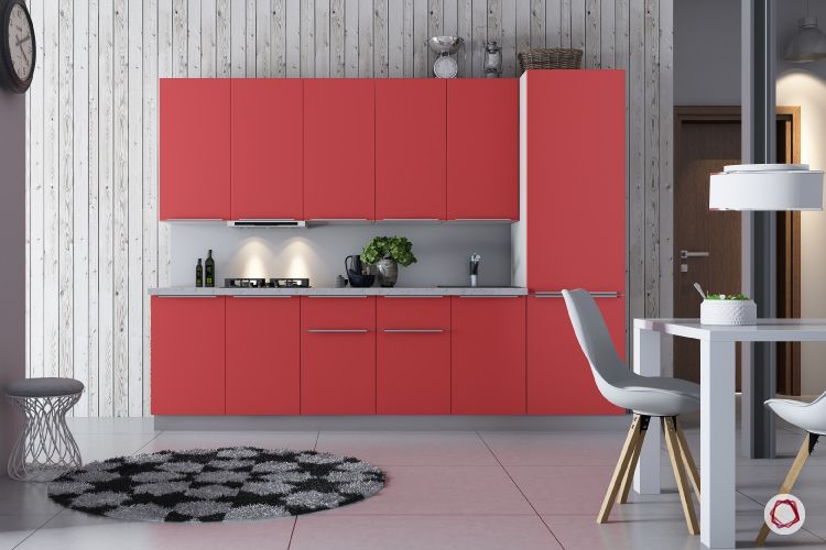
No matter what the layout of your kitchen, it is sure to rock this passionate colour with panache. Get over boring and dull cabinets and move on to more fun things this year. That’s what Pantone’s verdict is all about. You can also paint your kitchen walls is a subtle variant of Living Coral, instead of going all out with the cabinets.
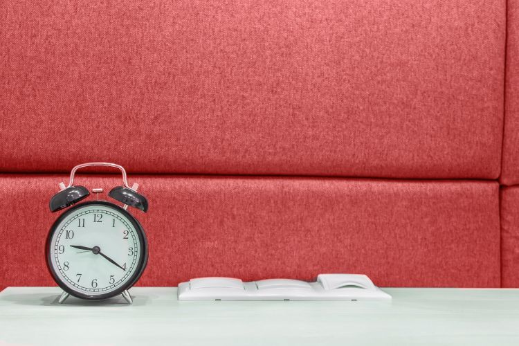
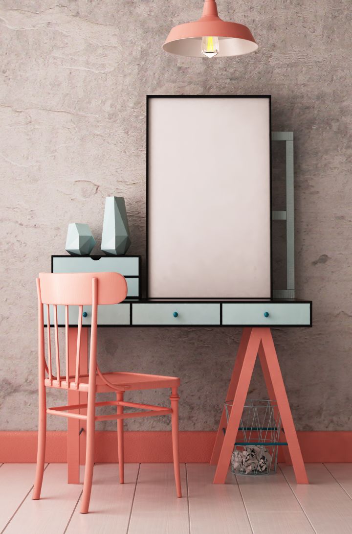
Interior Inspiration from Pantone 2019: Sprucing up your Office Space
Who said your “workspace” needs to look professional and boring? With almost every home having a work-from-home zone or a reading nook or a “me” corner, you have so many ways to use Living Coral to jazz up those corners. Think furniture, walls, accents and so on. Your study area will instantly feel more lively and inspire you to do more!
We love how this cozy study corner is spotted with shades of Living Coral that adds the right amount of colour to this space. Beauty lies in the details they say. The skirting on the wall and the pendant light are proof that it takes just some effort to put together the right look.
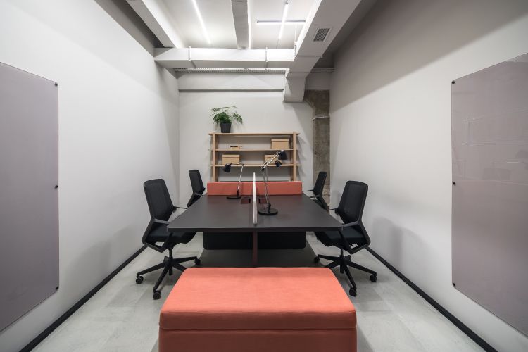
Well, a conference room like this one would definitely is sure to make dull meetings a fun experience. Throw in some Living Coral coloured benches and couches in a monochrome setting to perk up your office.
Interior Inspiration from Pantone 2019: Work the Soft Furnishing
We all know that Living Coral can get a little tough to work around your interiors. Fret not, we have an idea for everyone. When you are someone who doesn’t like taking big risks with your home, soft furnishings are your best bet. These little details can go a long way in defining your interiors and making it come to life!
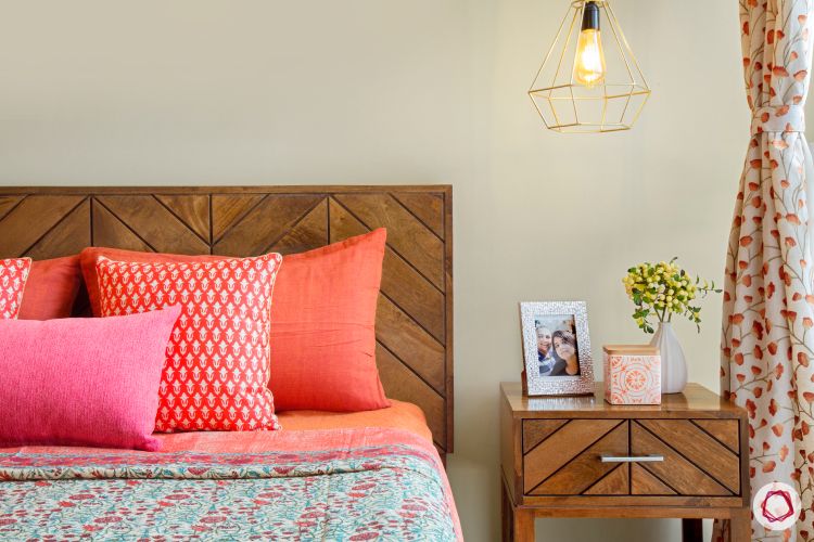
This is to show you just how versatile the Pantone Colour of 2019 is. Whether you have simple wooden furniture or plush leather ones, a couple of cushions can add so much vibrancy to it, you’d be surprised!
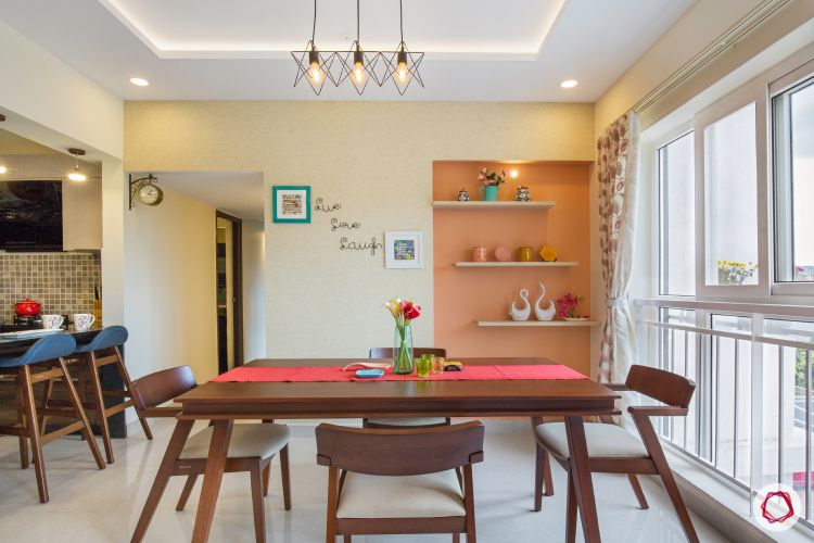
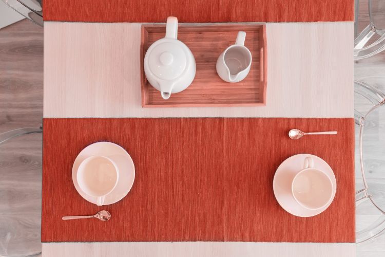
Don’t you just love the coral rush in the dining room? A soft shade of Living Coral in the wall niche and a brighter shade for the table runner does the works here. We strongly recommend you splurge on some tasteful coral tablecloth and runners for the upcoming festivities.
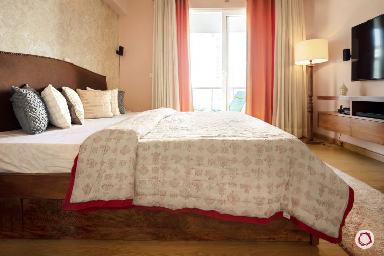
The Pantone colour of 2019 can be paired with other colours seamlessly. Just throw in a curtain or invest in some bright bed linen to jump on the bandwagon, but very subtly.
We are certain you’re as taken by this colour as we are for its versatility and freshness! We recommend you blindly embrace this colour for your interiors. Meanwhile, see how we curated looks for Posh, Playful and Positive: Pantone’s Ultra Violet!
Send in your comments and suggestions.


