
Have the soothing influences of rose quartz and serenity made their way into your home yet? We bring you eight delightful ways to decorate your home with stunning palettes inspired by the Pantone colors of the year 2016.
Pantone’s surprise announcement of not one, but two colors of the year has opened up a virtual goldmine of possibilities for home decor trends. The all-encompassing calm of serenity blue, when coupled with the soft and feminine vitality of rose quartz, can result in a stunning variety of effects ranging from tranquil and meditative to off-beat and eclectic. Read on for interesting ways to decorate with both of these two colors using well-coordinated palettes that incorporate rose quartz, serenity as well as their lighter and saturated forms.
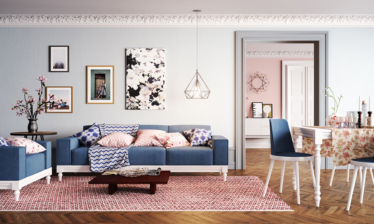
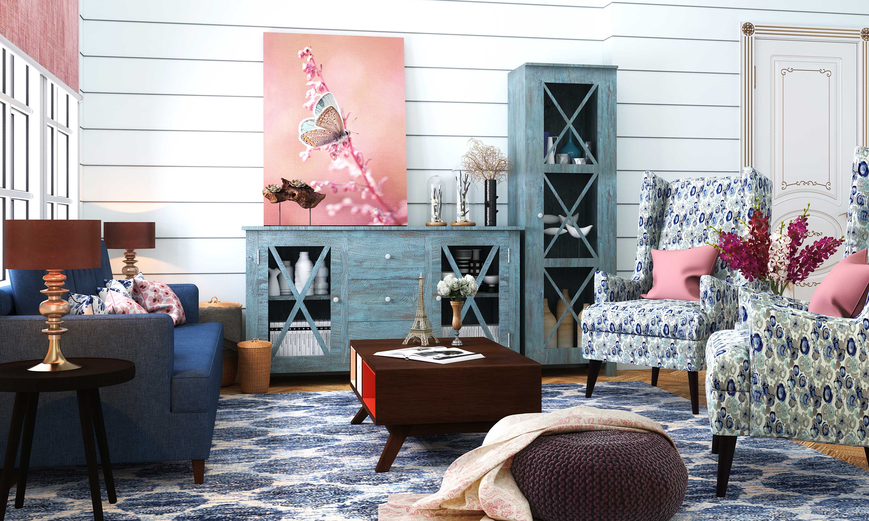
Rose quartz and serenity, being soft, subtle tones, immediately bring to mind the quintessential pastel themed palettes of the 60s. This classic living room is tastefully done up a wash of pleasant blues and pinks, balanced by a liberal dose of pristine white accents. A pale blue wall forms an elegant backdrop for classy photo frames, a stylish geometric pendant light and bold floral-themed artwork – another trending element in home decor this year. A saturated version of rose quartz used on the rug pairs off beautifully against the earthy flooring, creating a striking anchor for all the cool blue hues in the room.
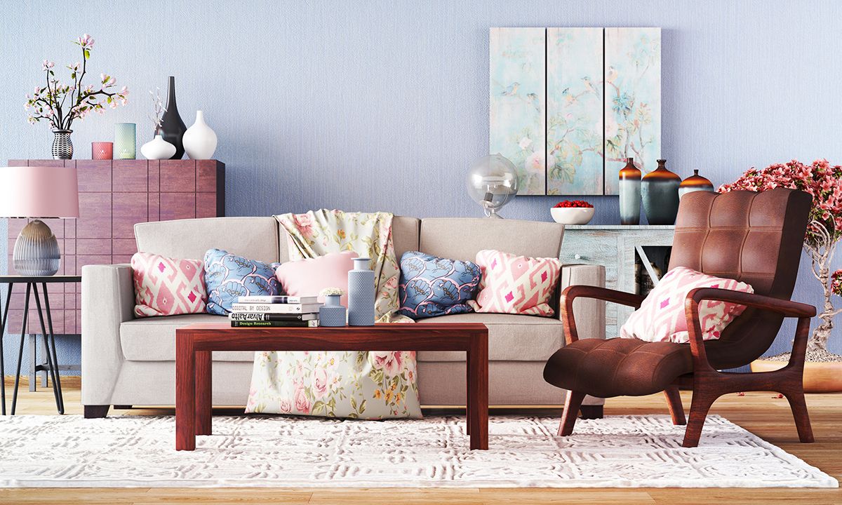
A statement wall suffused in a lighter hue of serenity creates a tranquil backdrop for this room. The colors of the year make a second appearance in the lively, patterned throw cushions, aptly placed on a neutral colored sofa. The solid brown tones of the large armchair and contemporary coffee table provide a subtle anchor against the airy, candy floss blue and pink tones.
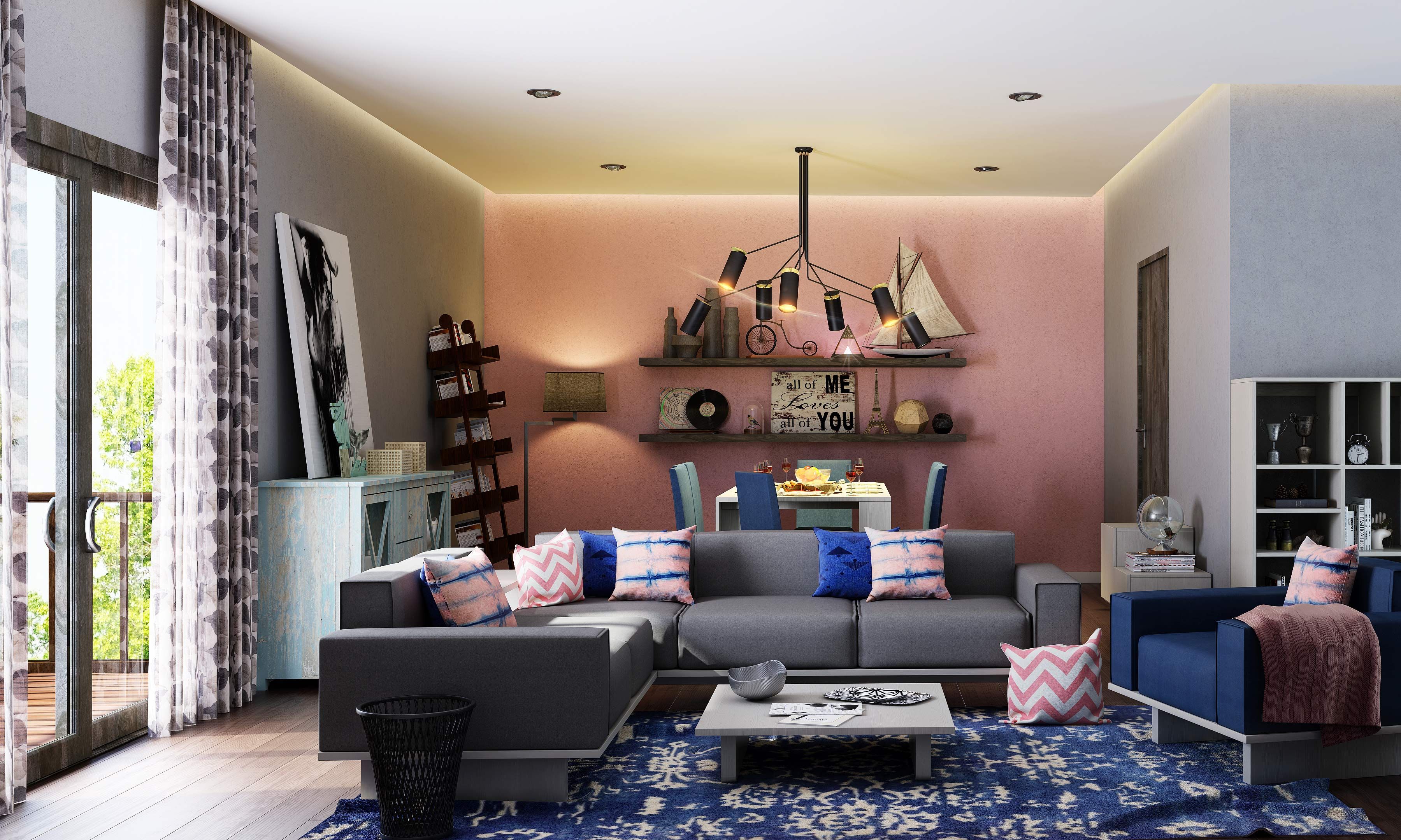
2016’s colors of the year can work well with contemporary eclectic styles too. Featuring a creative melange of decor elements from different styles, this room is dominated by two colors – a rose pink statement wall and a striking floor rug in a bewitching shade of serenity. This saturated version of serenity makes another appearance on the throw cushions along with a mellow shade of pink, a wonderful contrast against the neutral grey elements.
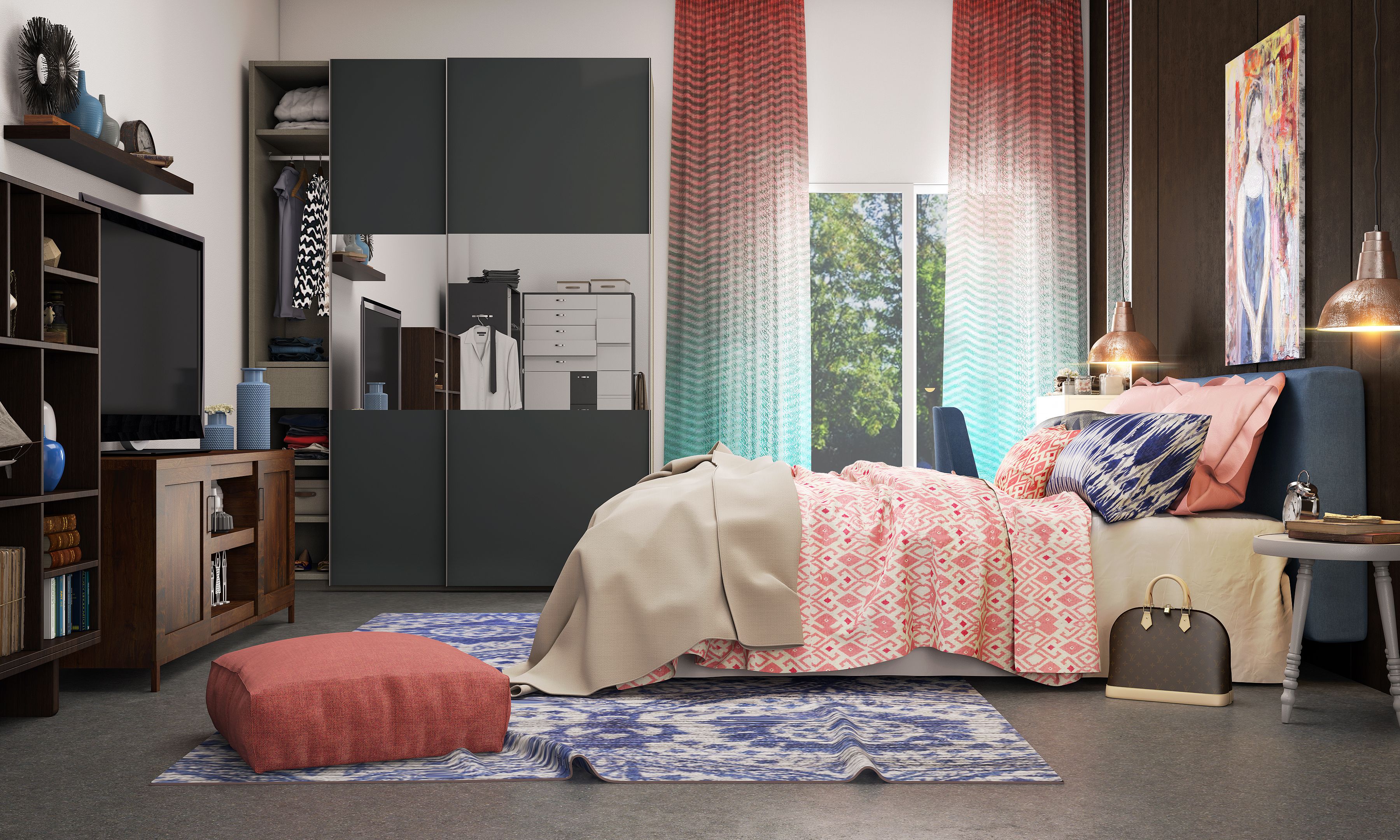
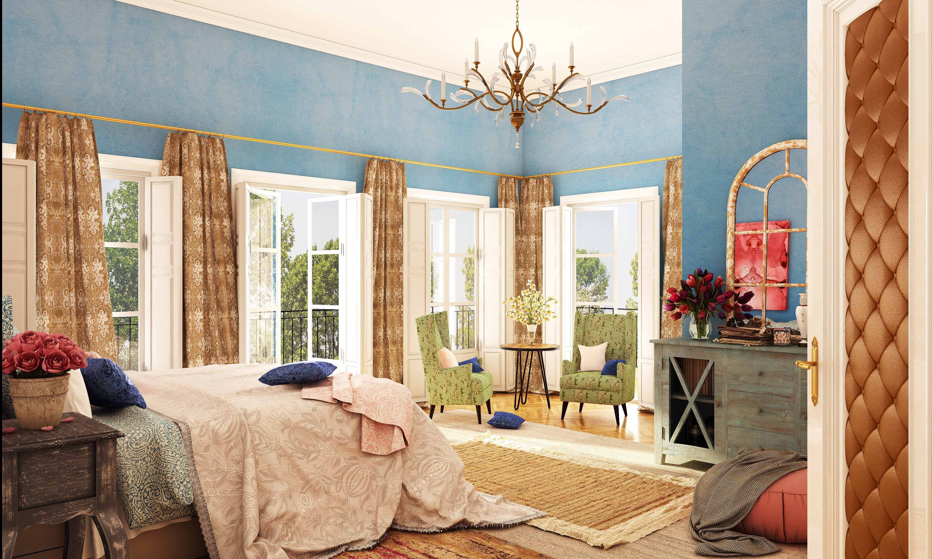
Rose quartz and serenity work especially well when used with solid neutrals. Rose pink blends seamlessly into a brilliant shade of turquoise on the light ombre drapes, a wonderful contrast against the steel grey wardrobe. A harmonious synergy of pink and blue on the bedspread, pillows, and floor rug creates a soothing, peaceful ambience that makes this room the perfect haven to retreat to for a spot of rejuvenation.
Versatile and adaptable, 2016’s colors of the year also promote a calming sense of order and peace. In this lovely living room, blue and pink hues are used to bind together a beguiling combination of rustic, ethnic and contemporary elements. Soothing white walls are paired with a symphony of layered blue hues – saturated serenity on the furry floor rug, a more solid hue on the comfy sofa and a lighter faded denim blue on the lattice work cabinets. Rose pink on the throw cushions and a large format nature-themed artwork adds a pleasing, tranquil vibe to the room
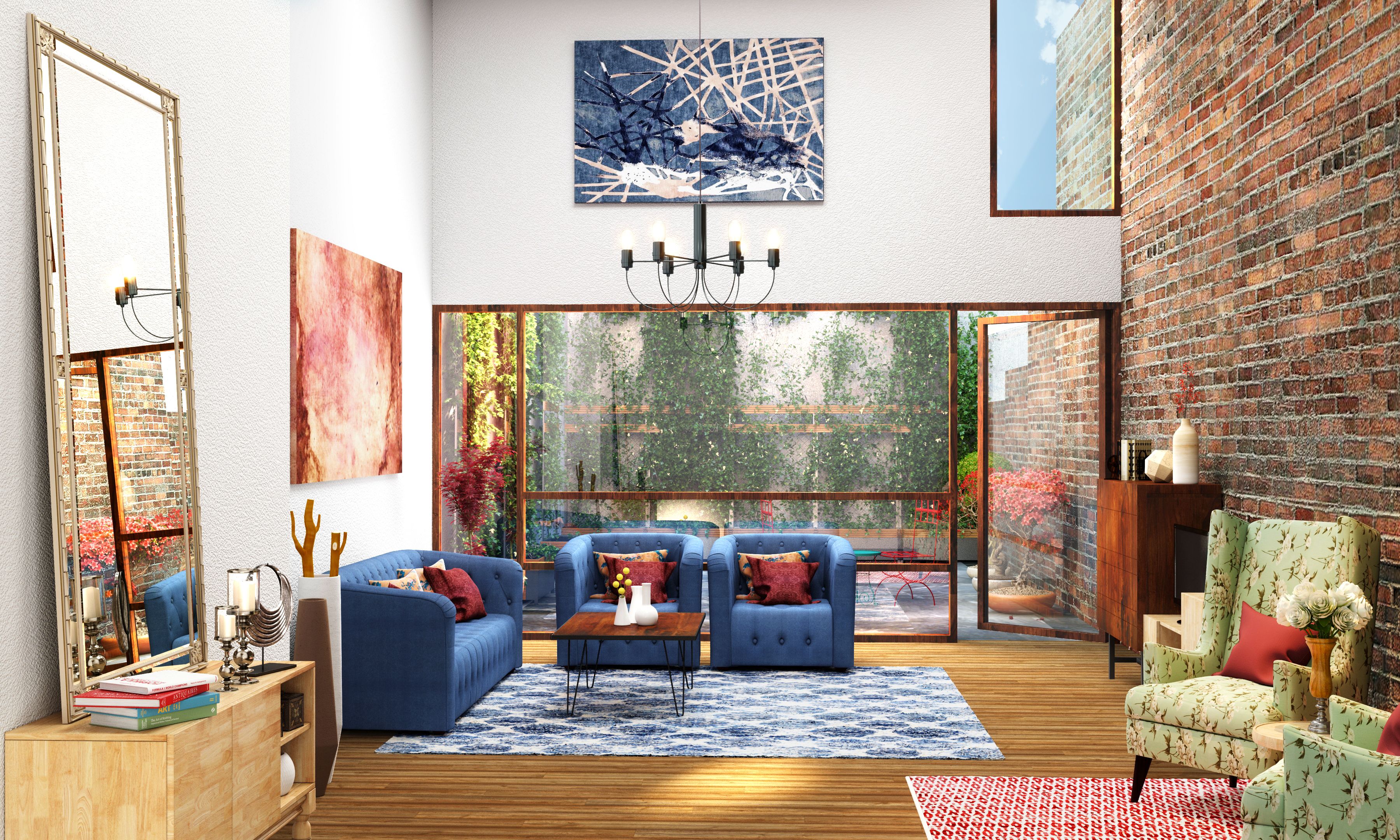
The combination of rose quartz and serenity promotes a sense of well-being and mindfulness, providing much-needed relief from the intense stresses of the modern world. This concept is translated into this wonderfully airy and inviting living room which features a pair of beautiful tufted sofas in a stunning shade of serenity. Blue and pink make their way onto artwork on the walls and are tactfully mirrored onto the floor rugs, creating a calming sense of balance. The earthy exposed brick wall and hardwood floor subtly balance out the splash of immaculate white.
Bring a peace and tranquil influence to your most intimate spaces with this serenity blue infused bedroom. The combination of rose quartz and serenity blue also embraces gender neutral themes that are pervading almost every aspect of modern life. The pale pink bedspread adds a soft, feminine touch, emphasized by saturated pink accents in the form of flowers and a wall painting. This acts as a counterpoint to the more traditionally masculine tones of blue and brown, with white accents to bind the entire look together.
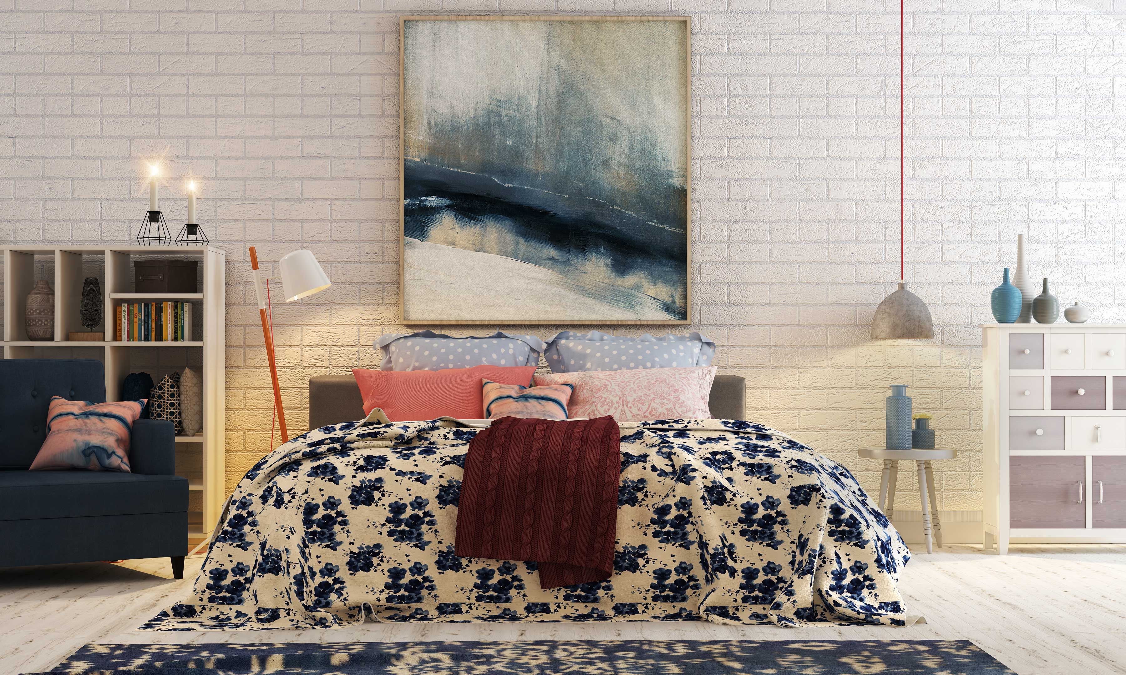
Sometimes, less is truly more. An intriguing way to incorporate the colors of year is to use them minimally as accents, demonstrated in this serene bedroom. An immaculate swathe of white dominates the room, acting as a background for deep blue hues and darker pastel tones. Rose quartz and serenity on the throw pillows stand out against this restful scheme and add a touch of brightness and life.
Pair this enchanting duo with metallics, bright yellows or vivid greens to create a variety of moods depending on your personal tastes. Experiment to your heart’s content to harness the tranquil and meditative vibes of both these colors and add your own unique spin to this trend.


