In This Article
- #1: Use a dark colour to instantly highlight a wall, making it your focal wall
- #2: If you’ve chosen a printed couch, choose a rug in the colour of the prints
- #3: Opt for bold colours on cushions to elevate a palette
- #4: Match the colour of your curtains with your furniture fabrics
- #5. For an Insta-worthy backdrop, try this unique combination of colours
Welcome to Take 5 with Heny, where interior designer Heny Savla gives us quick tips on an array of design dilemmas. Mumbai-based Heny comes across a variety of doubts homeowners have in pulling off a beautifully designed look. In our first edition, we pay homage to the process of picking a home interior colour palette, especially with respect to walls and soft furnishings.
Colours have the power to transform a space. It can change the mood of a space, evoke emotions and decide the vibe of the place.
– Heny Savla, Interior Designer, Livspace
So how do you get the colour combinations for your home right without going overboard with the colours used or without using enough? Here are 5 tips straight from the horse’s mouth.
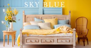
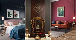
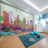
#1: Use a dark colour to instantly highlight a wall, making it your focal wall
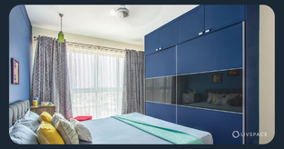
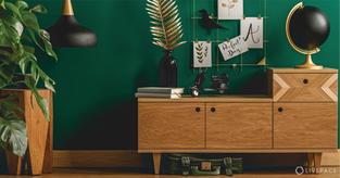
Heny believes that dark colours add depth to a space and draw attention easily. So when in doubt, opt for a deep shade that makes your accent wall stand out. But this is for the purposes of highlighting only. The rules change is you want to use a dark home interior colour all over.
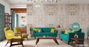
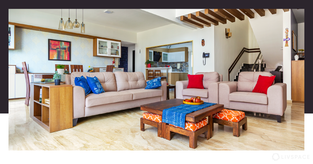
#2: If you’ve chosen a printed couch, choose a rug in the colour of the prints
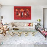
A couch with printed upholstery will typically have a base colour and a print colour(s). You can maintain continuity of design by picking out a rug in the colour of the prints. This also helps in ‘zoning’ out the sitting area.
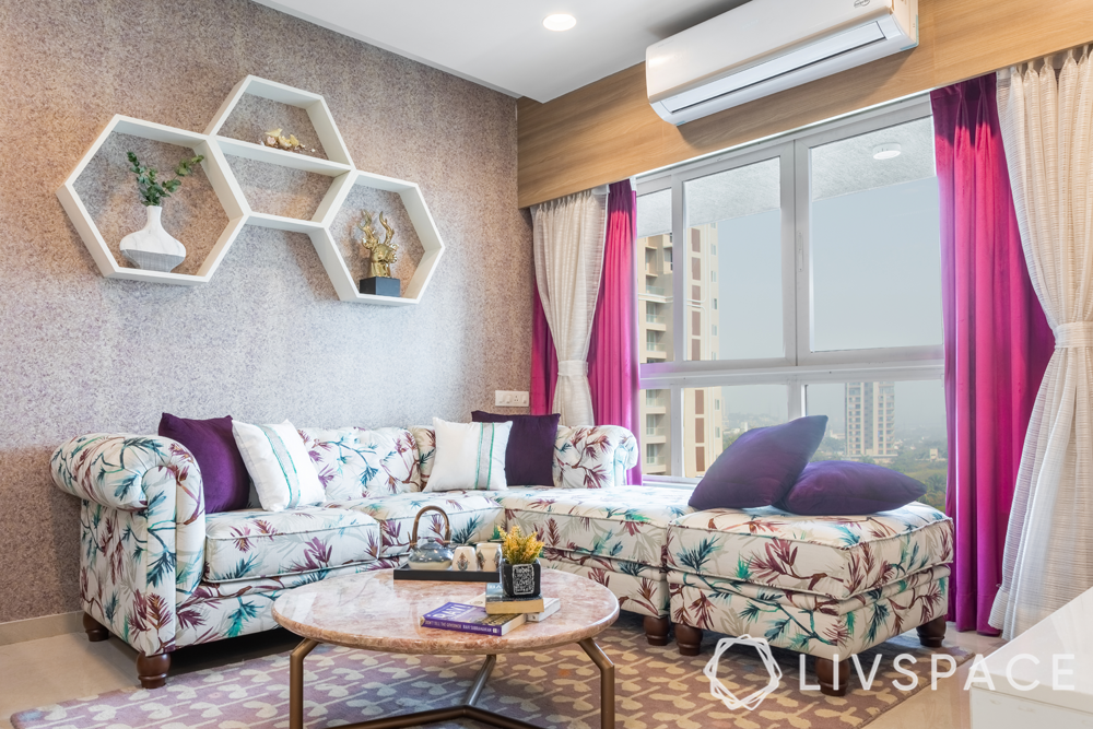
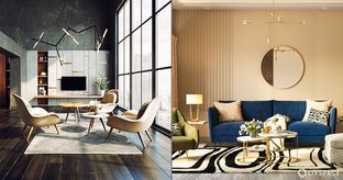
#3: Opt for bold colours on cushions to elevate a palette
Pop colours with their fresh and bold presence give your space an instant pick-me-up. So be brave with your choice of home interior colour for cushions and other soft furnishings.
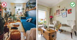
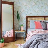
#4: Match the colour of your curtains with your furniture fabrics
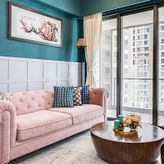
By match, we don’t mean that everything should be in the same colour. You can pick different shades from the same family of colours to create a ‘matched’ look. For instance, if your sofa is dusty pink, you can have nude pink curtains and pastel pink cushions.
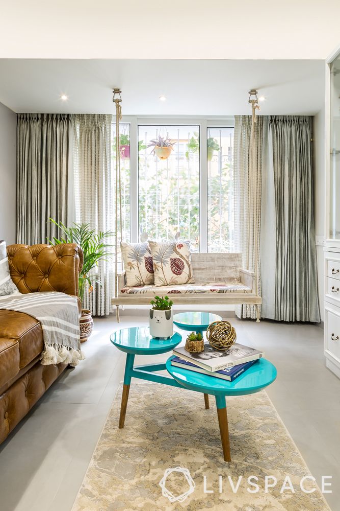
#5. For an Insta-worthy backdrop, try this unique combination of colours
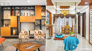
A tried and tested combination, Heny suggests pairing a shade of teal (like the centre table here) with camel (see the sofa), peach, rust, navy or pale wooden tones (shift gaze to the rustic swing) to set up a corner for your insta pictures or Zoom calls. Following this rule of thumb for your home interior colour palette for this corner will certainly add to your popularity online.
If you found these tips from our interior designers useful, keep exploring and read the design secret no one told you about!
For more queries, write to editor@livspace.com.

