
In This Article
We all want our home to be a welcoming space, a place you would want to come home to. So why is it that some homes feel cosy and some don’t? It is because spaces have an energy of their own. However, you can channel this energy in the best possible way if you get some design essentials right. Another way to look at it would be to avoid some basic interior design mistakes.
We have put together a list of some of the bad interior design examples we have come across. Don’t fret; we are also revealing how you can fix these interior design mistakes!
#1: Are You Blocking Any Windows?
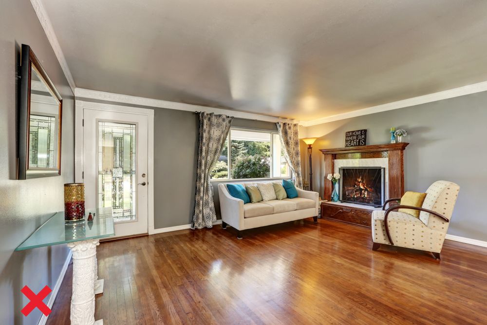
One of the major interior design mistakes that makes a space look dull and unwelcoming has to be insufficient lighting. Natural light takes precedence in this regard and the most natural light comes in through windows. If your home may be missing out on natural light it’s because you are blocking it out with heavy furniture or you have small windows.
How to Fix This
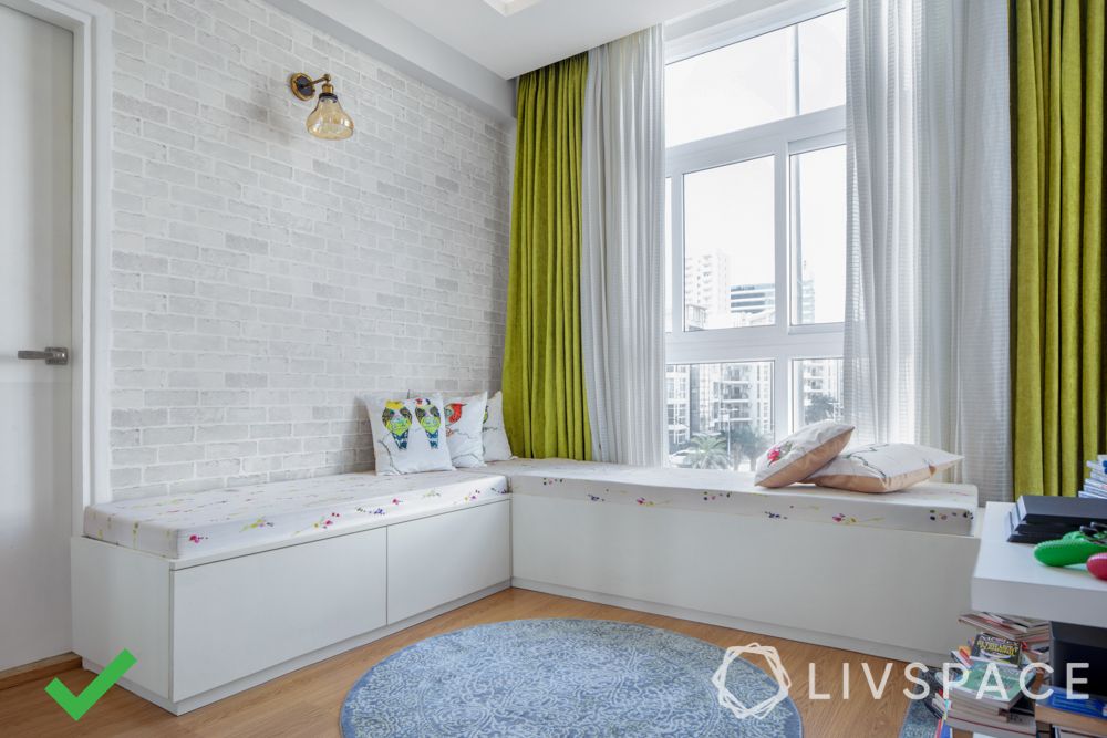
Always keep low-height furniture adjoining windows. In fact, low-height furniture actually makes your room look more airy and bright.
If that is not enough, you can move the furniture away from the window so that it doesn’t obstruct light. Widening the window also helps greatly but requires extensive civil iterations. Also, brush up on 10 ways to make your home brighter.
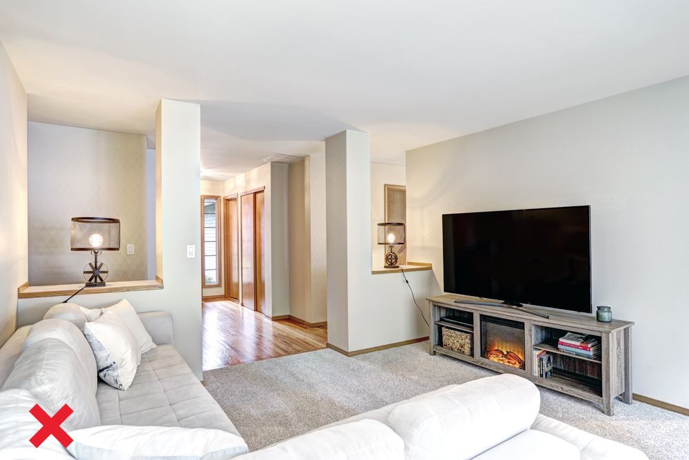
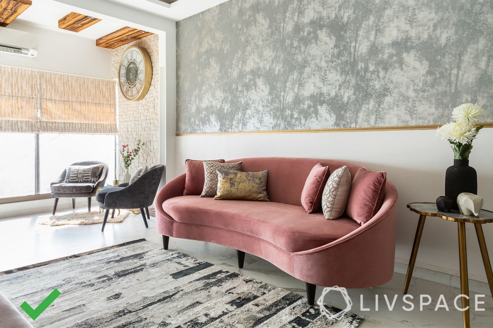
#2: Does Your Furniture Have Its Back to The Wall?
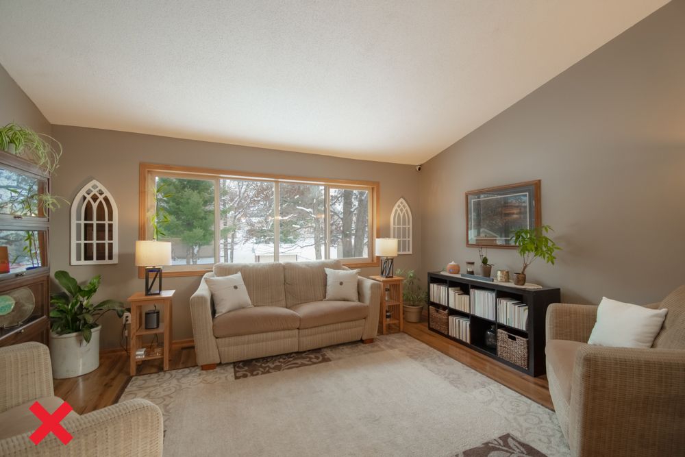
Most homeowners have a tendency to push most of the furniture to the walls in a room. It is a common misnomer that it makes the space look larger. Infact, it makes the room look boxed and flat, which means it is lacking in visual interest. Also, it hinders the organic flow of space within a room.
How to Fix This
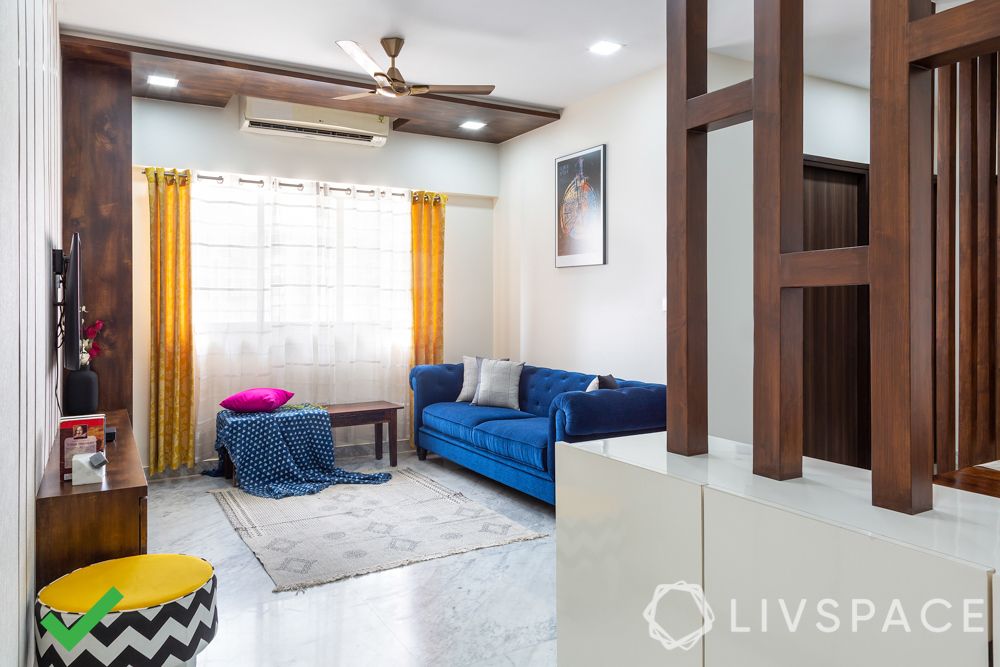
When you push all pieces of furniture to the wall, you are missing out on creating focal points. Thus, create focal points by placing a statement chair away from the wall in a corner.
If you don’t want to make these interior design mistakes, you can also use the furniture to create zones within a room. For instance, a low-height bookshelf could serve as a partition between the living and dining rooms. We can tell you how to arrange furniture in 6 foolproof ways.
#3: Have You Got The Scale All Wrong?
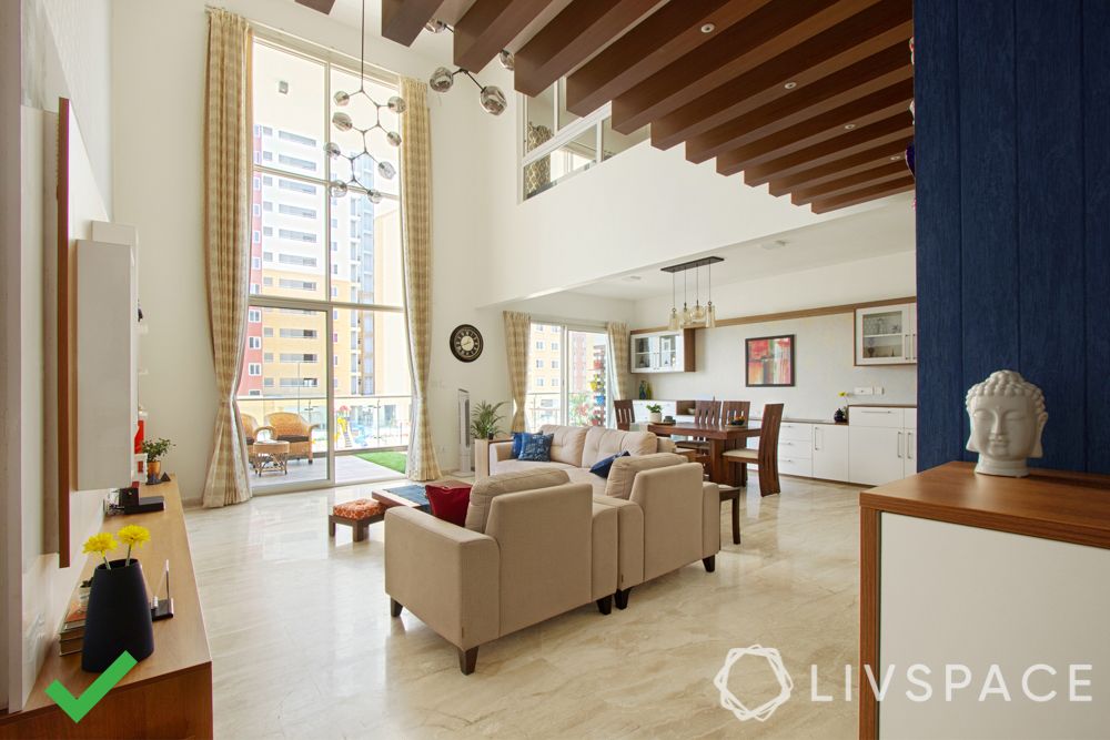
Have you entered a room and felt that it has too much or too little furniture? It is one of the most common interior design mistakes and it is mainly a function of scale. So if you have a huge living room with high ceilings, it does not make sense to furnish it with floor cushions and poufs; you will need bulky furniture that has height to fill up the space. The opposite is also true. For instance, the L-shaped sofa is a particularly interesting case. It is a trending design and helps you seat people for conversations. However, it is also rather large and helps you create zones in a large living room. But put it in a compact living room and it cramps up the space.
How to Fix This
You have to match the scale of your home with the furniture and furnishings you choose. A compact space will naturally look better with lesser and leaner pieces while a bigger space needs some bulk from larger pieces of furniture.
Scale also comes into play when you are applying a design style to your home. For instance, let’s assume you want to go traditional with your interior design. Be mindful of the fact that you are adapting a style that was originally meant for palaces and massive temples for an apartment or house. You need to scale back in order to make it work for your space. Make the most of available space when every inch of space counts…
#4: Too Many Accent Walls?
By definition, an accent wall is the wall that is supposed to be the focal point of the room. So when you have too many focal points, nothing draws your eye. These are classic bad interior design examples. Also, if you are using rich or deep colours for your accent walls, your room will look darker than usual.
How to Fix This
It is the question of asking yourself, how much is too much? Ideally, an average sized room should not have more than one accent wall because it defeats the purpose of being an ‘accent.’
To avoid such interior design mistakes for larger rooms including massive living areas, you can break up the space using a combination of smaller accent walls. Learn how to turn bare walls into accent walls.
Check out wall designs:
#5: Is Over Accessorising Killing It?
Too many cooks spoil the broth and too many accessories ruin your decor! An army of throw pillows is a classic example of interior design mistake. The job of accessories is to complement your decor, not to steal the show. And when you crowd your space with too many cushions, throws, rugs or wall accessories, they also eat up the light in the room.
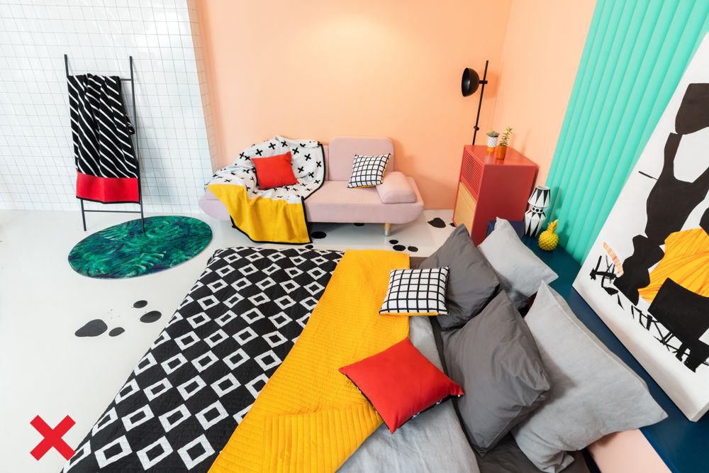
How to Fix This
Choose your accessories with as much care as you choose your furniture or wall paint. These items must adhere to a design plan and not be impulse buys thrown together for no apparent reason.
When you are choosy about the accessories, you can use your space judiciously. And hence avoid bad interior design examples. Besides, you can always use different sets of accessories in rotation to change the look of your home instead of using everything at once. We can help get it right like this Delhi home that makes the most of accessories for a stunning new look.
#6: Layered Lighting Lacking Punch?
Layering is an important aspect of lighting for a room. It involves using different types of lighting, namely ambient, task and accent, in varying combinations. Layering helps light up different parts of the same room with different intensities. Moreover, it also helps draw attention to certain key design elements. But it can also go really wrong. Typically, layering interior design mistakes involve all the different types of lights facing a particular direction (upwards or downwards) or light being concentrated in part of the room while the rest of the space is dark.
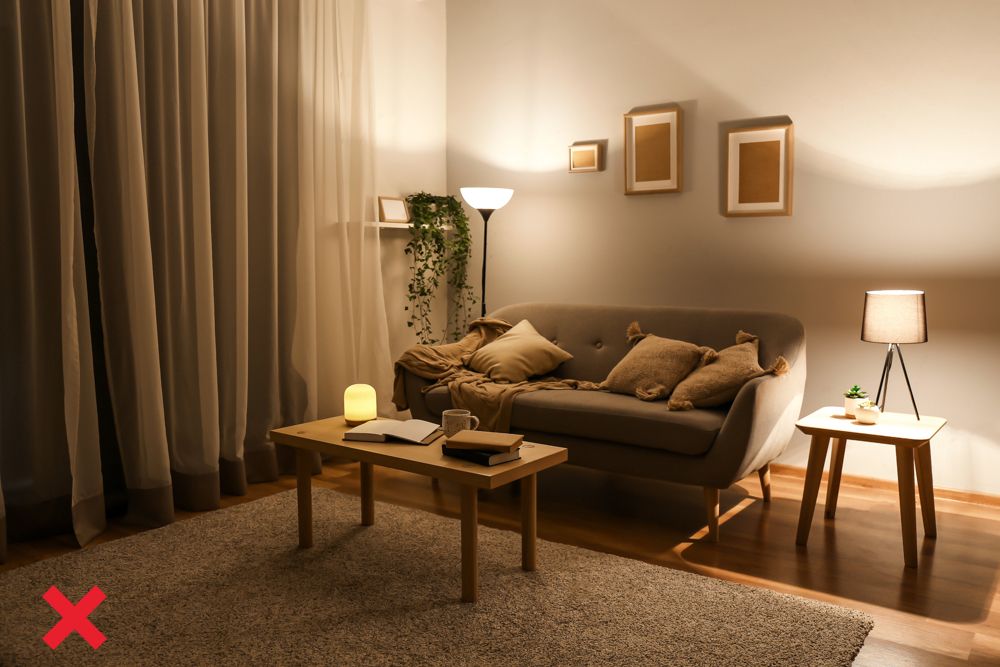
How to Fix This
Always use a balanced mix of different types of lighting and ensure that the lighting fixtures are directed in a variety of directions (upwards, downwards and sideways). This helps spread out the light evenly.
Also, never mix different colour temperatures of light as they are bad interior design examples. It has a detrimental effect on the space. You might want to get details from a beginner’s guide to lighting and how to layer them.
PRO TIP: Don’t Decorate With Anything That You Can’t Maintain
You can decorate your space all you like but don’t lose sight of the fact that you will have to maintain it too. For example, it is great to have plants as a part of your decor. But maintaining plants takes effort. And keeping them alive is the least of your efforts; they need pruning to stay in shape. If you cannot invest that kind of time and effort in your indoor garden, it will turn into a jungle and make your home look dark and cluttered.
Now that you have learnt these, you can be sure to avoid the basic interior design mistakes in your home. If you found this useful, also read how our designers can help you through these blunders.
Send in your comments & suggestions to editor@livspace.com


