
In This Article
- How do different hues affect us psychologically?
- So how do we harness room colour design for our well-being?
- Colourful interior design for creating a peaceful atmosphere
- Guidance on layering subtle hues
- Guidance on incorporating texture and pattern
- Guidance on using lighting
- Guidance on understated colour schemes
- How to create maximalist interiors?
- How different cultures use colour in their interiors
- How can Livspace help you?
Ever felt like your home décor is missing a certain je ne sais quoi?
That’s the kind of design revolution we’re talking about here! Full on maximalist vibes with a synchronised clutter of beautiful shades of colour. But before that…
How do different hues affect us psychologically?
Several case studies have shown that colour is more than just a visual element in interior design; it’s a powerful tool that can profoundly impact our moods, emotions, and even behaviour. The impact of colour on our psyche is rooted in both biological and cultural factors. Our brains are wired to respond to different wavelengths of light, which translate into the colours we perceive. These responses are often linked to primal associations – for example, red is associated with fire and danger, while blue is linked to water and the sky.
So how do we harness room colour design for our well-being?
Let us give you the research behind it: Colour choices in educational and professional environments are often based on the age and needs of the individuals using the space.
- Preschools tend to use bright and exciting colours
- Older students benefit from a mix of warm and cool tones
- Office spaces often incorporate beige and vibrant colours to help employees focus
- Spaces for older adults, like meditation centres, use more subdued colours to create a calming atmosphere
Colourful interior design for creating a peaceful atmosphere
#1. Blue room colour design
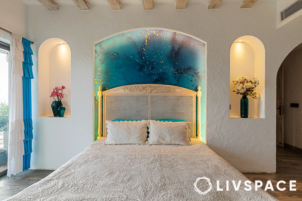
Blue is a classic favourite when it comes to interior design. It’s a versatile colour that works well in any room, and its association with relaxation and calmness makes it a popular choice for creating a peaceful atmosphere. Check out this Santorini-inspired celeb full home design for more inspo!
#2. Green room colour design
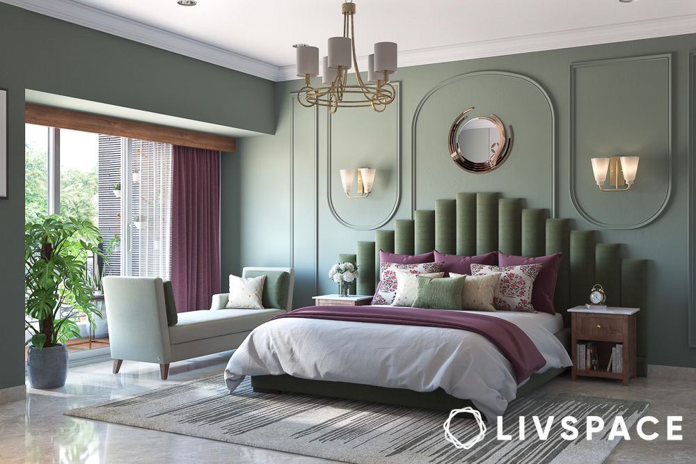
Green is the colour of life, growth, and all things good. Green can make you feel calm, balanced, and connected to nature. So go ahead and bring some green into your life – your mind and body will thank you for it!
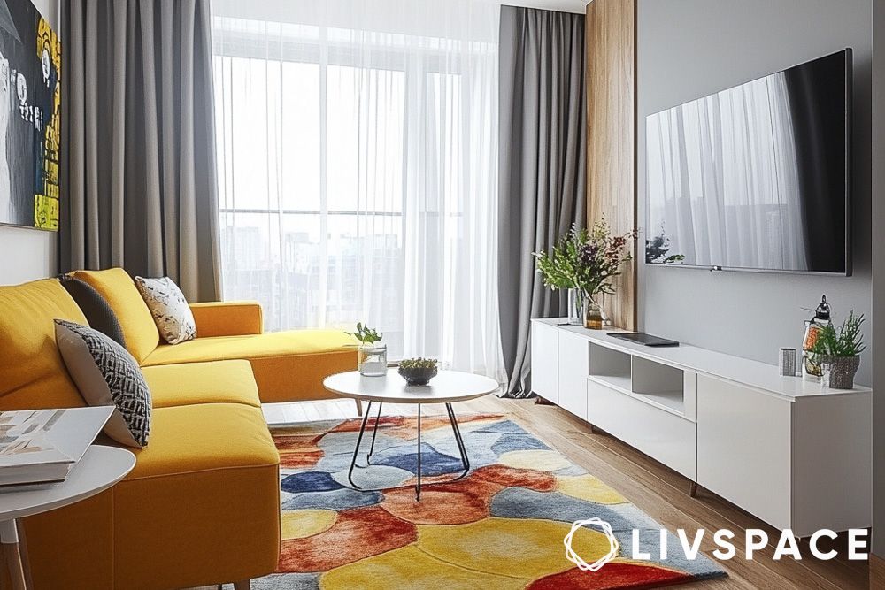
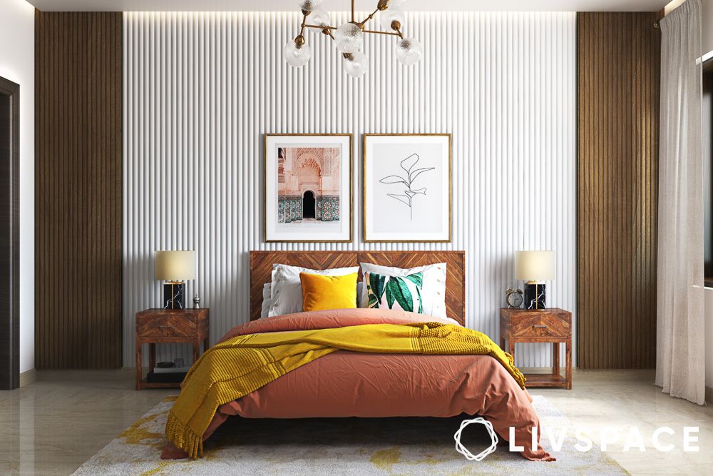
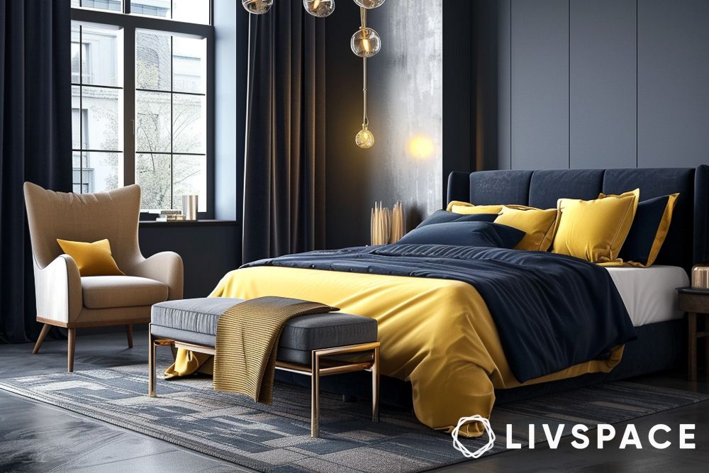
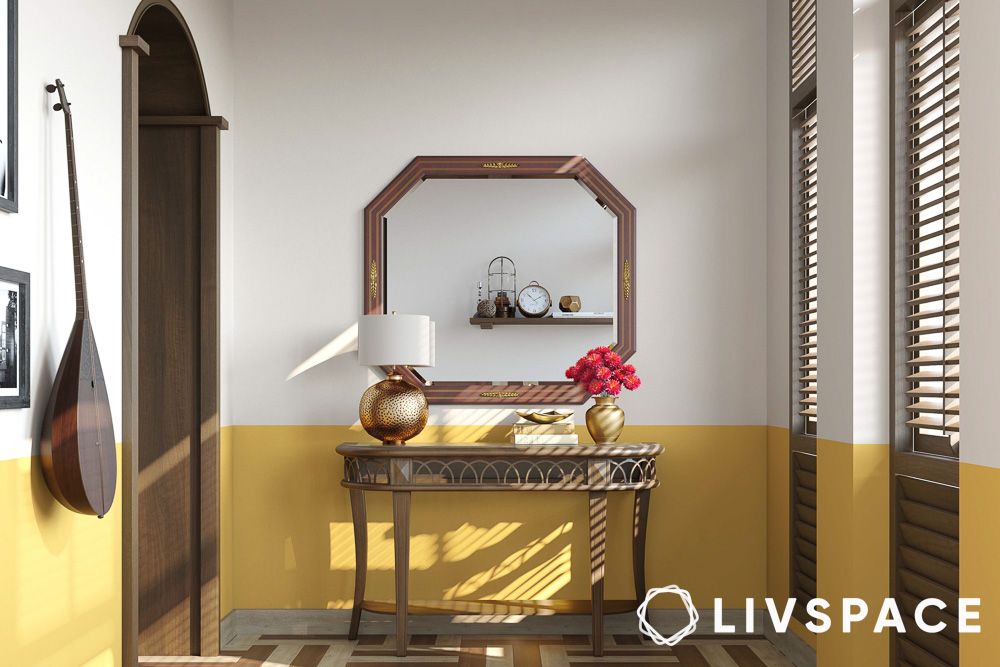
#3. Yellow room colour design
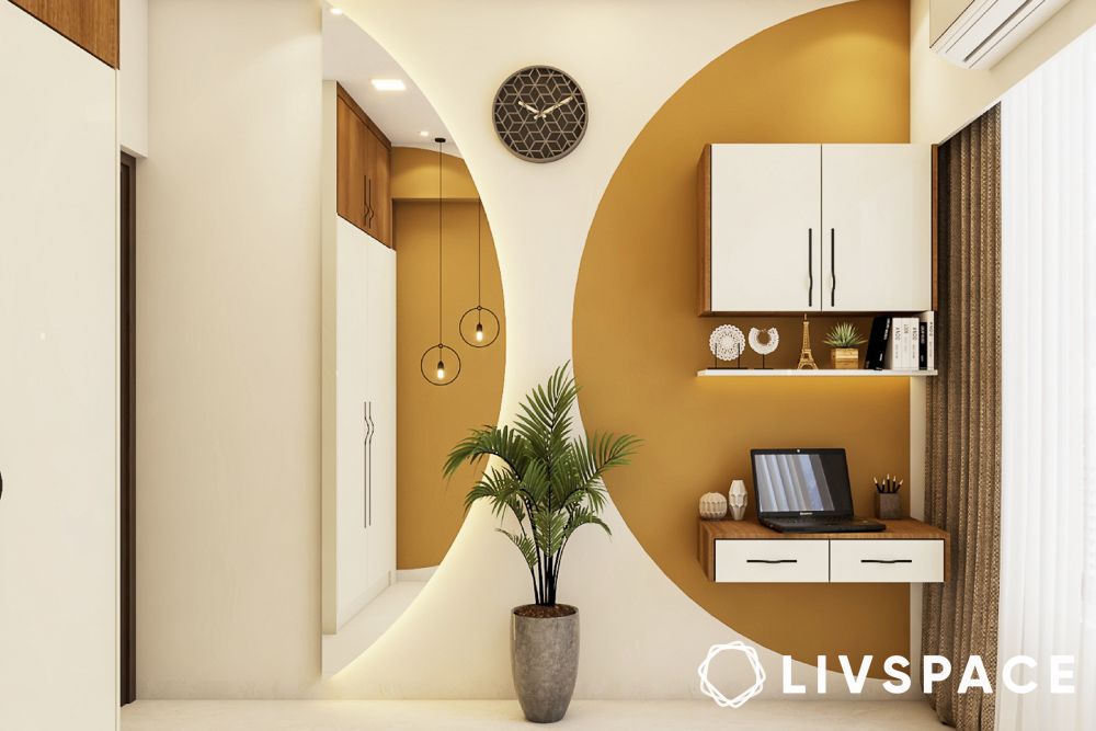
Yellow is the colour of sunshine and smiles! It is often associated with positive emotions such as happiness and optimism and can be used to stimulate creativity and mental activity. This makes it a popular choice for spaces where people gather to eat or work, such as kitchens, dining areas, and workspaces.
#4. Pink room colour design
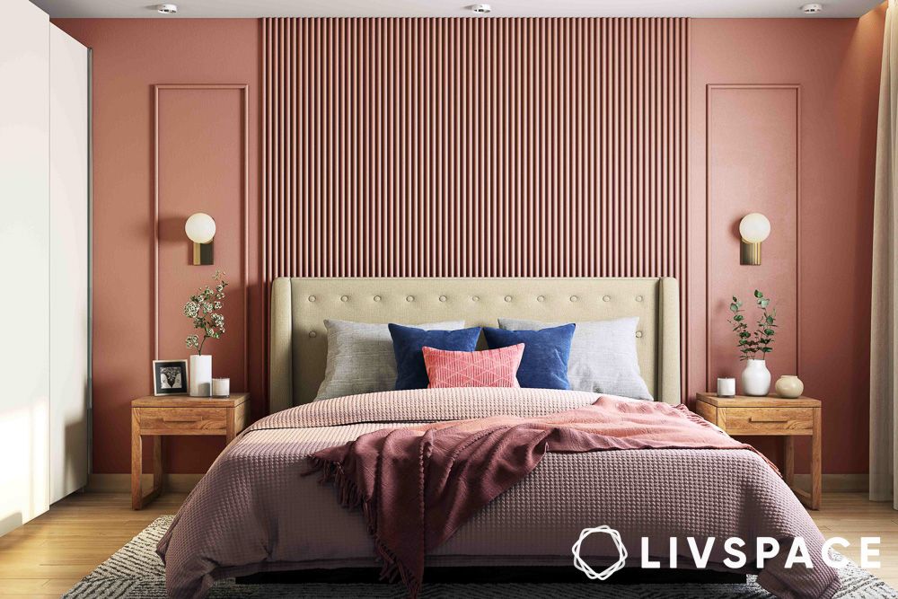
This colour isn’t just for princesses and bubblegum! Often seen as feminine and sweet, pink can make you feel calm, comfortable, and optimistic, creating a nurturing and soothing vibe.
- Lighter pinks, like blush or rose quartz, have been shown to chill people out and reduce aggression, so they’re great as bed room interior colour
- On the other hand, brighter pinks like fuchsia or magenta can inject energy and creativity which are good colours for living room or creative studios
- For best results, use pink as an accent colour with cushions, throws, or artwork to add some warmth without going overboard
- A soft pink feature wall can also create a focal point and add depth
- Pairing pink with colours like greens, gold, or greys can balance things out and create a sophisticated look
- Try using different textures like velvet or faux fur in pink to make things more interesting
Also Read: Pretty in Pink: Two Colour Combinations for Your Bedroom Walls
#5. Neutral room colour design

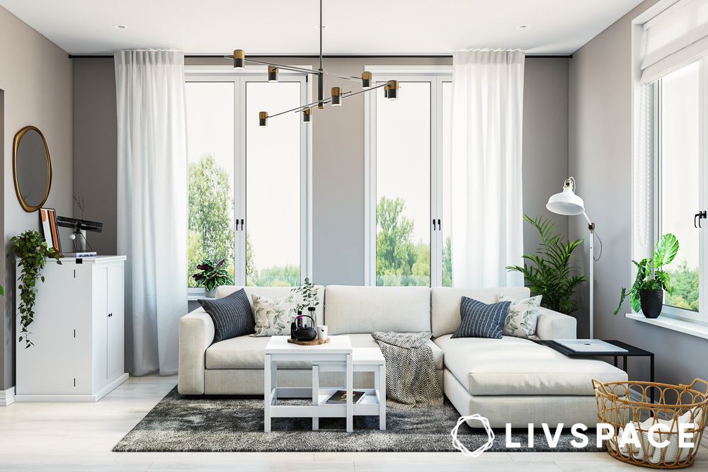
Neutrals are also easy to work with. You can add pops of colour and other decorations without having to completely redo the room. To use neutrals well, try using different shades and textures so it doesn’t look boring. You can add some subtle patterns with rugs or fabrics.
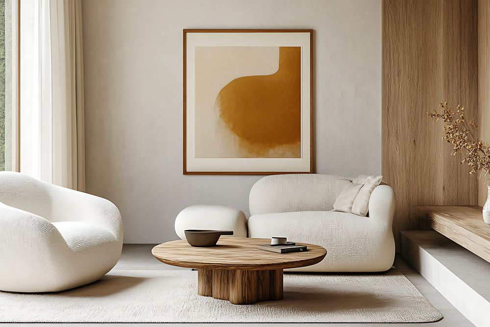
A touch of metal, like gold or silver, can make the room look classy. And don’t forget good lighting! Neutral colours reflect light really well, which makes the room feel bigger and cosy.
Colourful interior design to boost productivity
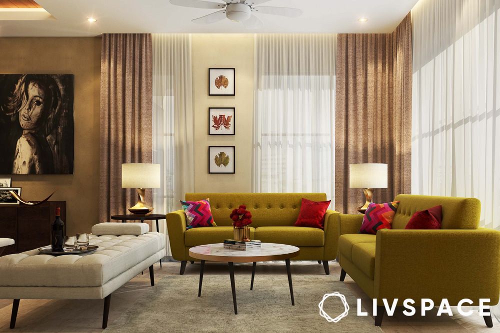
#1. Red room colour design

Red, a psychologically potent colour, is often used in interior design to evoke energy, passion, and excitement. It can boost mood and spark conversation, but it’s also intense and needs to be used carefully. Too much red can make people feel anxious or aggressive.

The best way to use red is as an accent – think of a red sofa or a striking piece of art in a room with neutral colours like white or grey. A touch of red in a dining room can even stimulate appetite, and in a home office design, it can help with focus. The key is to balance red with other colours to create a dynamic and sophisticated space.
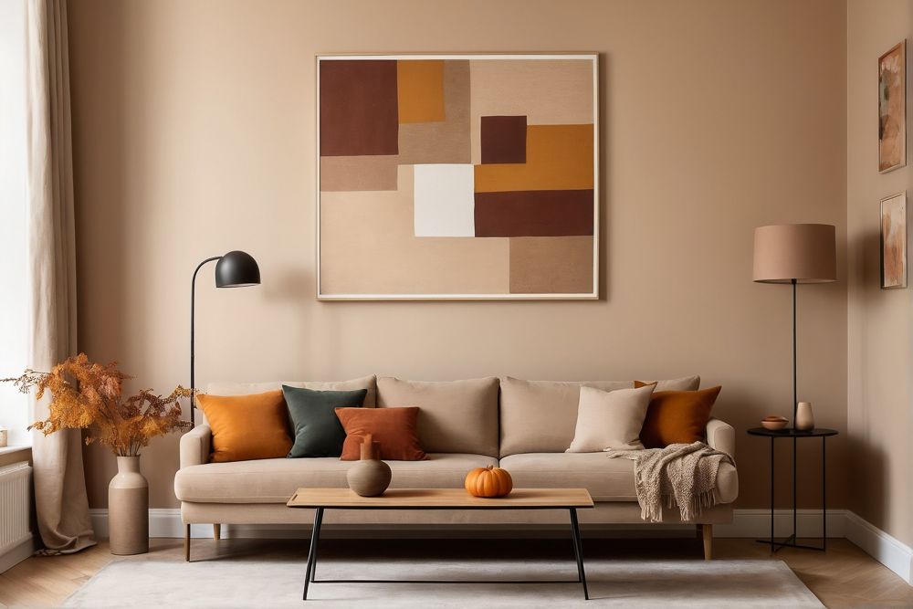
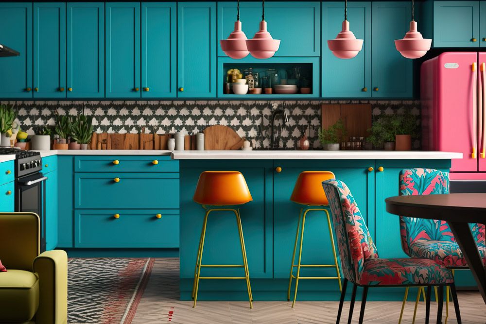
#2. Orange interior design colour combinations

It’s super energetic and can make you feel all warm and fuzzy inside. Think creativity, enthusiasm, and a big dose of happiness! But, like that one friend who’s a bit too enthusiastic, you gotta use it wisely. Maybe throw in some orange cushions or a funky piece of art, or even paint one wall a chill orange. Just don’t go overboard, or your room might feel like a citrus explosion! And, if you’re feeling brave, try mixing orange with its colour buddies, blue or green.
Also Read: Your Guide to Orange Two Colour Combination for Bedroom Walls
#3. Purple interior design colour combinations

Purple, often associated with royalty and spirituality, can bring a unique psychological dimension to interior design.
- Lighter purples, like lavender, create a calm and relaxing atmosphere, perfect for bedrooms and meditation spaces, potentially reducing anxiety and promoting sleep
- Deeper shades, such as plum, can add sophistication and stimulate creativity, making them suitable for studies
However, it’s important not to overdo it, as too much purple can be overwhelming. Consider using purple as an accent, through cushions or artwork, or with a statement piece like a velvet armchair. Pairing purple with complementary colours like soft greens or greys can create a balanced look. Also, remember that different types of lighting design influence how purple appears.
Also Read: Beyond Royalty: Purple Two-Colour Combination for Bedroom Walls
#4. Gold room colour design

Want to make your home feel like a million bucks (without actually spending it)? Sprinkle some gold around! It’s often associated with success and high status, subtly influencing how people feel in a room. Gold’s reflective qualities can also make a space feel brighter and bigger.
The key to using gold well is to treat it as an accent. Think about using it for light fixtures, hardware, decorative items like mirrors and frames, or even in textiles like cushions and throws. A touch of gold leaf or wallpaper design can also create a striking focal point. Remember to balance the gold with neutral or complementary colours for a pleasing overall look.
#5. Coral colour combination for room

Coral, a mix of pink and orange, is a complete mood booster for your home. It can boost energy without being too stimulating, so they are good colours for living room and dining areas. It’s also a fun and youthful colour that can spark creativity and joy. If you want to use coral effectively, try using it as an accent colour on walls, furniture, or textiles.
- For example, a coral-coloured sofa or armchair can be a real eye-catcher in a living room
- Coral throw pillows or blankets can add a pop of colour to a neutral bed room interior colour
- In the kitchen, coral accents on backsplash tiles or kitchenware can make the space feel warm and inviting
- To create a balanced and harmonious look, try pairing coral with complementary colours like teal, mint green, or soft neutrals
Keep in mind that the intensity of the coral shade matters; brighter corals are more energising, while softer, more muted corals are more relaxing.
Guidance on layering subtle hues
Layering subtle hues is all about using a colour scheme where the colours work well together, but with slight differences in how light or dark they are, or how intense they are. This makes a room interesting to look at but still peaceful. Here’s how you do it:
- Pick a main colour that’s neutral or very light
- Then, add things like furniture and cushions in slightly darker or lighter versions of that colour
- You can also play around with warm and cool versions of your colours
- And don’t forget about neutral colours like beige and grey – they can really make your subtle colours pop
Guidance on incorporating texture and pattern

Textured walls and patterns are key to making a space with a simple colour scheme more visually interesting and dynamic. They keep the room from feeling boring and one-dimensional. You can mix different textures like soft fabrics, rustic wood, and shiny metal to make the space more tactile. Also, try adding subtle patterns with things like textiles, wallpaper, or rugs. Think about using soft floral designs, geometric prints, or woven textures. Sometimes, the texture itself can be the pattern, like with a textured wall or a cosy knitted blanket.
Guidance on using lighting
#1. Warm lighting for warm colour combination for room
Warm lighting, with its yellow and orange hues, complements and intensifies the richness of warm colours like reds, oranges, and yellows in your decor. When warm colours are illuminated by warm lighting, they appear more vibrant and saturated, enhancing their visual impact. This combination creates a sense of visual harmony and coherence in the space. It also has a psychological effect on us, promoting feelings of relaxation and comfort.
#2. Natural lighting for dark colour combination for room

The chiaroscuro vibes are strong with this one! Natural light interacts with dark tones in a way that artificial light cannot replicate. It creates a play of light and shadow, highlighting textures and adding depth to the space. This interplay enhances the visual interest of dark tones, more so if there are textures involved.
#3. Cool lighting for cool colour combination for room
Cool lighting, typically in the range of 5000K-6500K, emits a bluish-white light that accurately renders cool colours like blues, greens, and greys. It prevents these colours from appearing washed out or distorted. In workspaces or home offices, cool lighting can enhance focus and concentration. It mimics natural daylight, which has been shown to improve alertness and productivity.
#4. Creating shadows

Shadows create a sense of three-dimensionality, making a space feel more dynamic and interesting. They accentuate the texture of surfaces, whether it’s the roughness of a stone wall or the weave of a fabric and add a tactile element to the visual experience.
Here’s how you can create aesthetic shadow play in your home:
- Use a mix of ambient, task, and accent lighting to create depth and layers of light
- Use dimmers to adjust the brightness of your lights and create different shadow effects
- Play with the direction of your light sources to cast shadows in interesting ways
- Use lighting to emphasize architectural features like columns, arches, or mouldings, creating dramatic shadows that highlight their form
- Incorporate recessed niches or shelves into your walls to create areas of shadow and depth
- Place objects like plants, sculptures, or decorative screens in front of light sources to cast interesting shadows
- Furniture with intricate details or unique silhouettes will create more visually appealing shadows
- Use sheer curtains or blinds to diffuse natural light and create softer shadows
Also Read: Rosewood furniture: To buy or not to buy?
Guidance on understated colour schemes
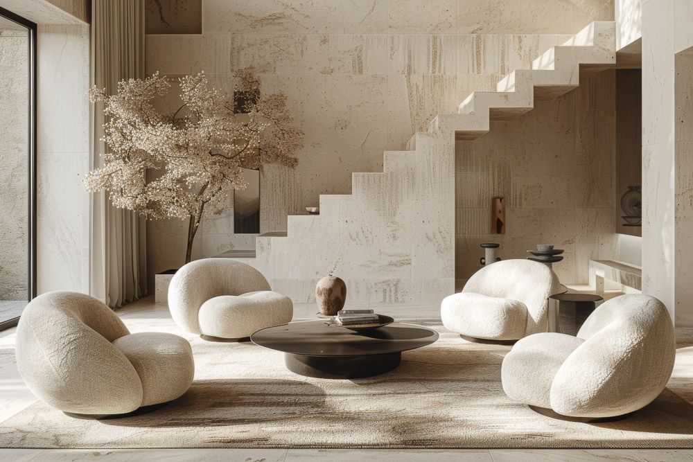
While bold and vibrant colours often grab attention, understated colour schemes are gaining popularity as people seek more calming and sophisticated interiors. These include various shades of white, beige, grey, and cream. They can be used monochromatically or combined to create a warm and inviting atmosphere.
Use different shades and tints of your chosen colours to create depth and visual interest. Balance the use of understated colours with other design elements, such as furniture, artwork, and accessories, to create a harmonious and visually appealing space.
How to create maximalist interiors?
#1. Living room interior design colour combinations
- Focal point: A bold, patterned sofa or a gallery wall filled with eclectic art and photographs
- Colour palette: Rich jewel tones like emerald green, sapphire blue, or ruby red, or a mix of vibrant, contrasting hues
- Patterns: Layer different patterns like florals, geometrics, and animal prints, but ensure they have some colour or scale in common to create cohesion
- Textures: Combine luxurious textures like velvet, silk, and faux fur with contrasting materials like wood, metal, and glass
- Lighting: Use a mix of statement lighting fixtures like chandeliers, table lamps, and wall sconces to create a warm and inviting living room design
#2. Bed room interior colour
- Statement bed: A canopy bed with a dramatic headboard design or a bed piled high with patterned cushions and throws
- Wallpaper: Cover the walls of your bedroom design with bold, patterned wallpaper or create a feature wall with a mural or a collection of framed artwork
- Textiles: Layer luxurious bedding, including a duvet, throw blankets, and decorative pillows in various textures and patterns
- Accessories: Display your favourite collections, whether it’s books, vintage finds, or travel souvenirs, on shelves, dressers, or nightstands
#3. Kitchen
- Bold backsplash: Use a vibrant tile or a patterned wallpaper for the backsplash design to add a pop of colour and personality
- Open shelving: Display your favourite dishes, glassware, and cookbooks on open shelves to create a visually interesting focal point
- Mix and match: Combine different cabinet styles, hardware finishes, and countertop materials to create a unique and eclectic look
- Statement lighting: Install a statement chandelier or pendant lights over the island or dining room design to add a touch of drama
Also Read: How to Choose the Perfect Dining Table Design?
#4. Bathroom
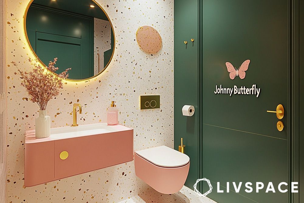
- Wallpaper: Cover the walls with bold, patterned wallpaper, even in a small bathroom, to create a jewel-box effect
- Statement mirror: Choose a decorative bathroom mirror with an ornate frame or an unusual shape to add a touch of glamour
- Textiles: Use luxurious towels, bath mats, and shower curtains in rich colours and patterns
- Accessories: Display your favourite bath products, candles, and plants on trays or shelves to create a spa-like atmosphere
#5. Pooja room
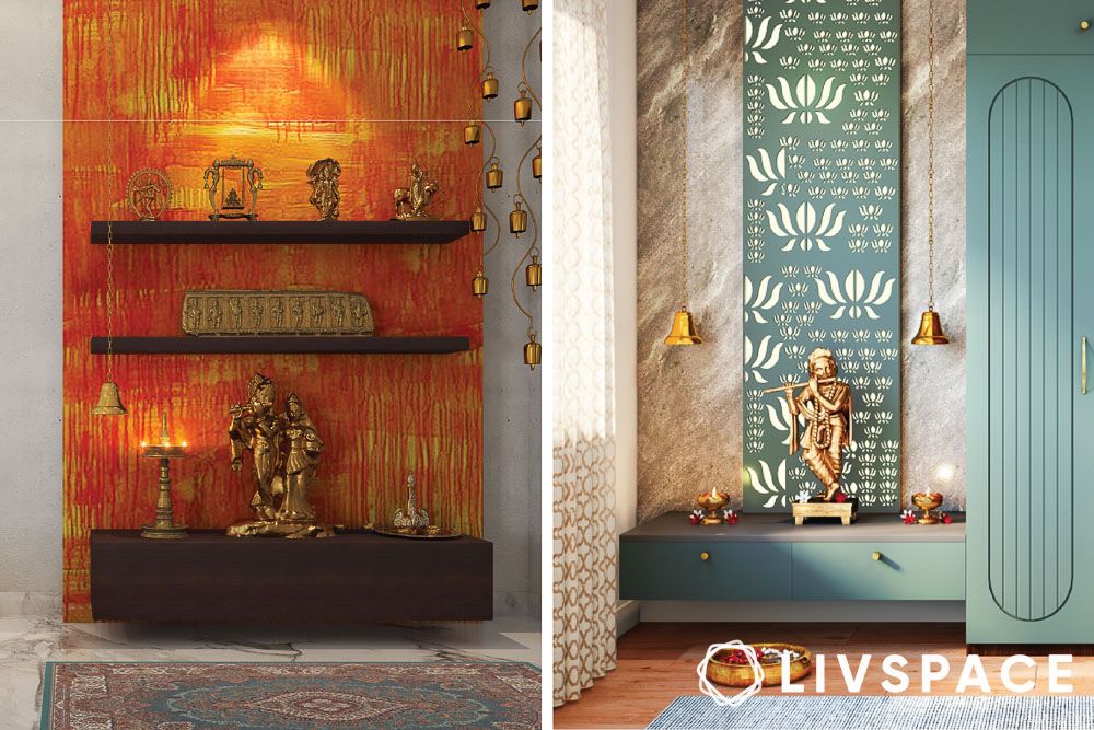
- Metallic accents: Incorporate gold, silver, or brass through decorative elements, idols, or even small furniture pieces. These metallic touches add a touch of divinity and luxury
- Textured walls: Consider textured wallpaper, intricately carved panels, or even a mural depicting a divine scene
- Fabric overload: Use rich fabrics like silk, velvet, or brocade for curtains, drapes, or even a backdrop for your idols
- Offerings: Create a designated space for offerings, whether it’s a small bowl for water, a plate for fruit, or a place to light incense
#6. Balcony
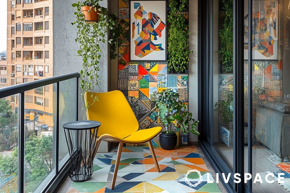

- Statement flooring: Instead of plain concrete or tiles, consider patterned tiles, a colourful outdoor rug, or even artificial turf with a fun design
- Walls: Use weather-resistant wallpaper with a bold print, create a gallery wall with outdoor-safe art, or paint a vibrant mural
- Plant variety: Go beyond basic balcony garden ideas. Include a mix of:
- Tall, leafy plants: Think bamboo, ferns, or small trees for a jungle vibe
- Trailing plants: Let them cascade from hanging baskets or shelves
- Flowering plants: Choose vibrant blooms in various colours and sizes
- Succulents and cacti: Add interesting shapes and textures
- Statement furniture: A brightly painted bistro set, a hanging egg chair, or a unique outdoor sofa can be a focal point
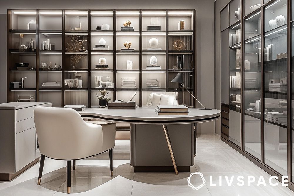
#7. Home office

- Display your treasures: A maximalist home office is a perfect place to showcase your favourite collections. Display books, artwork, travel souvenirs, and other cherished items
- Organised chaos: While maximalism embraces a sense of abundance, it’s important to keep your collections organised and not overly cluttered. Use shelves, cabinets, and display cases to keep everything tidy
- Statement desk: This could be a vintage writing desk, a brightly coloured modern desk, or even a large, ornate table
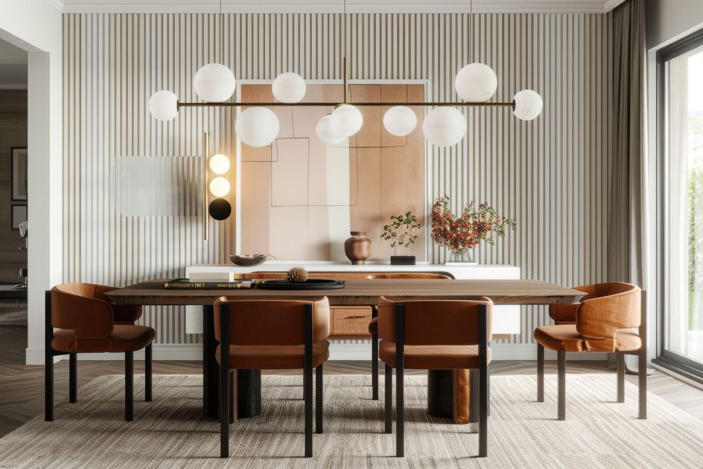
#8: Dining room
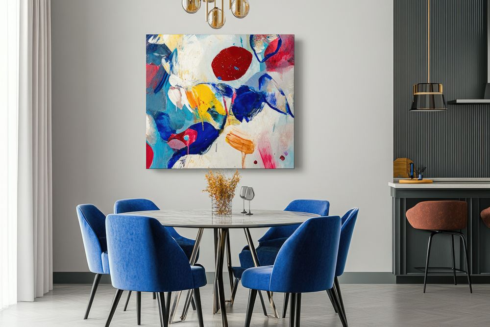
- Statement table: A large dining table with a unique design or a bold finish can be the centrepiece of the room
- Mix and match chairs: Combine different chair styles and colours around the dining table to create an eclectic and interesting look
- Wallpaper: Use bold, patterned wallpaper on the walls or ceiling to add drama and personality
- Lighting: Install a statement chandelier or pendant lights over the dining table to create a warm and inviting atmosphere
How different cultures use colour in their interiors
Indian home interior colour
- Vibrant and symbolic: Indian homes often feature a riot of colour, reflecting the country’s rich cultural heritage and diverse traditions
- Meaningful hues: Colours are often chosen for their symbolic meaning. For example, yellow represents knowledge and wisdom, while red symbolises auspiciousness and is often used in wedding decorations
- Pattern play: Intricate patterns and motifs are common, adding visual interest and storytelling to the space
- Materials: Natural materials like wood, stone, and textiles are favoured, adding warmth and texture to the colourful palette.
Moroccan home interior colour
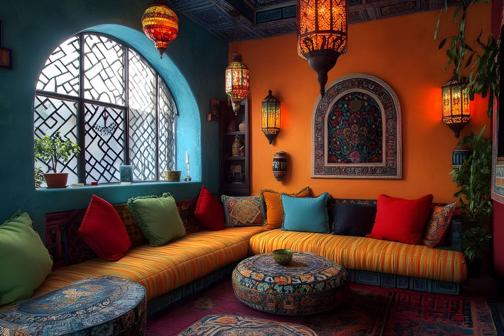
- Rich and earthy: Moroccan interiors often feature warm, earthy tones like terracotta, ochre, and sand, reflecting the desert landscape
- Jewel tones: Vibrant jewel tones like emerald green, sapphire blue, and ruby red are used to add pops of colour and create a sense of opulence
- Intricate details: Detailed tilework, carved wood, and ornate metalwork are common, showcasing the country’s rich craftsmanship
- Textiles: Richly textured textiles like carpets, rugs, and tapestries are used to add warmth and comfort to the space
Mexican Hacienda colour combination for room
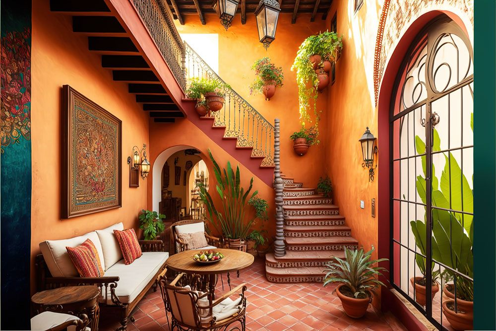
- Bold and festive: Mexican homes are known for their bold and vibrant colour palettes, reflecting the country’s festive culture and love of life
- Earthy tones: Earthy tones like terracotta, ochre, and burnt orange are often used as a base, with pops of bright colour added through textiles, artwork, and decorative objects
- Handcrafted details: Handcrafted details like painted tiles, woven textiles, and folk art are common, adding a personal touch and celebrating the country’s artistic heritage
Japanese home interior colour
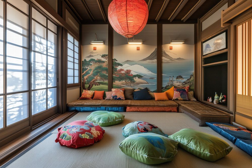
- Minimalist and serene: Japanese home interior colour often feature a minimalist colour palette, focusing on natural materials and subtle hues
- Neutral tones: Neutral Japanese home interior colour like white, beige, and grey are used to create a sense of calm and tranquillity
- Natural light: Natural light is highly valued, and spaces are designed to maximise its flow
- Wood and bamboo: Natural materials like wood and bamboo are used extensively, adding warmth and texture to the space
Scandinavian home interior colour

- Light and bright: Scandinavian homes often feature a light and bright colour palette, reflecting the region’s long winters and desire for warmth and light
- White and grey: White and grey are used extensively to create a sense of spaciousness and airiness
- Pops of colour: Pops of colour are added through textiles, artwork, and furniture, often in muted tones
- Natural materials: Natural materials like wood, wool, and linen are used to add warmth and texture to the space
African home interior colour
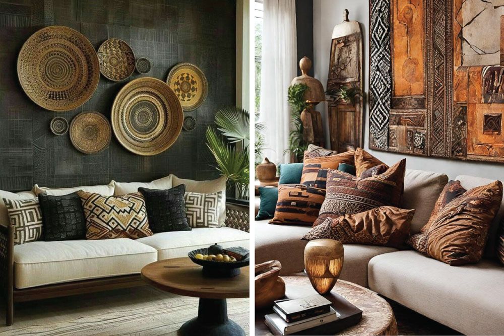
Image credits: Pinterest @anilashaheen371 and @casavitahomedesign
- Warm and earthy: African interiors often feature warm, earthy tones like terracotta, ochre, and brown, reflecting the continent’s diverse landscapes
- Bold colours: Bold colours like red, orange, and yellow are used to add vibrancy and celebrate the continent’s rich cultural heritage
- Natural materials: Natural materials like wood, stone, and leather are used extensively, adding texture and authenticity to the space
- Patterns and motifs: Traditional patterns and motifs are often incorporated into textiles and decorative objects, telling stories and preserving cultural traditions
How can Livspace help you?
When it comes to designing your home, colours play an important role. We hope you found these house colour ideas useful! If you want the best colour for the interior of your home, then look no further. Book an online consultation with Livspace today.
- Our team can custom design your dream home with curated render designs and expert advice
- We have delivered over 75,000 happy homes
- Count on us for premium-grade materials that are not only high-quality but also built to last
Wondering how our customers feel about working with us? Check out the Livspace reviews here!


