
In This Article
With the start of every year, global trends make the rounds and homeowners around the world make decisions. Soft sage living rooms, buttery yellow kitchens, dusty blue bedrooms that look like they belong in a French countryside cottage. The walls get painted. And then, the summer arrives.
Indian light is not the light those palettes were designed for. It’s more intense, more directional, and in peak summer months, more relentless. A colour that looks calm in a north-facing London flat can feel washed out or simply off in a west-facing Mumbai room at 4pm.
Your city matters too. Mumbai’s humidity does something different to colour than Delhi’s dry afternoons. Bengaluru’s gentle light is a different brief from Ahmedabad’s long, blazing summers.
Why colour hits differently in an Indian home
Light, heat and the walls in between
Walk into a well-photographed room on Pinterest and the light is soft, diffused, almost apologetic. It flatters everything. Now think about your living room at noon in May. That is a different kind of light entirely.
Indian sunlight is high-intensity and directional. In summer it comes in hard, bleaches out lighter colours, and makes saturated ones vibrate in a way that is genuinely exhausting to live with. Colours that photograph beautifully in temperate conditions can feel loud, washed-out or simply wrong on an Indian wall because they were never road-tested in this kind of light.
This is why finish matters as much as colour. A matte or eggshell finish absorbs light rather than bouncing it back into the room. A high-gloss wall in a bright Indian room is almost always a mistake, regardless of the colour on it.
Also Read: Discover 14 Different Types of Paints for Your Home
Your city is part of the brief
Mumbai and Delhi are both hot in summer but they are not the same brief. Mumbai’s humidity means colours can look slightly deeper and more saturated than they do on a paint chip, and rooms with limited ventilation can feel heavy if the palette is too warm or too dark. Delhi’s dry heat and intense afternoon glare wash colour out in a different way, making deeper, earthier tones more reliable than pale ones.
Bengaluru sits in a relatively forgiving middle ground. Chennai and Hyderabad deal with a combination of heat and strong light that makes cooler, more muted tones the sensible starting point. Kolkata’s pre-monsoon months are brutal in a specific way, humid and airless, and the colour choices that help are different again from what works in Ahmedabad’s long, bone-dry summers.
The city-by-city guide at the end pulls this together. But it helps to have this in mind as you read through the colours.
The 2026 colour trends and how they hold up in Indian heat
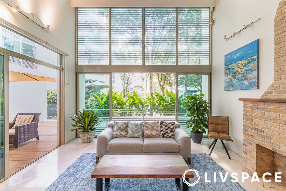
Warm whites and cloud tones
What it is: Not the stark, blue-toned white that dominated interiors for years. Warm whites have a barely-there undertone of cream, blush or grey that makes them feel considered rather than clinical. Think the colour of good cartridge paper, or a cloudy morning sky. I’m sure you haven’t missed Cloud dancer, the Pantone colour of the year.
Why it works in India: Bright white is one of the most common mistakes in Indian interiors. In high-light rooms it creates glare. In lower-light rooms, especially older Mumbai flats with small window types, it reads as dingy rather than fresh. Warm white avoids both problems. It reflects light without amplifying it, and it holds up on overcast days in a way that stark white simply does not.
Where to use it: Everywhere, honestly. This is the most universally safe pick on this list. It works as a base for every room and in every city. If you are painting a room and genuinely unsure, this is where to start.
One watch-out: Warm whites can read as yellow in rooms with very warm artificial lighting at night. Test your chosen shade under the bulbs you actually use before committing.
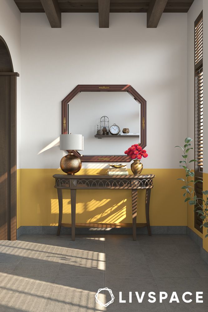
Sun-faded ochre and butter yellow
What it is: Not a bright, saturated yellow. Think of the colour of old plaster walls, or turmeric diluted into something softer. Warm, optimistic, slightly weathered-looking.
Why it works in India: Because Indian summer light already has yellow in it. This is a colour that works with the quality of the light rather than against it. Where a cool colour might look strange or washed out in afternoon sun, ochre and butter yellow simply deepen and glow. It is one of the few trends on this list that feels native rather than imported.
Where to use it: Bedrooms and dining rooms respond particularly well. It is warm enough to feel cosy in the evening and light enough not to feel oppressive during the day. Works beautifully as an accent wall rather than a full-room commitment.
One watch-out: Avoid using it in west-facing rooms that get direct afternoon sun. In those rooms, this colour can tip from warm and inviting to hot and claustrophobic.
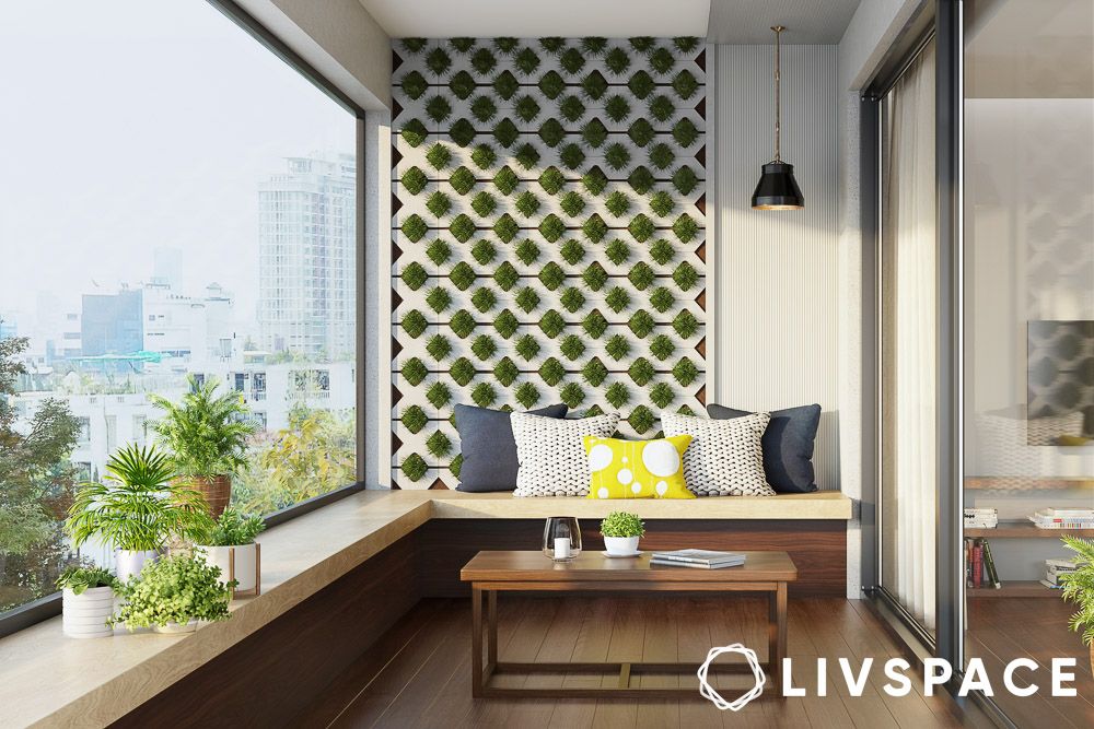
Sage, olive and muted greens
What it is: Greens that have been quietened down, greyed out or deepened so they feel botanical rather than bright. Sage is the soft, silvery version. Olive is earthier and warmer. Muted greens sit somewhere in between.
Why it works in India: Green is psychologically cooling, which matters in a hot climate. More practically, muted greens are flattering under both natural and artificial light, which means they hold up across the full range of Indian daylight conditions. They also connect visually to the greenery outside the window, which is a particular advantage in cities like Bengaluru and Pune where there is still plenty of it.
Where to use it: Bedrooms are the natural home for this palette. A sage green bedroom is one of the most restful rooms you can create in an Indian home. Works equally well in living rooms, especially when paired with natural materials like cane, wood and cotton.
One watch-out: Olive can read as dull or flat in rooms with very limited natural light. If your room is north-facing or has small windows, go for the lighter, more silvery end of the green spectrum.
Terracotta and baked clay
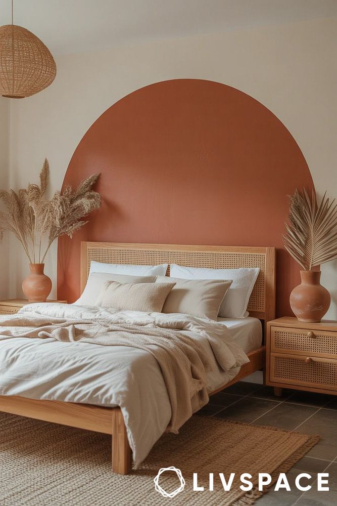
What it is: The warm, earthy red-orange family. Ranges from a pale, dusty apricot to a deeper, more burnt shade. At its best it looks like sun-baked earth, old pottery, or the walls of a Rajasthani haveli.
Why it works in India: Of all the trends on this list, terracotta is the one that feels most at home here. It is rooted in Indian craft, Indian architecture and Indian light. It does not need to be translated or adjusted. In dry-heat cities especially, it feels completely right.
Where to use it: Feature walls in living rooms, entryways, and dining rooms. It creates warmth and depth without needing much else around it. Pairs naturally with brass, dark wood and cotton textiles in off-white or cream.
One watch-out: Terracotta does not work as well in humid cities. In Mumbai or Kolkata, especially in rooms with limited airflow, it can make a space feel heavy and airless. If you live in a humid city and love this colour, use it in small doses rather than as a dominant wall colour.
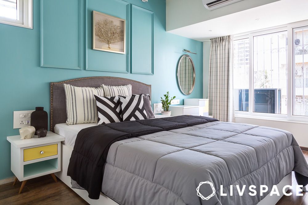
Dusty, muted blues
What it is: Not the bright, saturated blues of a few years ago. This is the grey-based, almost-faded version. The colour of old denim, or a hazy sky just before the monsoon. It does not shout.
Why it works in India: Blue is visually the coolest colour, and this version of it is calm enough not to feel cold or stark in the way that some blues can. In cities where the summer heat is relentless, a dusty blue room offers genuine psychological relief. It is also one of the most flattering colours under artificial light in the evening.
Where to use it: Bedrooms first and foremost. A dusty blue bedroom in Chennai or Hyderabad is hard to argue with. Also works well in bathrooms and as an accent in living rooms.
One watch-out: In rooms with limited natural light, dusty blue can start to feel melancholy rather than calm. Balance it with warm wood tones and plenty of warm-toned lighting.
Warm neutrals: Caramel, soft taupe and greige
What it is: The middle ground between beige and something more interesting. Caramel has warmth and depth. Soft taupe is cooler and more sophisticated. Greige sits in between. These are not the cold, flat greys that dominated the last decade.
Why it works in India: Cool grey, for all its global popularity, has always been slightly at odds with Indian light. It can look beautiful in photographs and slightly lifeless on the wall. Warm neutrals solve this problem. They have enough warmth to feel alive in Indian light without being as committed as ochre or terracotta. They are also the most versatile backdrop for furniture and textiles of any colour on this list.
Where to use it: Every room, every city. This is the all-purpose, all-climate pick. Particularly useful in open-plan homes where you need a colour that connects multiple spaces without dominating any of them.
One watch-out: The risk with warm neutrals is that they can feel safe to the point of being forgettable. If this is your whole-home colour, make sure your furniture, textiles and lighting have enough personality to carry the space.
Your city, your palette: A quick guide
Where you live shapes how colour behaves on your walls. Here is a city-by-city summary.
| City | Key challenge | Palette that works | One to avoid |
| Mumbai | Humidity + low natural light in older buildings | Warm whites, cloud tones, dusty muted blues | Bright white (glare on good days, dingy on overcast ones) |
| Delhi NCR | Harsh afternoon glare + intense dry heat | Ochre, terracotta, baked clay, deep earthy greens | Cool greys (feel clinical and wrong under Delhi light) |
| Bengaluru | Relatively mild, the most forgiving city on this list | Sage, olive, caramel, almost anything works here | Very dark tones in older, smaller flats |
| Chennai | Intense heat + coastal humidity + strong light | Dusty blues, muted greens, warm neutrals | Terracotta and warm oranges (add visual heat you don’t need) |
| Hyderabad | High light intensity + dry-ish heat | Muted greens, warm whites, soft taupe | Saturated or bright colours, the light will amplify them |
| Kolkata | Humidity + strong seasonal light shifts (pre-monsoon heat is brutal) | Warm whites, butter yellow, muted greens | Dark, heavy tones, they absorb the pre-summer heat and make rooms feel airless |
| Pune | Dry heat with good natural light, more temperate than most | Sage, dusty blue, warm neutrals, soft taupe | High-contrast palettes, unnecessary in a city with this much going for it light-wise |
| Ahmedabad | Extreme dry heat, intense glare, long summers | Earthy ochres, baked clay, warm whites | Bright or cool whites, the glare makes them harsh and cool tones feel disconnected from the climate |
What to actually avoid: The heat filter
A few things that come up again and again, and are worth saying plainly.
Dark accent walls in west-facing rooms are almost always a mistake. A deep charcoal or forest green feature wall sounds compelling on paper. In a room that takes the full force of afternoon sun from the west, it will absorb heat and make the room feel smaller and hotter than it already is.
Stark, blue-toned white in direct sunlight creates glare that is genuinely uncomfortable to live with. It also has a tendency to look grey and cold in the shade, which means it rarely looks good at any point during an Indian summer day.
High-contrast palettes, think very dark walls paired with very bright accents, create visual tension that is exhausting in a hot room. Your eyes are already working harder in strong light. A high-contrast colour scheme adds to that load rather than relieving it.
Cool, clinical greys, the ones with a blue or green undertone, have always been slightly at odds with warm Indian light. They can look beautiful in a showroom with controlled lighting and feel flat and slightly wrong at home. In summer especially, they offer none of the visual warmth that makes a hot room feel liveable.
Try the trend without repainting: Low-effort ways to bring in summer colour
Not everyone is in a position to repaint, and not every renter wants to negotiate with a landlord. The good news is that colour does not have to come from the walls.
Curtains are one of the highest-impact changes you can make in a room. A set of linen curtains in dusty blue or warm white will shift the entire feeling of a space, filter the light coming in, and do double duty as a cooling measure. No drilling required if you use tension rods or clip rings on existing fixtures.
Cushion covers and throws are the lowest-commitment entry point. A sofa that felt heavy and dark in winter can feel completely different with a set of sage or butter yellow cushions swapped in for summer. This is also the easiest way to test whether a colour actually works in your specific room before committing to paint.
A single painted wall is enough in most rooms. You do not need to paint all four walls to get the effect. One terracotta wall in a living room, one dusty blue wall in a bedroom, gives you the colour story without the full commitment. In a rented home, this is often negotiable with a landlord in a way that a full repaint is not.
Bedlinen is underrated as a colour vehicle. Most people look at their bedroom walls. They actually spend more time looking at their bed. A set of warm neutral or sage bedlinen changes the room more than most people expect.
Start with what you can change this weekend. The colour does not have to be permanent to be worth trying.
How can Livspace help you?
- 100,000+ happy homes designed with expertise and trust
- Operational in 100+ cities across India for seamless service
- 3,500+ designers and professionals bringing your dream home to life
- Designed to last, our products come with a lifetime warranty
Finding the right designs for your dream home is not an easy feat. The good news? You don’t have to figure it out alone, and you definitely don’t need to make expensive mistakes that’ll haunt you every time you walk into your home.
Looking for tailor-made costs for your home? Hit our Cost Calculator to jump into your financial planning.
Need inspiration beyond your current Pinterest spiral? Check out Design Ideas for professionally curated looks that actually translate to Indian homes and lifestyles.
Want to see what real people think? We have designed over 75,000+ homes. Browse through Livspace reviews from customers and hear what they have to say about us.
Ready to take the next step? Find an interior designer near you and let’s get started.


