
In This Article
- Foyer: First impressions matter
- Living room: The art of togetherness
- Brown, grey and white tones: The neutral territory
- Kitchen: A subtle affair
- Primary bedroom: Where rest meets refinement
- Kids’ bedroom: A Growing room for growing minds
- Secondary bedroom: The gentle alternative
- The larger truth
- How can Livspace help you?
In the curious ecosystem of Hyderabad’s residential developments, where naming conventions seem to favour celestial aspiration (towers that “soar,” residences that “shine”), Hallmark Skyrena makes its own modest claim to vertical ambition. But step inside this particular 3BHK flat, and you discover something infinitely more interesting than nomenclature: timeless beauty can be achieved through the sort of restraint that comes not from parsimony but from genuine understanding.
With ₹25 lakh and what one suspects was considerable thought, this 3BHK sprawling across 2,255 square feet in Narsingi gives us the best lesson of all—that luxury lies not in excess but in the confidence to say “enough.”
Who Livs here: Akkiraju Chandramouli and family
House type: 3BHK
Area: 2,255 sq. ft.
Scope of work: Full Home Design
Budget: 25L
Property name: Hallmark Skyrena
Address: Hallmark Skyrena, Narsingi Main Road, Narsingi, Hyderabad, 500075
Livspace designer: Harsha Agarwal
Foyer: First impressions matter
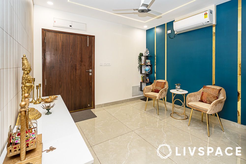
The old adage about first impressions rings particularly true here. Visitors are greeted by a striking blue accent wall adorned with sleek golden panel strips. It’s a bold choice that could have easily veered into gaudy territory, but the restraint shown in execution—those clean, geometric lines—keeps it sophisticated.
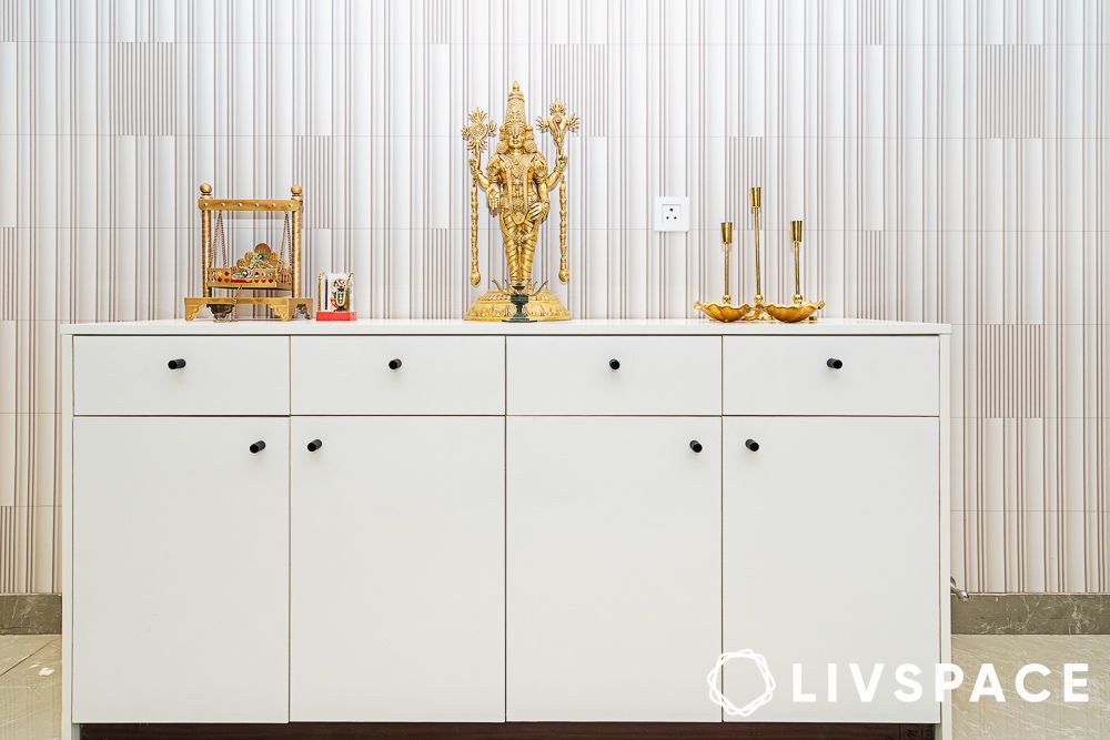
A white console table design serves as the foyer’s anchor, dressed with golden accents and carefully curated décor. Behind this tableau, wallpaper featuring golden and brown lines creates depth without overwhelming the space. It’s worth noting that wallpaper in Indian homes often suffers from the “more is more” philosophy, but here it’s deployed with surgical precision—enough pattern to intrigue, not enough to tire the eye.
Living room: The art of togetherness
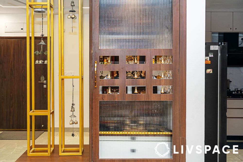
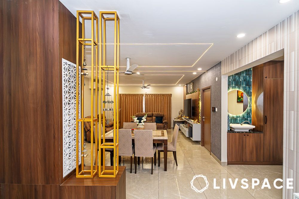
The transition from foyer to living space shows us the deftness of the designer. A small wooden unit—actually a pooja unit with fluted glass panels—serves as a gentle partition alongside decorative golden rods. It’s a clever bit of spatial choreography that maintains the open-plan ethos whilst providing just enough separation to define territories.
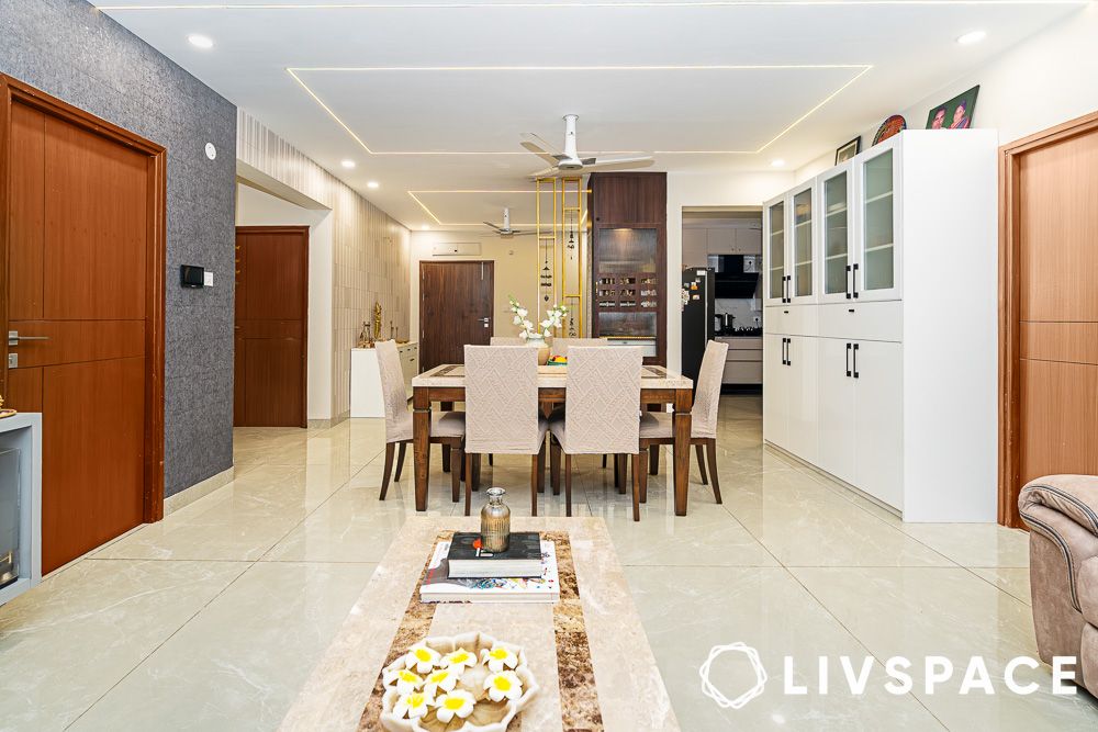
The living room seamlessly incorporates the dining area, creating that much-coveted “great room” feeling that developers promise but rarely deliver. What ties this ambitious space together is the false ceiling design, complete with sleek LED strips and recessed lighting that provides both ambient and task illumination. The golden accent lights and linear ceiling elements—part of the project’s signature use of vertical elements to make spaces appear grander.
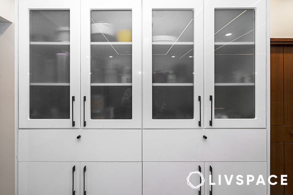
Near the dining area, a white modular crockery unit with black handles proves that storage needn’t be an afterthought—it can be a design feature in its own right.
Brown, grey and white tones: The neutral territory
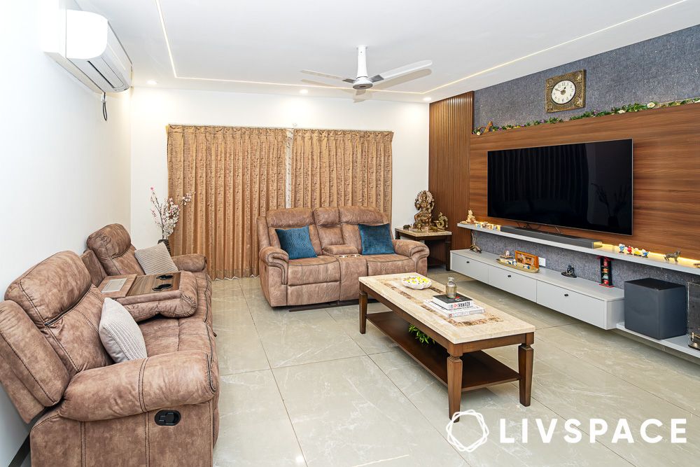
If there’s a masterclass in how to work a neutral palette without descending into beige monotony, it’s happening right here in this living space. The brown recliner sofas anchor the seating area with their rich, chocolate tones, whilst a coffee table sporting wooden legs and a beige glass top bridges the gap between rustic and refined.
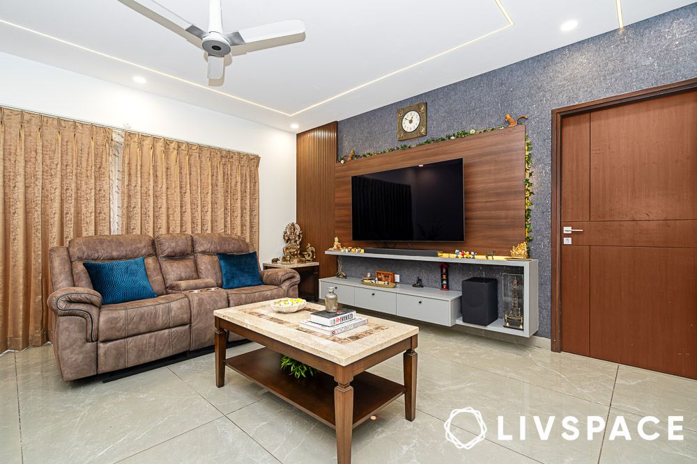
The TV unit design deserves particular mention—a grey backdrop with wooden panels behind the television and fluted wooden panels to the left, topped off with a light grey floating storage unit. It’s the sort of feature wall that photographs beautifully but, more importantly, lives beautifully too. The beige-brown curtains echo the coffee table’s material palette, creating visual continuity that interior designers spend years learning to master.
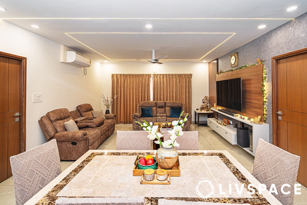
The dining table follows suit with its wooden legs and beige glass top, proving that good design often lies in knowing when to repeat a successful formula. The light beige flooring throughout allows the furniture to shine without competing for attention.
Kitchen: A subtle affair
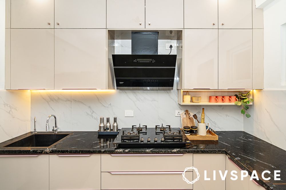
Kitchens often reveal more about a household’s priorities than any other room. And this L-shaped kitchen design suggests serious cooking ambitions. Beigish ivory cabinets above and below create a warm, welcoming atmosphere, whilst the black granite kitchen countertops provide the sort of dramatic contrast that makes everyday tasks feel more purposeful.
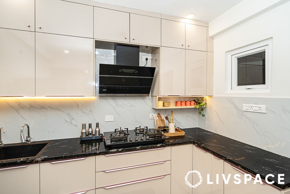
LED strip lighting under the cabinets creates proper task lighting for food preparation, proving that good design always serves a function. The backsplash with subtle white marble-effect tiles adds a touch of luxury whilst remaining practical for the inevitable splashes and spills of daily cooking.
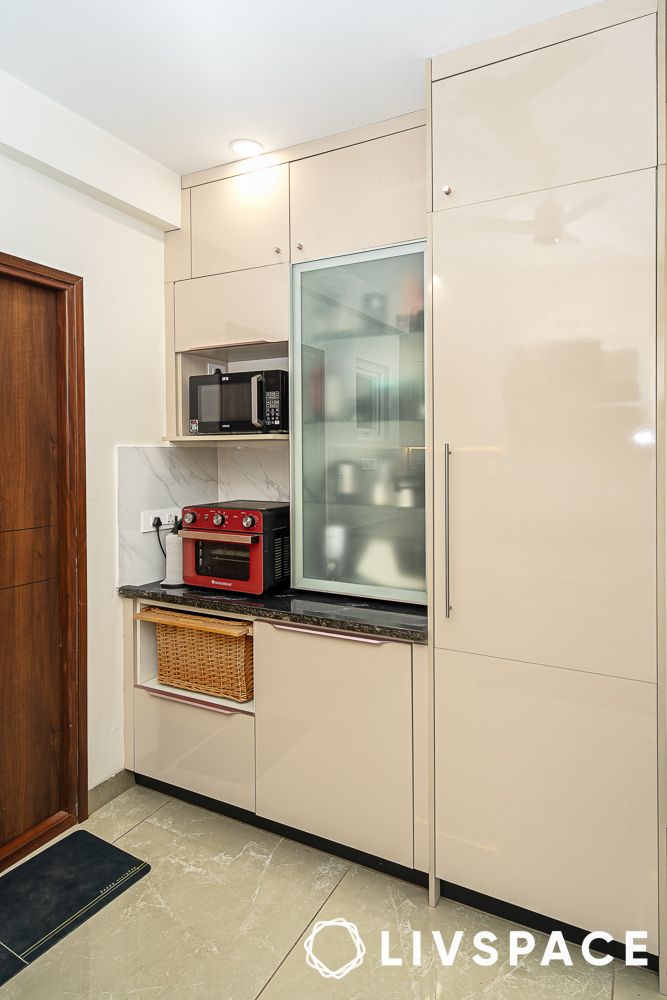
The additional corner section with its separate storage and wicker baskets acknowledges the Indian kitchen’s need for bulk storage and organisation—a detail that speaks to the real understanding of how these spaces actually function.
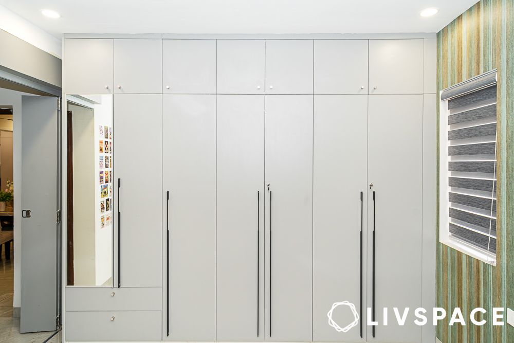
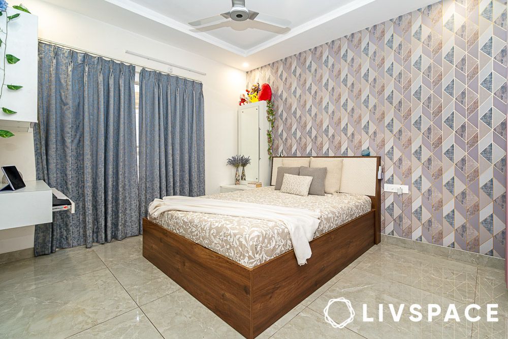
Primary bedroom: Where rest meets refinement
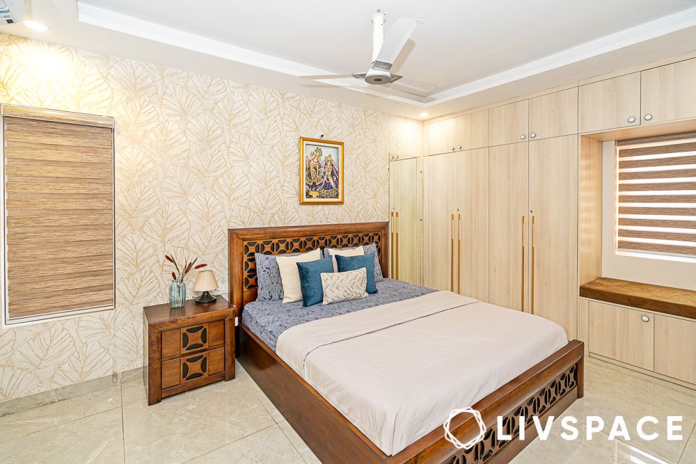
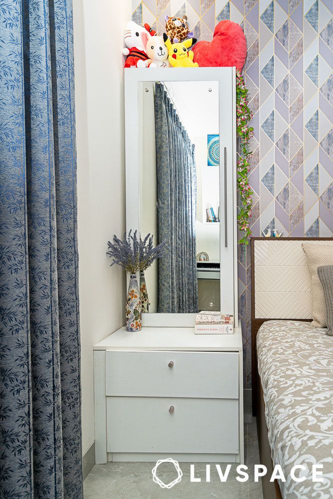
Step into the primary bedroom, and you’re immediately struck by the beige wallpaper featuring delicate leaf patterns behind the bed. It’s botanical without being busy, adding texture and interest without overwhelming the restful atmosphere that bedrooms demand. The far wall houses a full-height modular wooden wardrobe that cleverly incorporates a seating ledge by the window—a detail that transforms dead space into a reading nook.
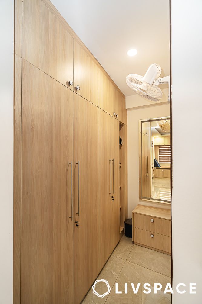
But the real surprise lies in what appears to be a simple wall gap that reveals a walk-in wardrobe area near the ensuite bathroom. Complete with a four-door wardrobe system and dressing table unit, it’s proof that good storage design often lies in the art of concealment. The floating wooden TV unit maintains the room’s clean lines whilst providing practical entertainment options.
Kids’ bedroom: A Growing room for growing minds
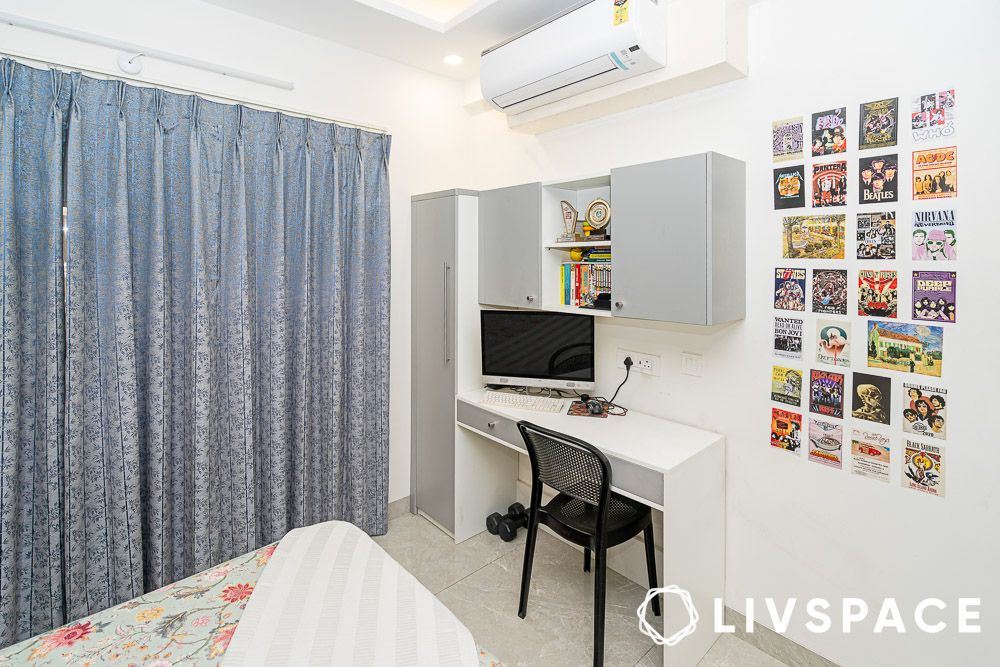
The kids’ bedroom strikes that delicate balance between adult sophistication and child-friendly functionality. The bedroom false ceiling design with cove lighting creates interest overhead, whilst colourful wallpaper provides the requisite dose of whimsy. The grey study table unit, complete with book storage, acknowledges the reality of homework whilst maintaining the room’s cohesive colour scheme.
A seven-door wardrobe with overhead lofts and an inbuilt mirror proves that children’s storage needs are just as complex as their parents’, requiring the same level of design consideration. The grey curtains tie the palette together, creating a space that children can grow into rather than quickly outgrow.
Secondary bedroom: The gentle alternative
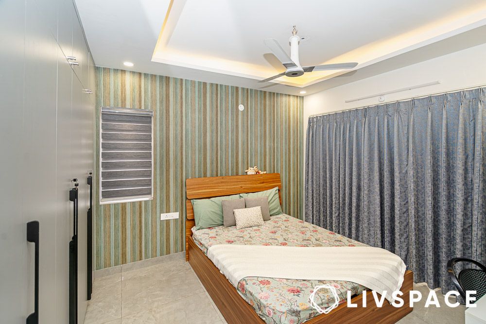
The secondary bedroom takes a different approach, with white walls serving as a backdrop for wallpaper design featuring geometric patterns. It’s a more graphic approach than the botanical primary bedroom, but no less effective.
The white dressing table design and floating study tables maintain the clean, contemporary aesthetic, whilst the pastel purple wardrobe provides the room’s colour moment.
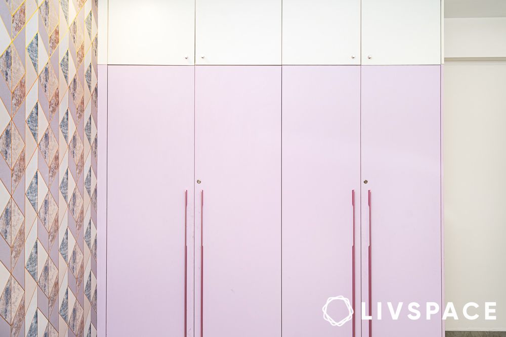
Four doors with white lofts overhead ensure that storage remains both practical and visually light—a consideration that’s particularly important in smaller bedrooms where every design decision carries more weight.
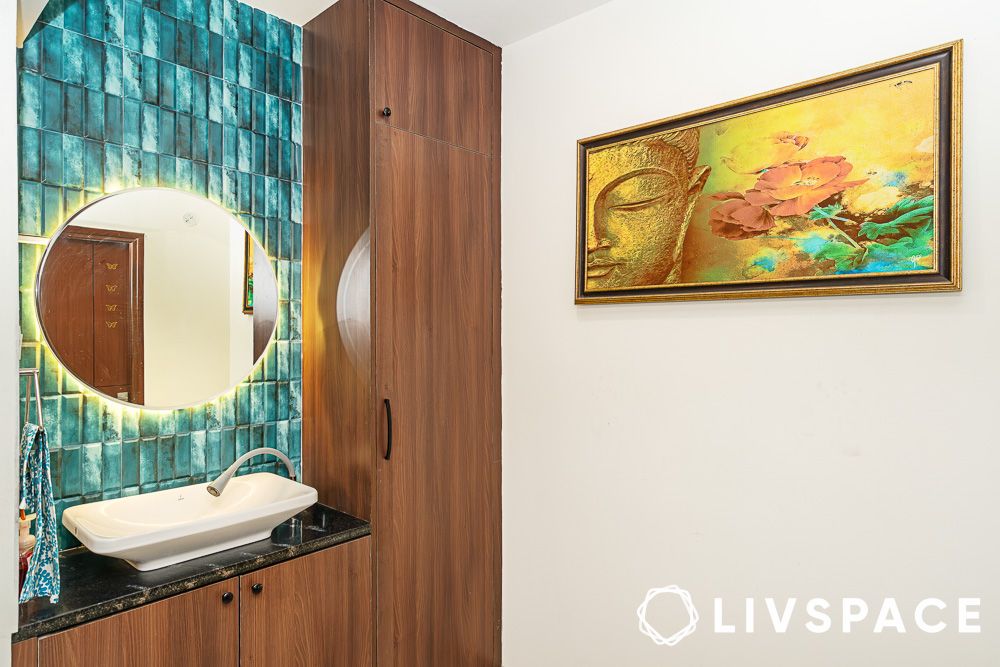
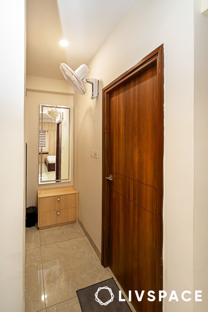
Outside the bedrooms, a common sink unit with wooden cabinets and blue subway tiles topped with a mirror proves that transitional spaces needn’t be afterthoughts. It’s the sort of practical consideration that makes daily life flow more smoothly whilst maintaining the home’s overall design coherence.
The larger truth
The clients approached the designers with a clear preference for elegant, clutter-free interiors with practical storage, and their trust in the design vision, whilst staying involved in key choices, resulted in something that feels both personal and universal.
The project’s unique selling points—the smart usage of vertical space, the balanced blend of functional modularity and luxury—speak to a design philosophy that understands Indian realities whilst refusing to compromise on international standards. The prayer unit with its perfect blend of privacy and display exemplifies this balance, as does the use of vertical elements like mirrors, grooves, and partitions to make compact spaces feel grand.
In a city where apartment living often feels like an exercise in compromise, this home stands as gentle proof that constraints can catalyse creativity rather than stifle it. The contemporary Indian aesthetic touched with European minimalism suggests that perhaps the secret to good living lies not in having more space, but in understanding the space you have.
How can Livspace help you?
Looking to create your own dream home? Find a Livspace interior designer near you for personalised interior solutions that match your style and budget.
- We have delivered over 75,000 happy homes
- You can choose from our 20+ lakh catalogue products
- All our materials undergo 146 quality checks
Visit your nearest experience centre!
*For select finishes on modular products. For full scope of warranty, please visit livspace.com/in/service
Disclaimer: All contents of the story are specific to the time of publication. Mentions of costs, budget, materials, finishes, and products from the Livspace catalogue can vary with reference to current rates. Talk to our designer for more details on pricing and availability.


